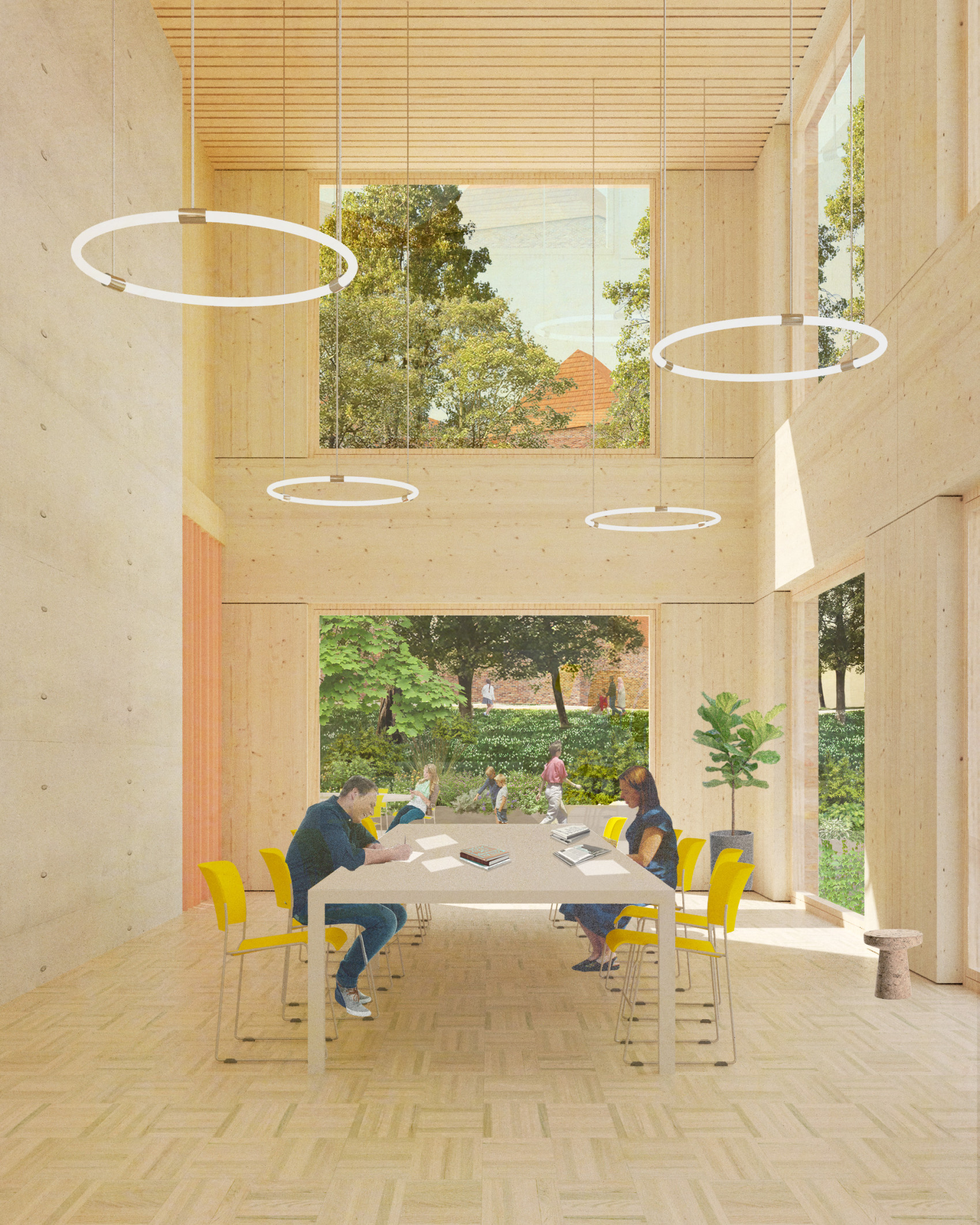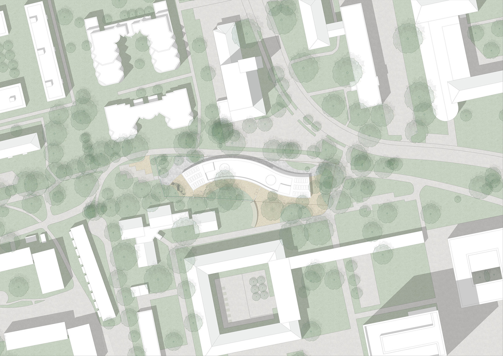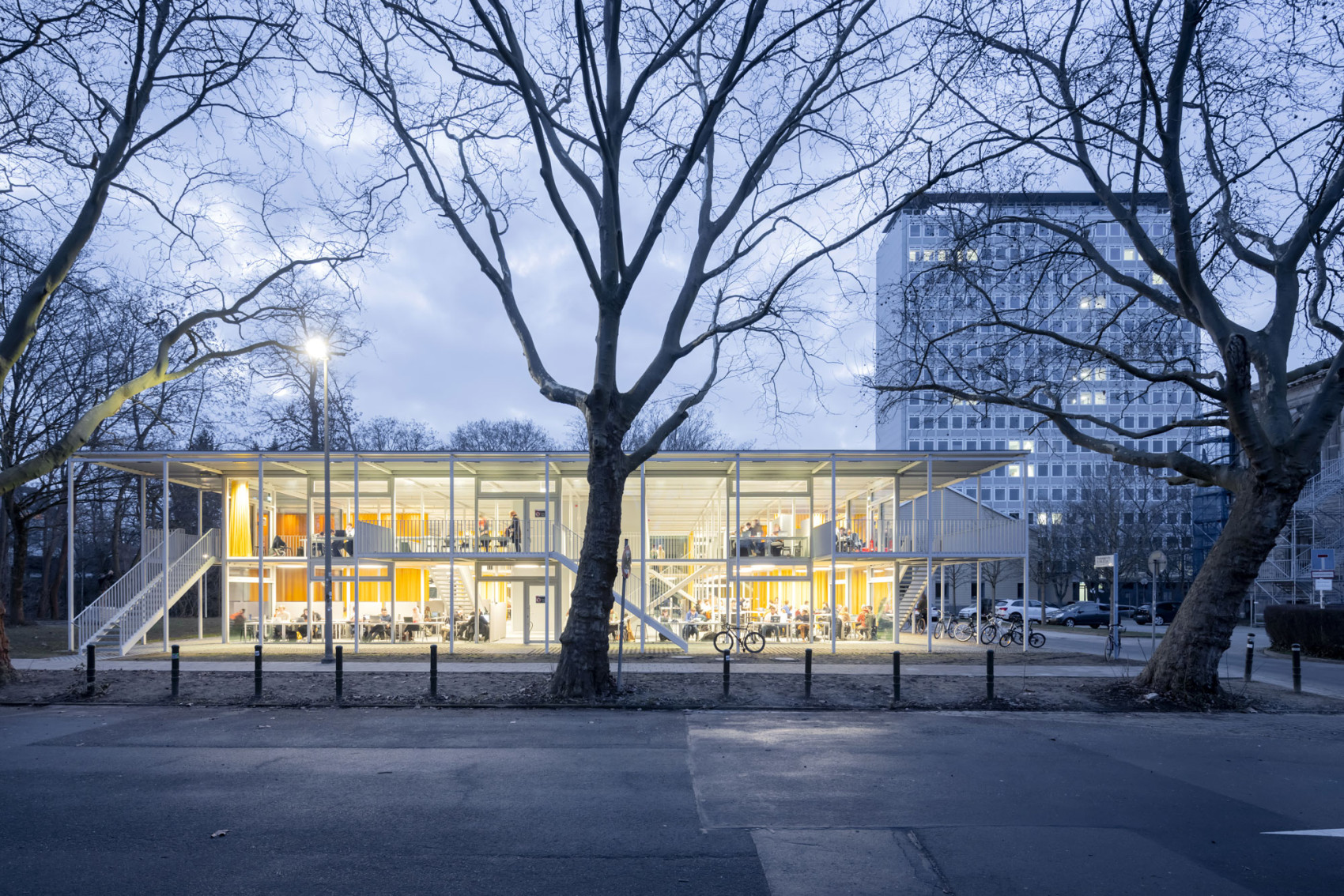
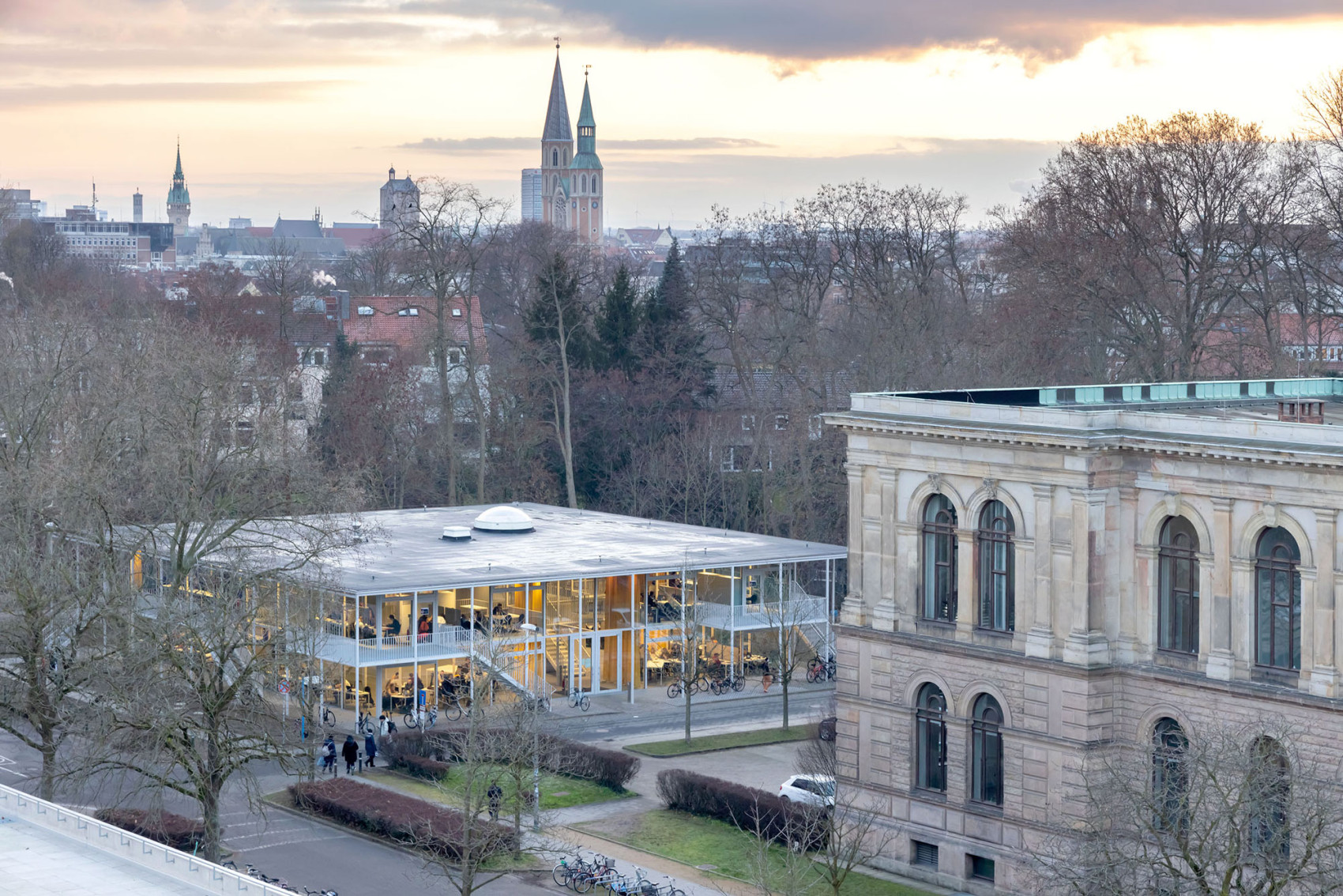
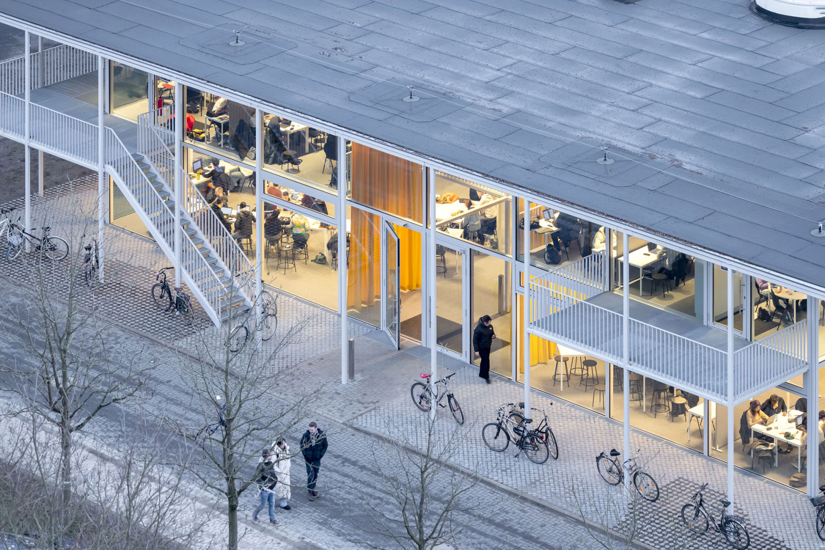
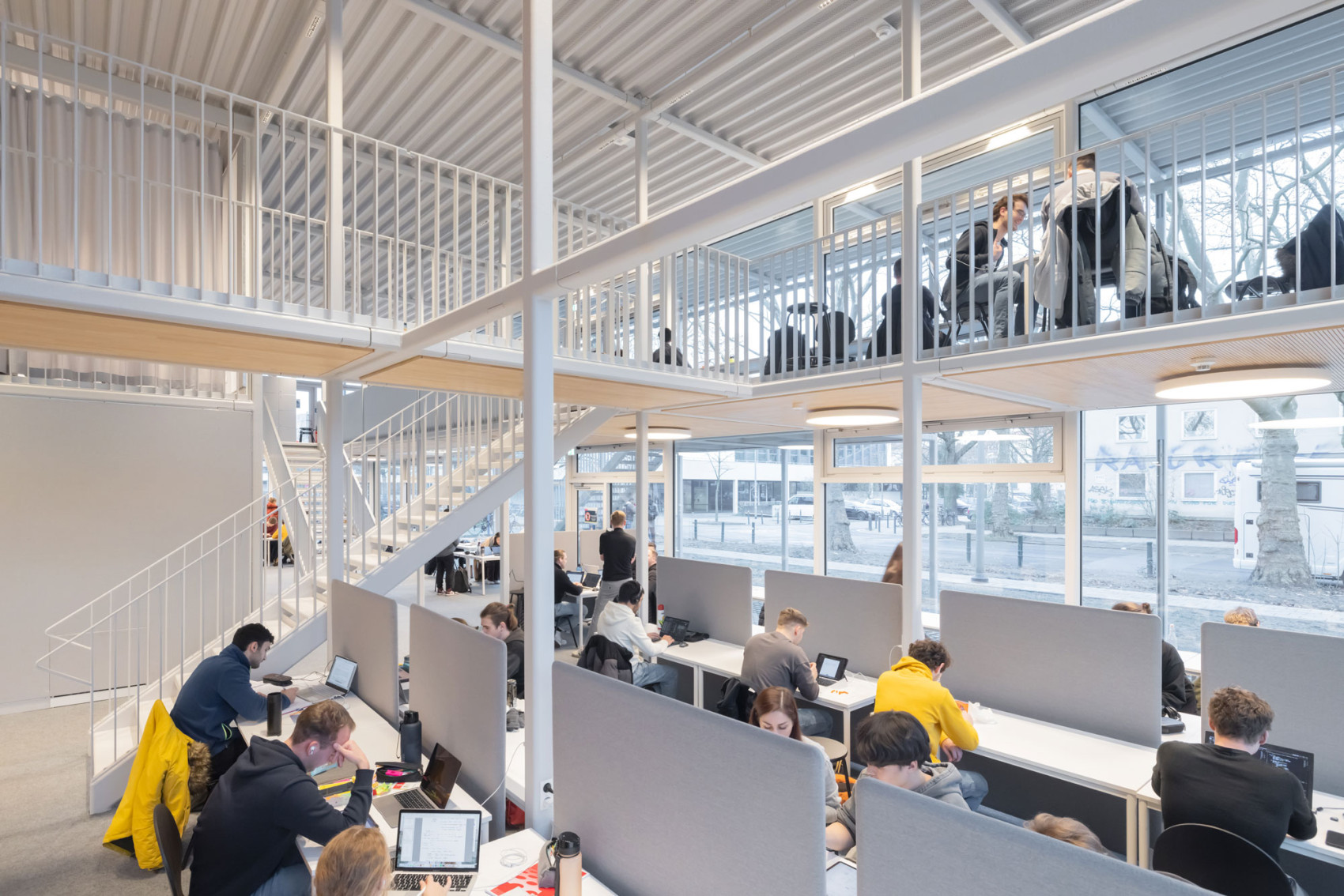
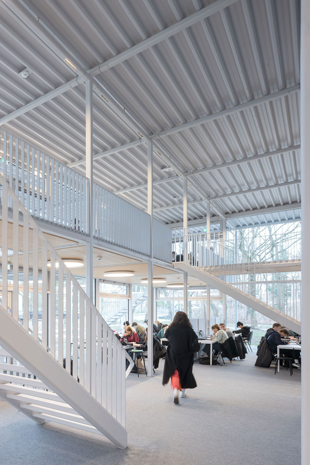
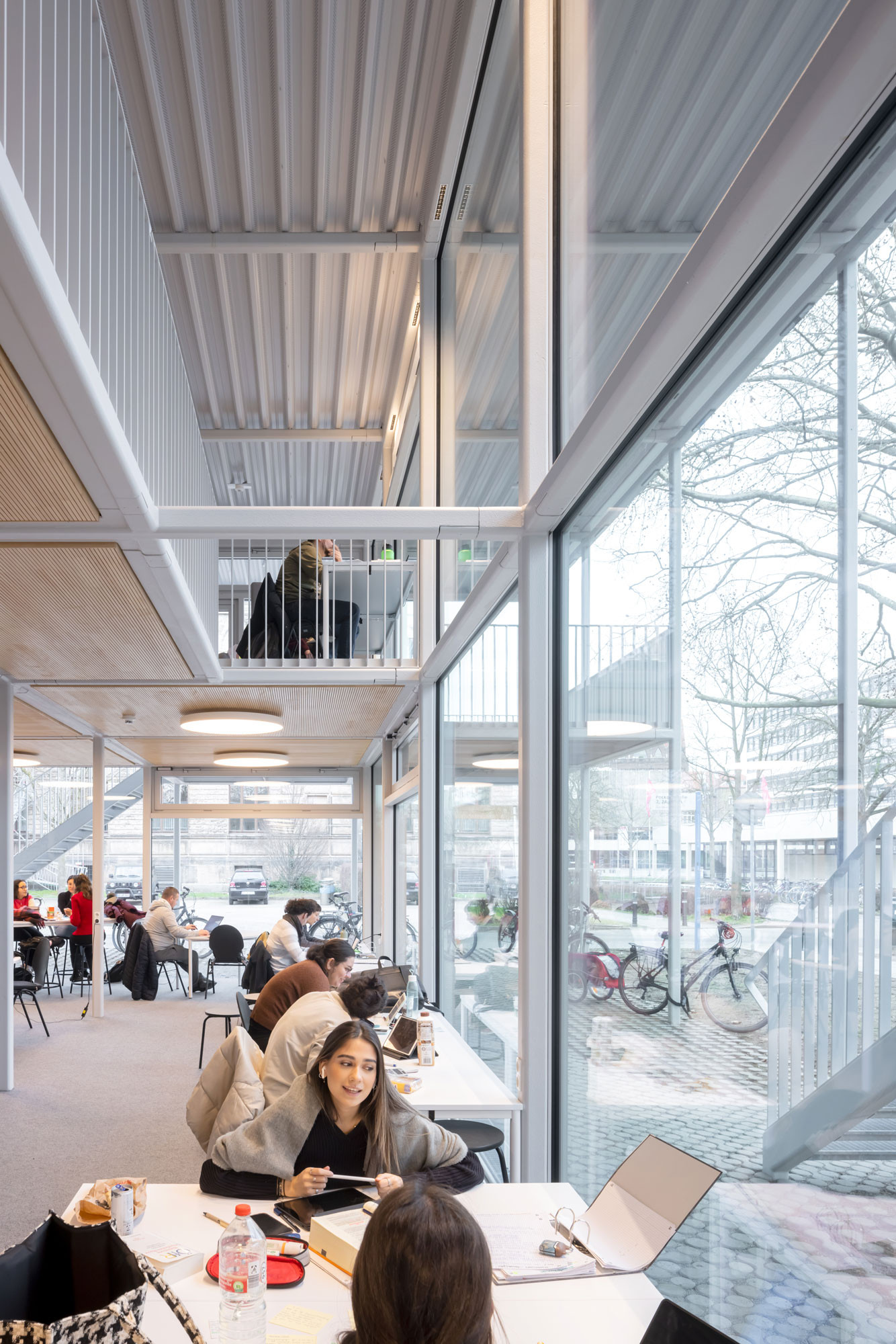
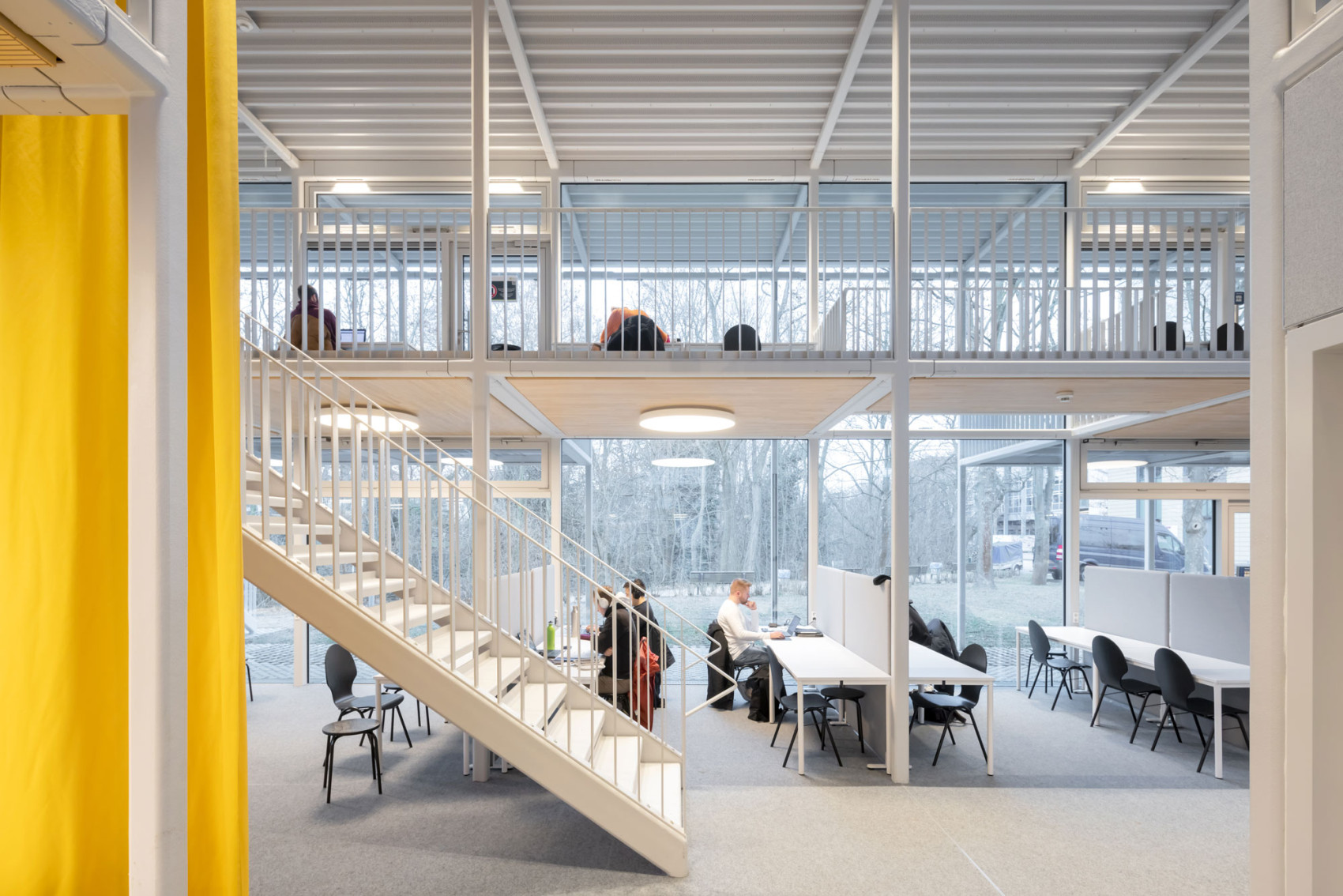
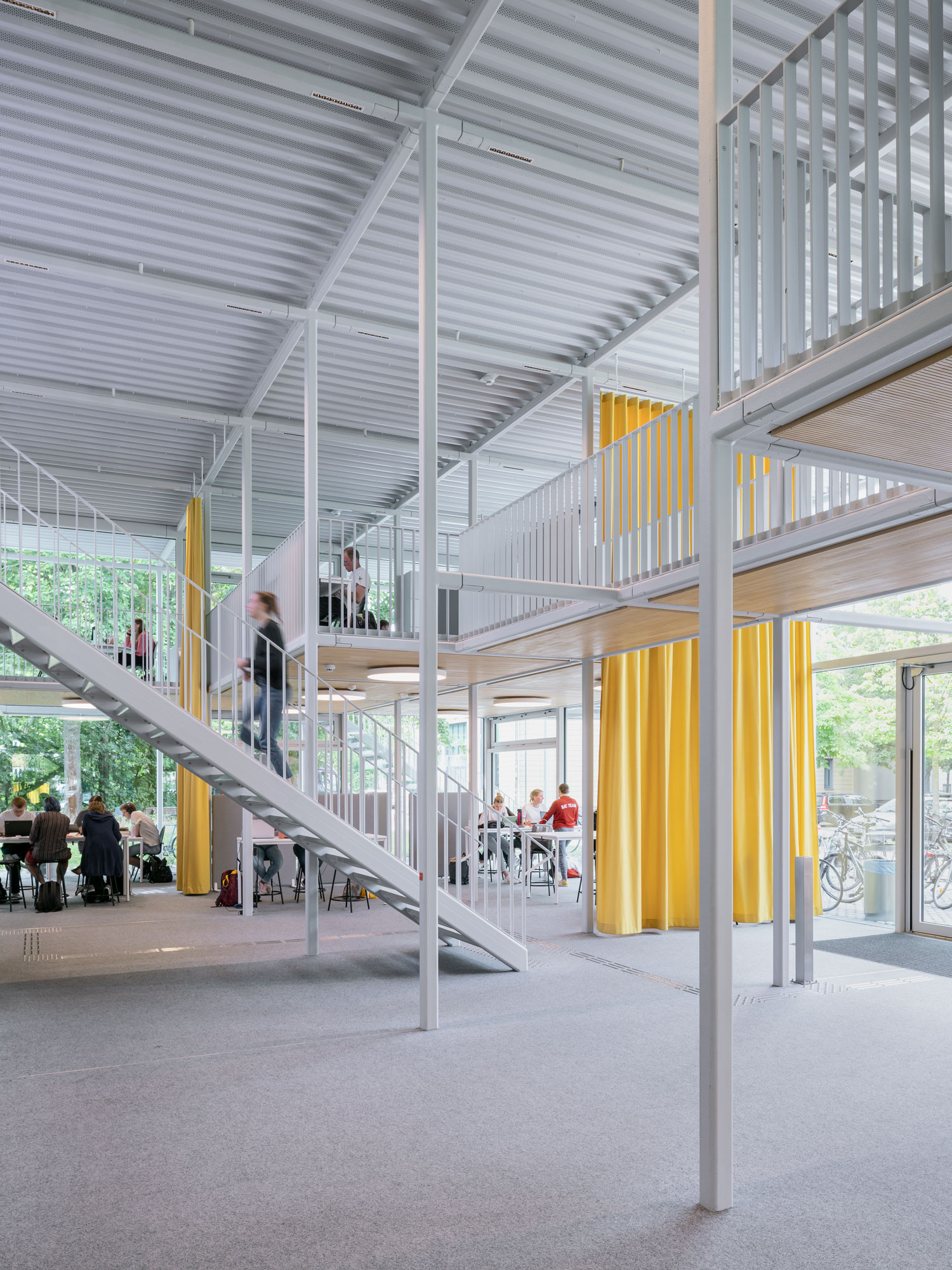
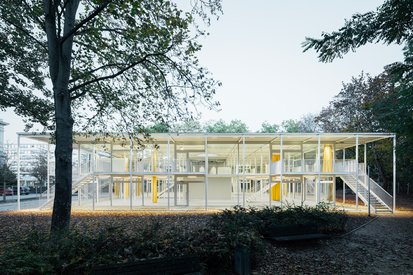
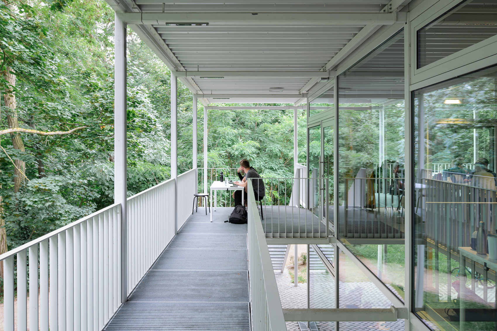
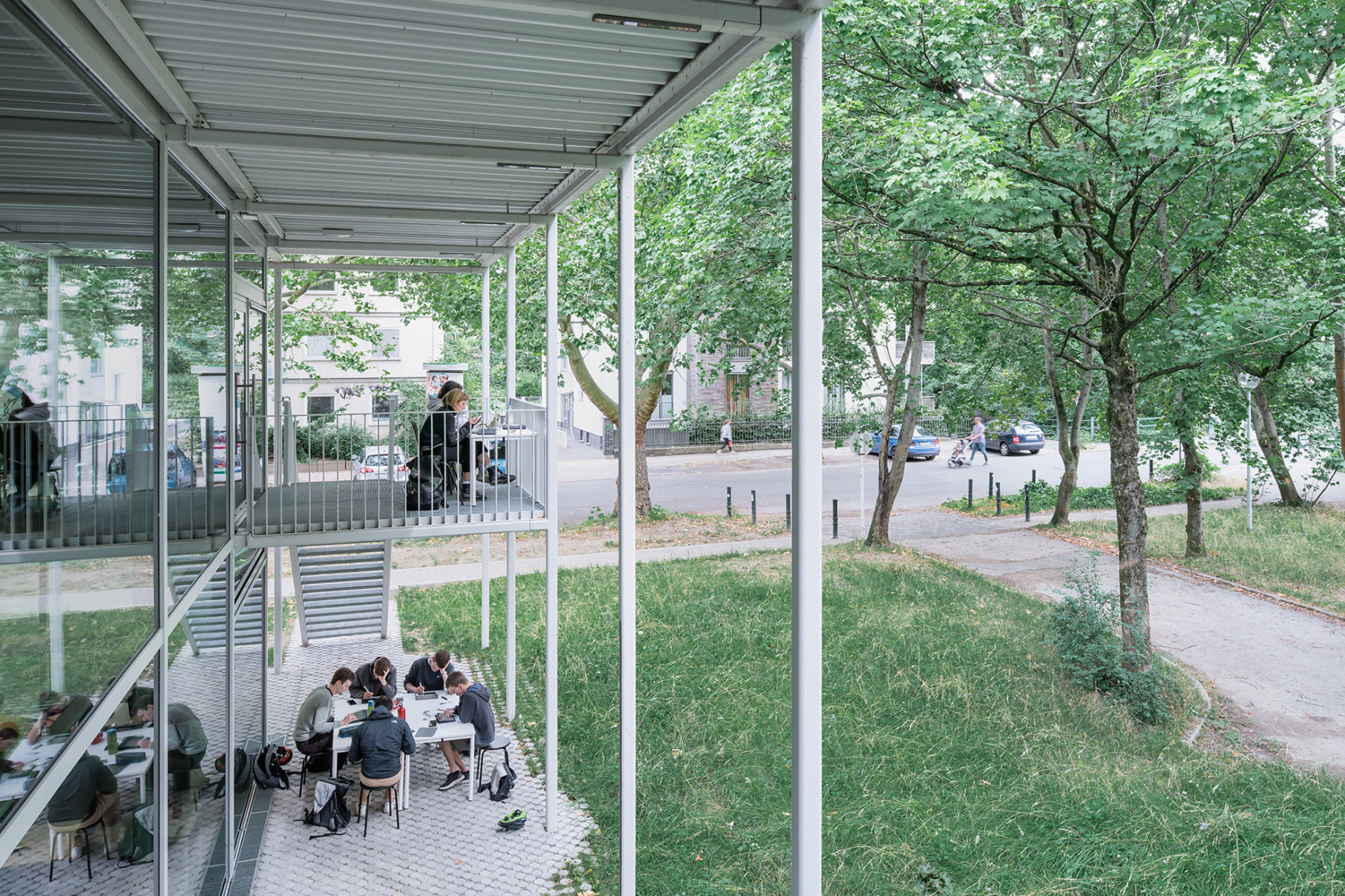
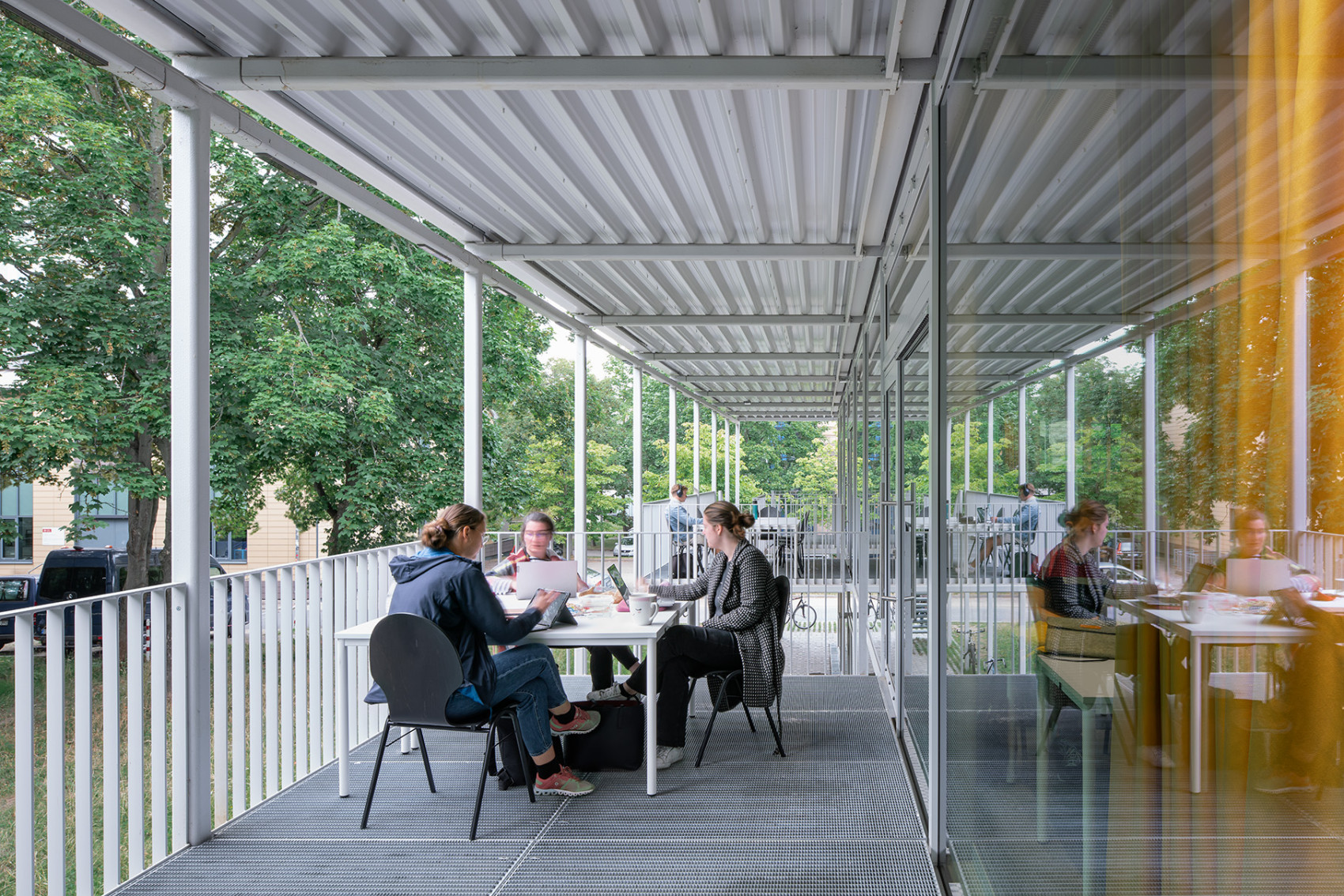
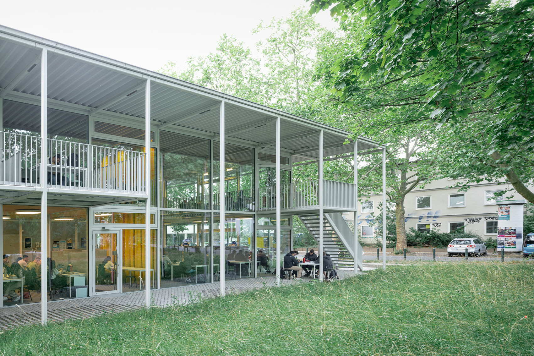
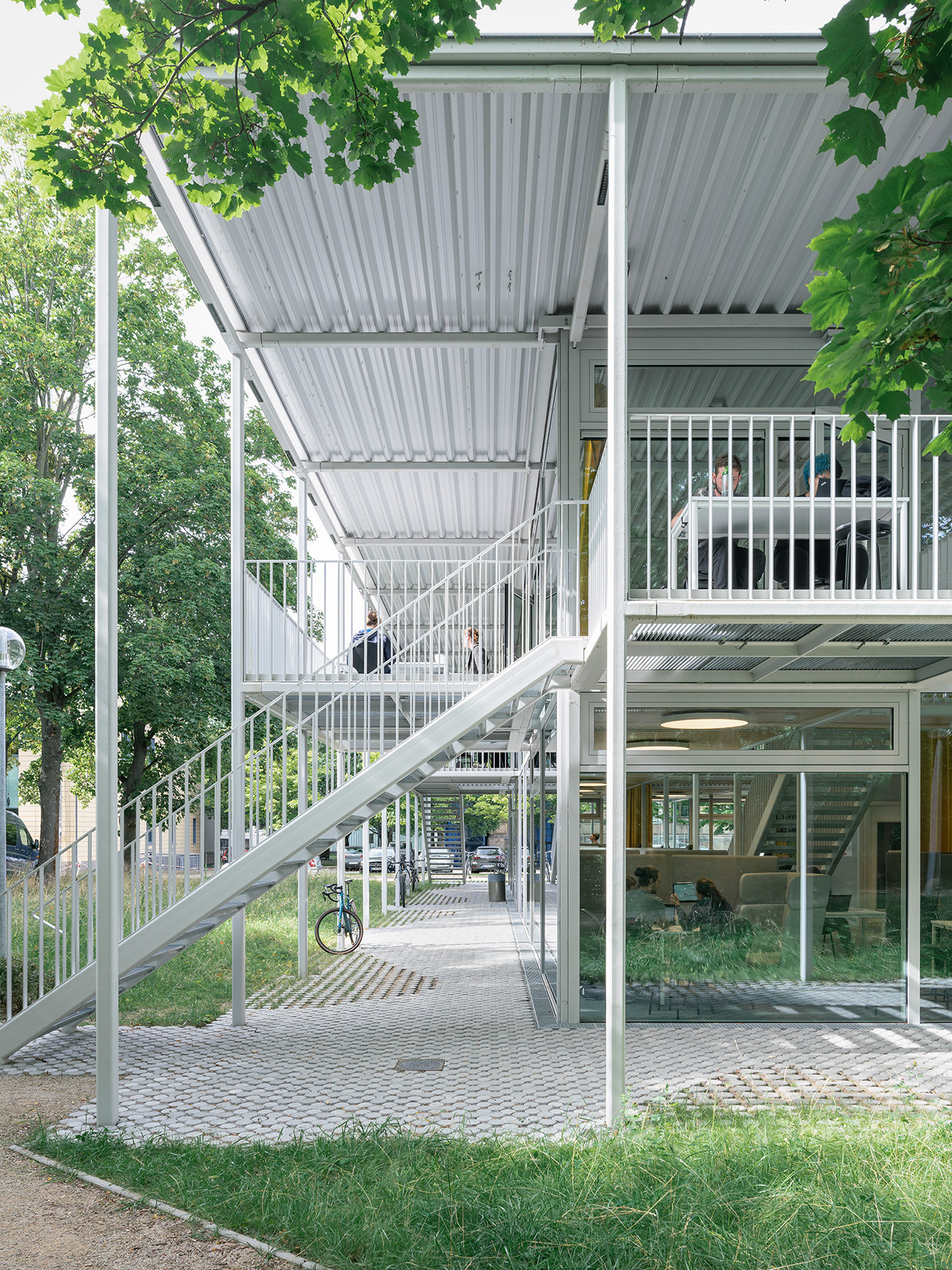
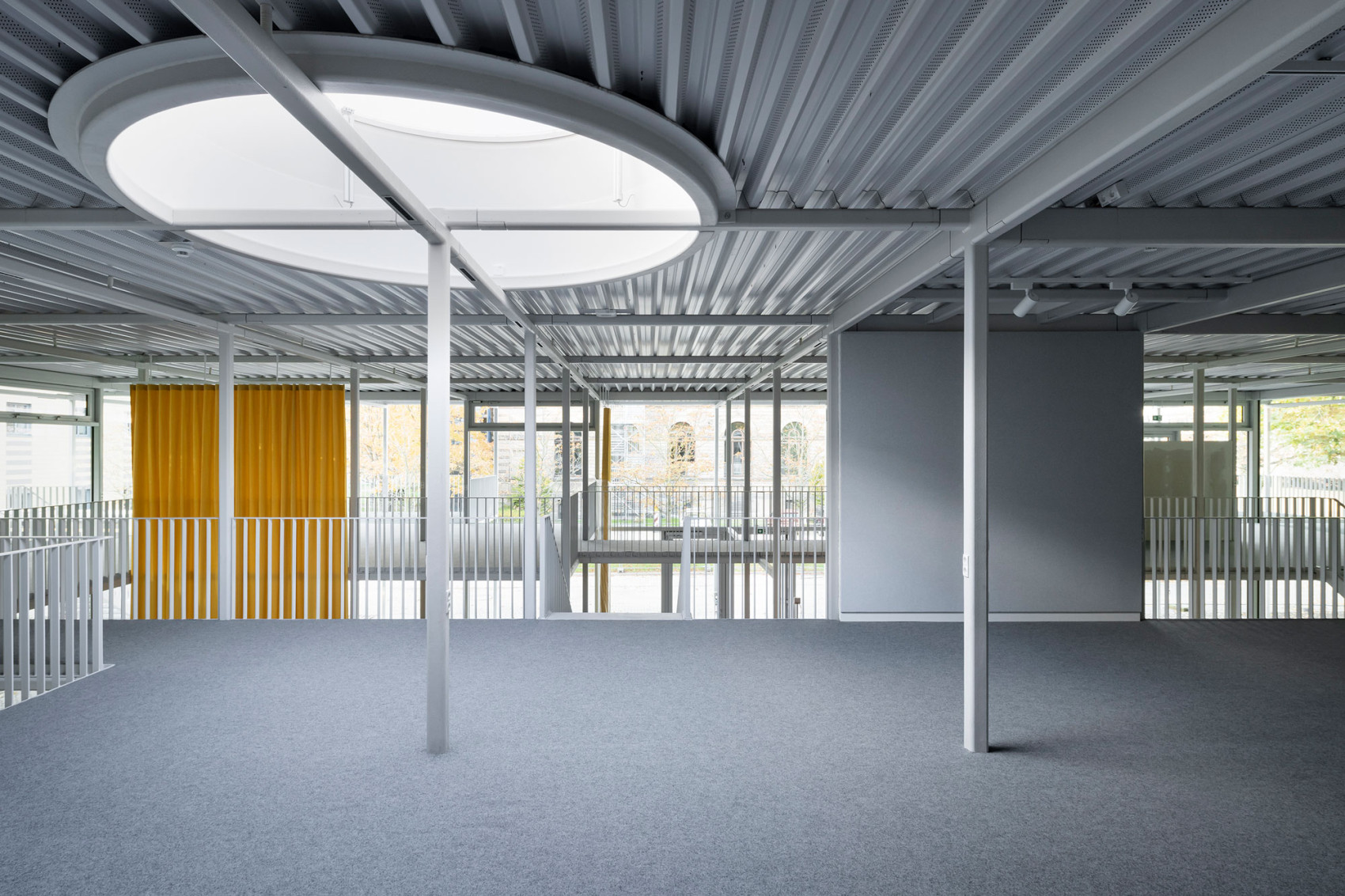
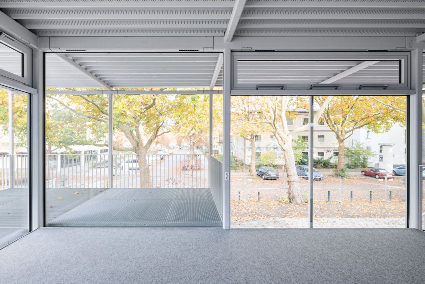
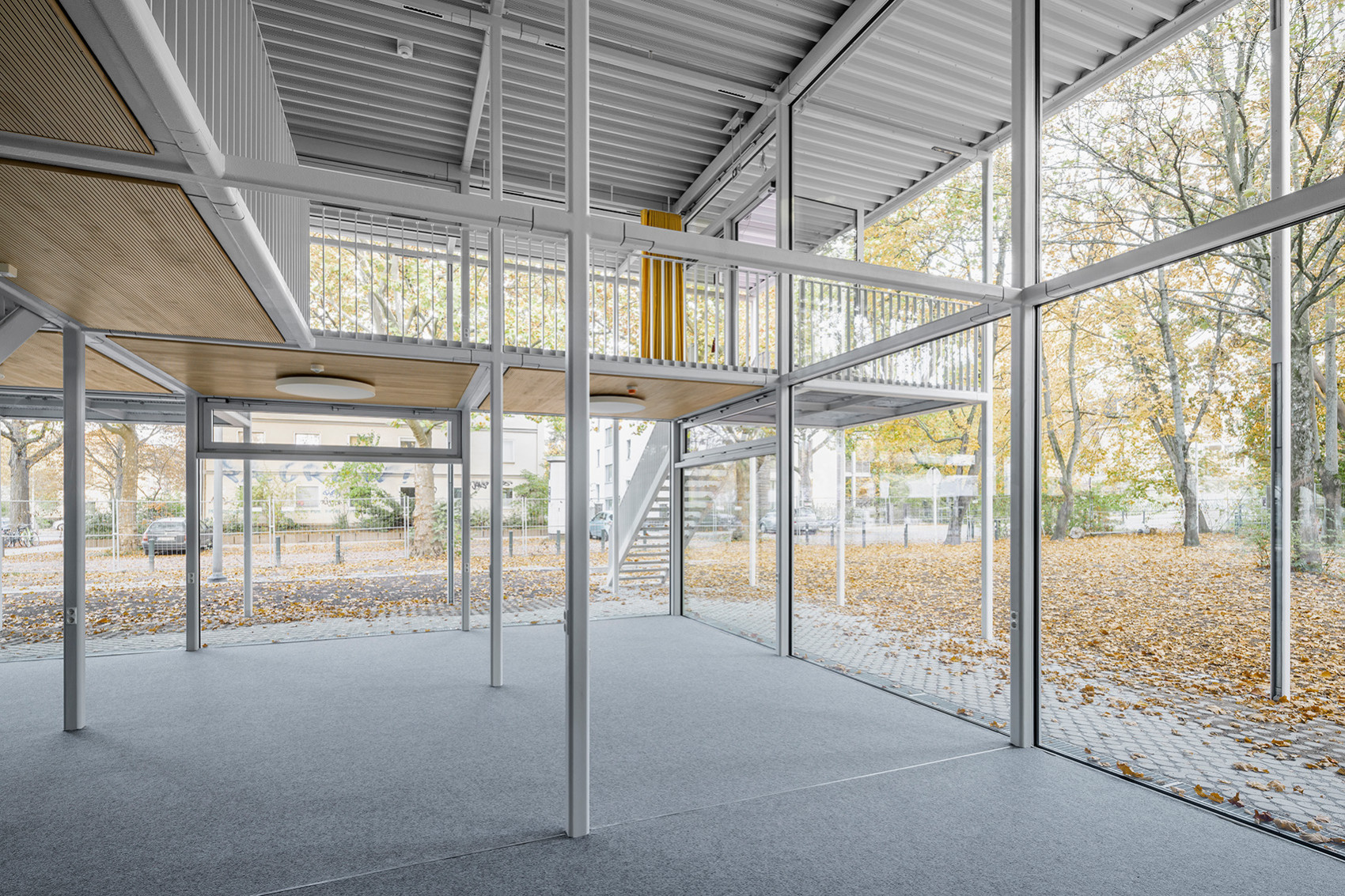
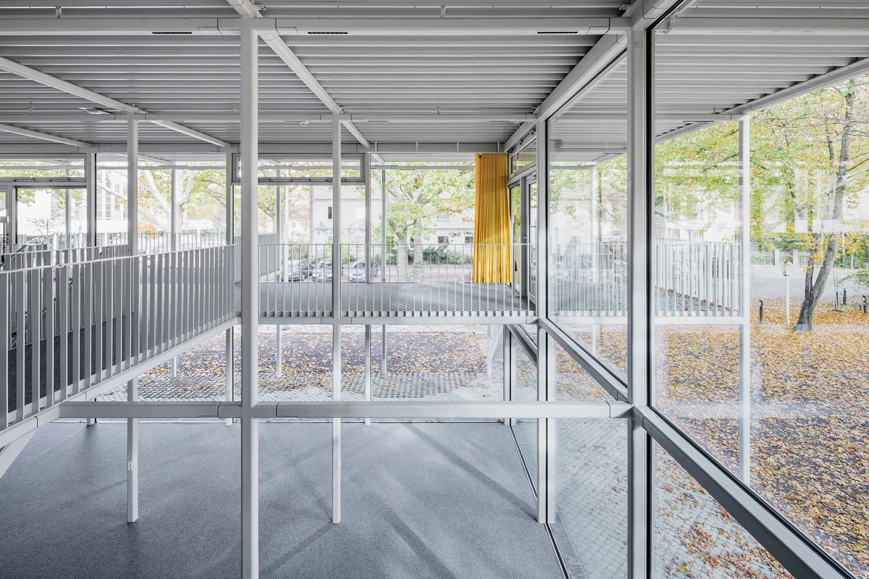
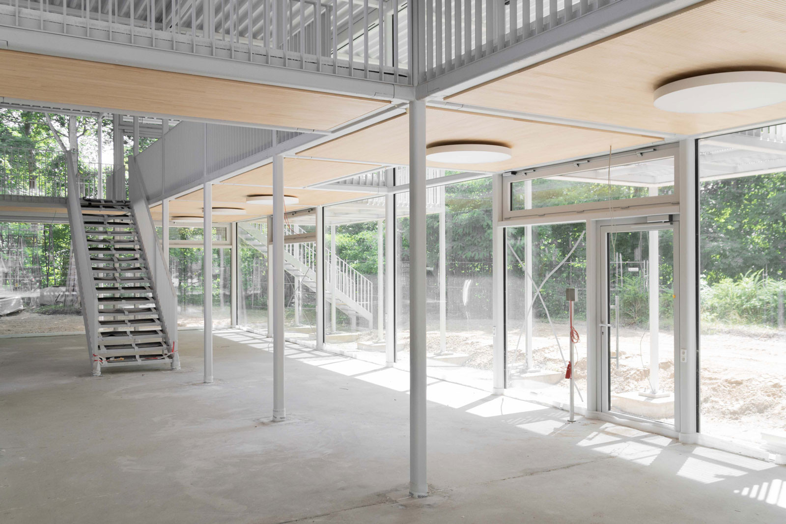
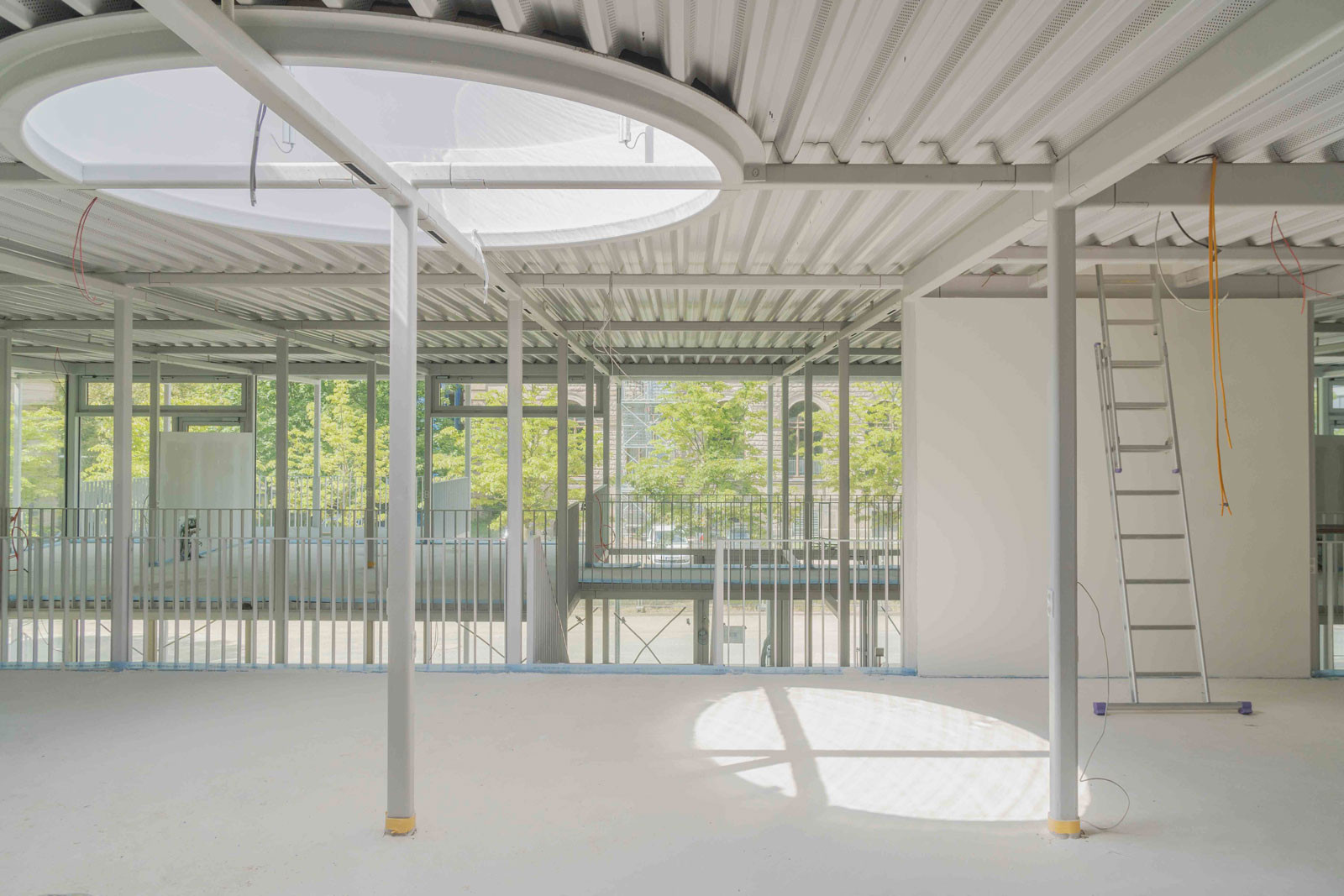
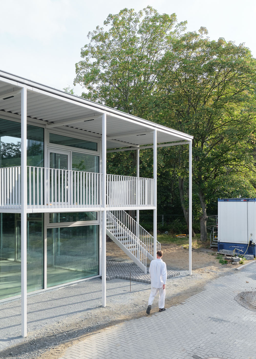
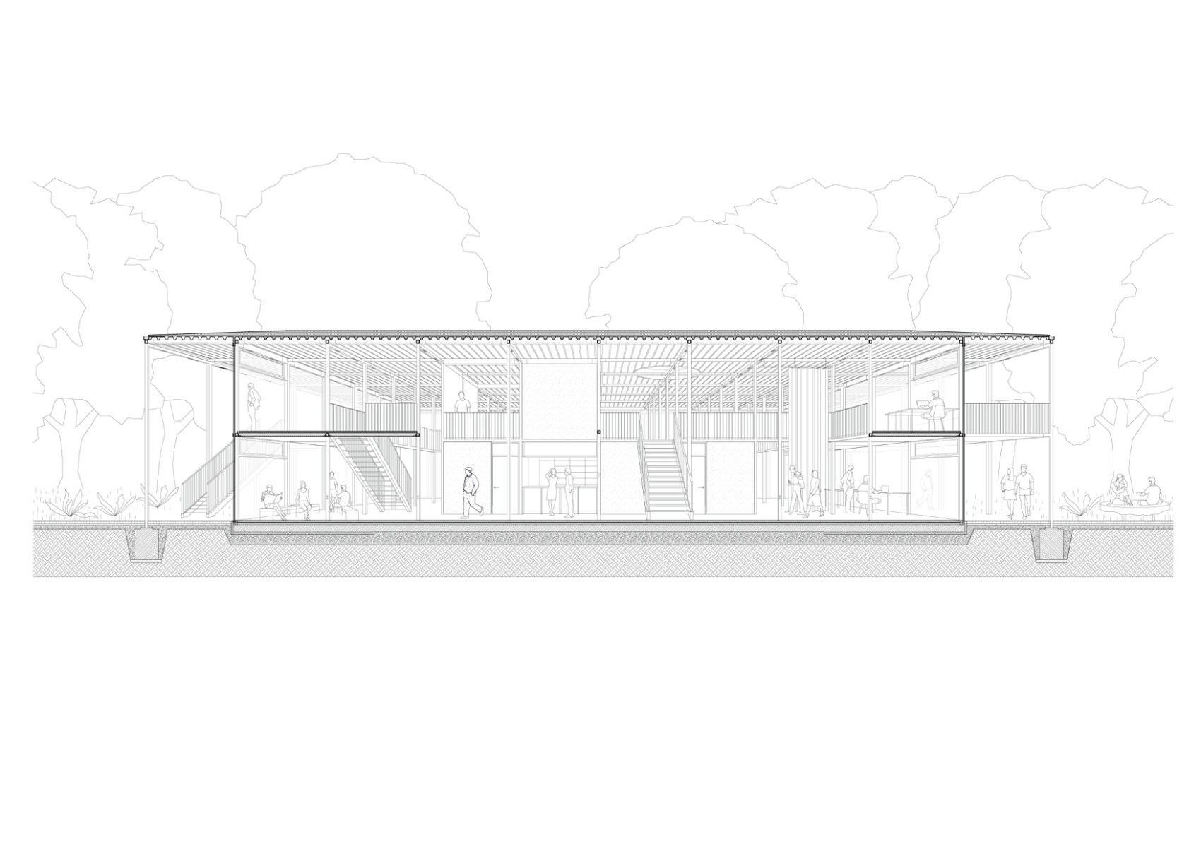
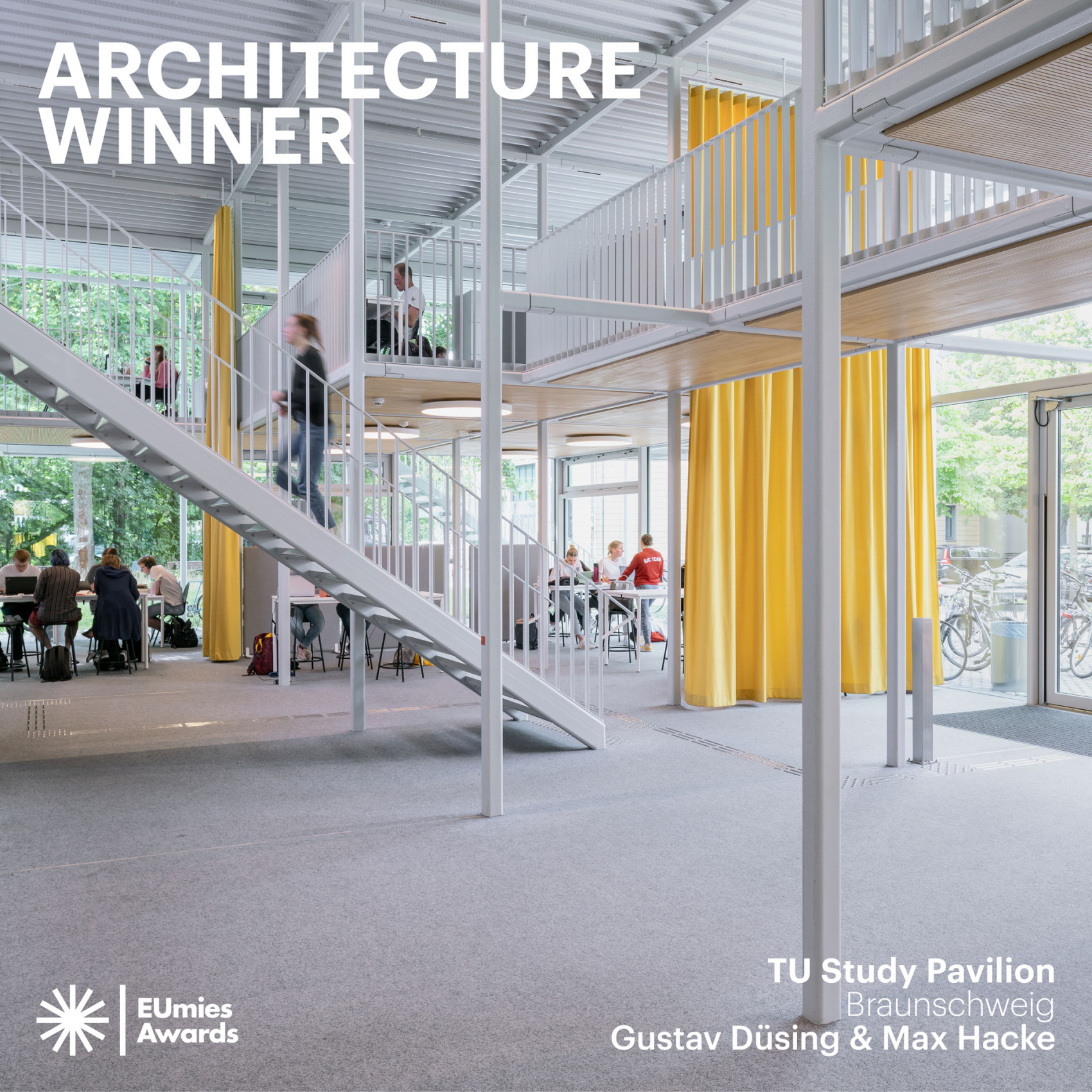
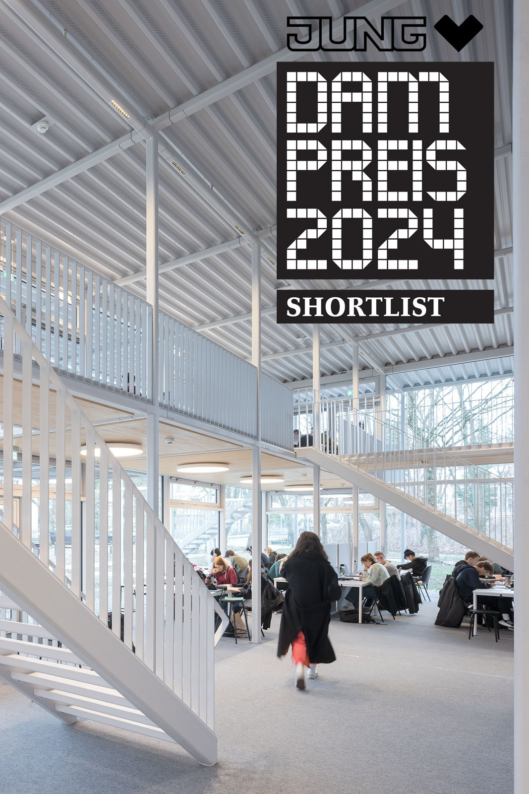
The student pavilion of the Technical University of Braunschweig is a two-story campus building designed for students of all disciplines. Located directly on the central campus, near a river, the building marks the entrance to the central university campus. Our goal was to create a multi-functional space that is accessible to all students and offers a contemporary learning environment as an addition to existing campus typologies. The result is an open-space concept that supports a wide range of activities and provides a flexible environment for group work, seminars, lectures and socialising.
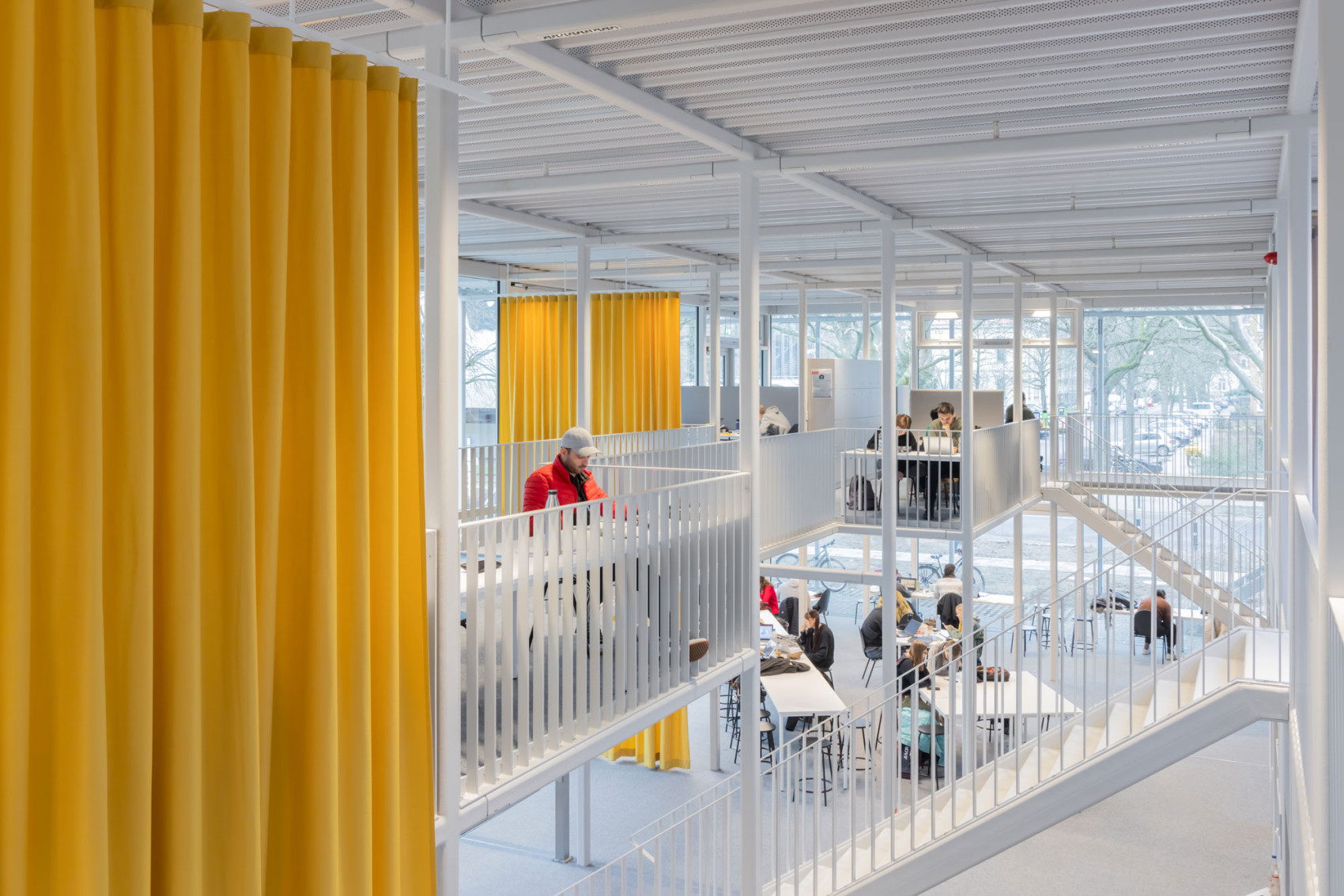
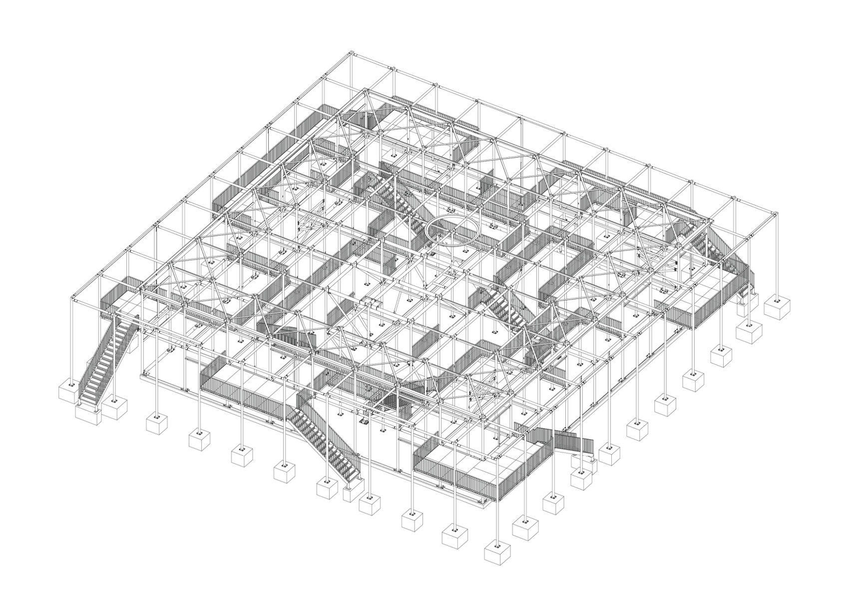
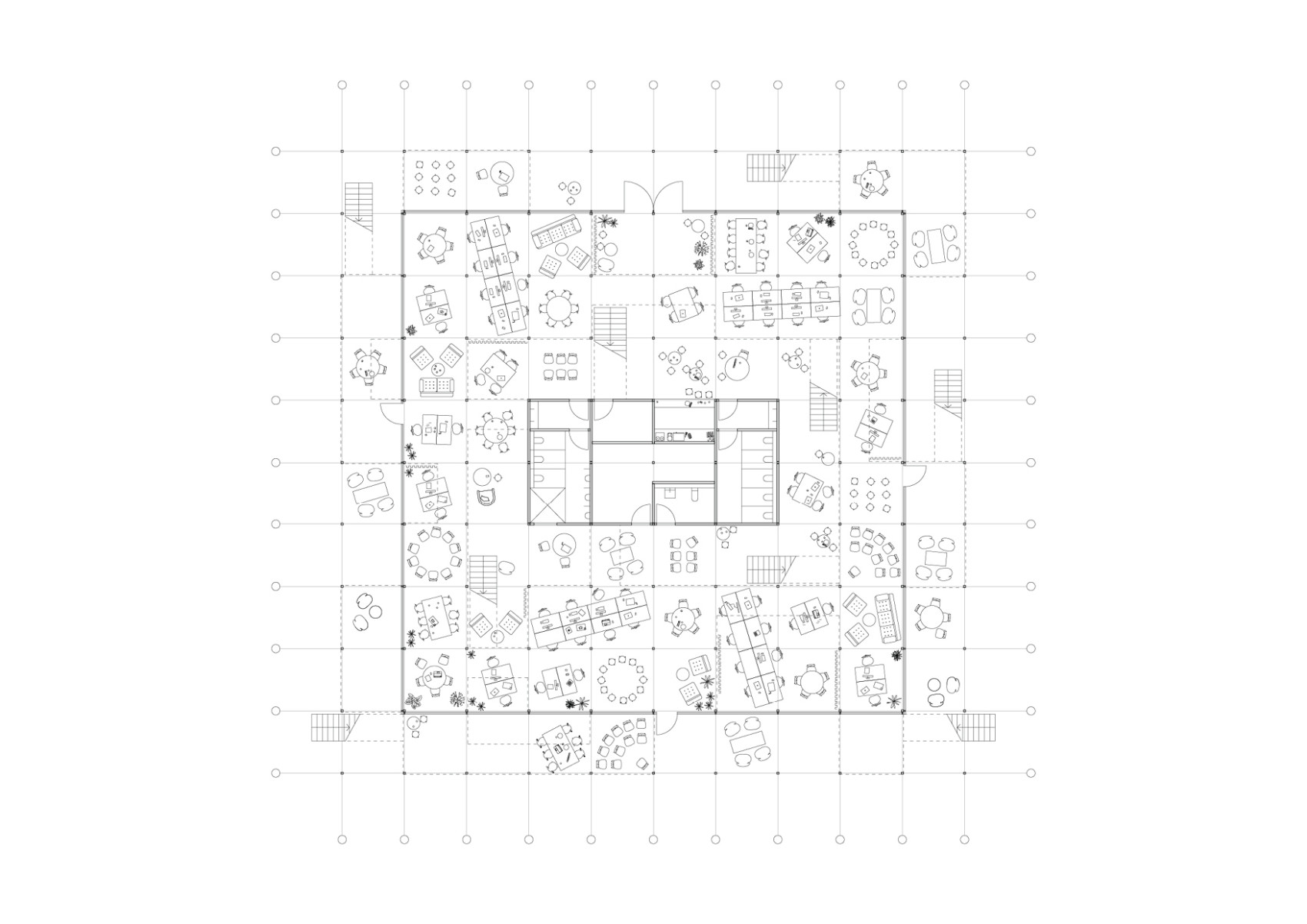
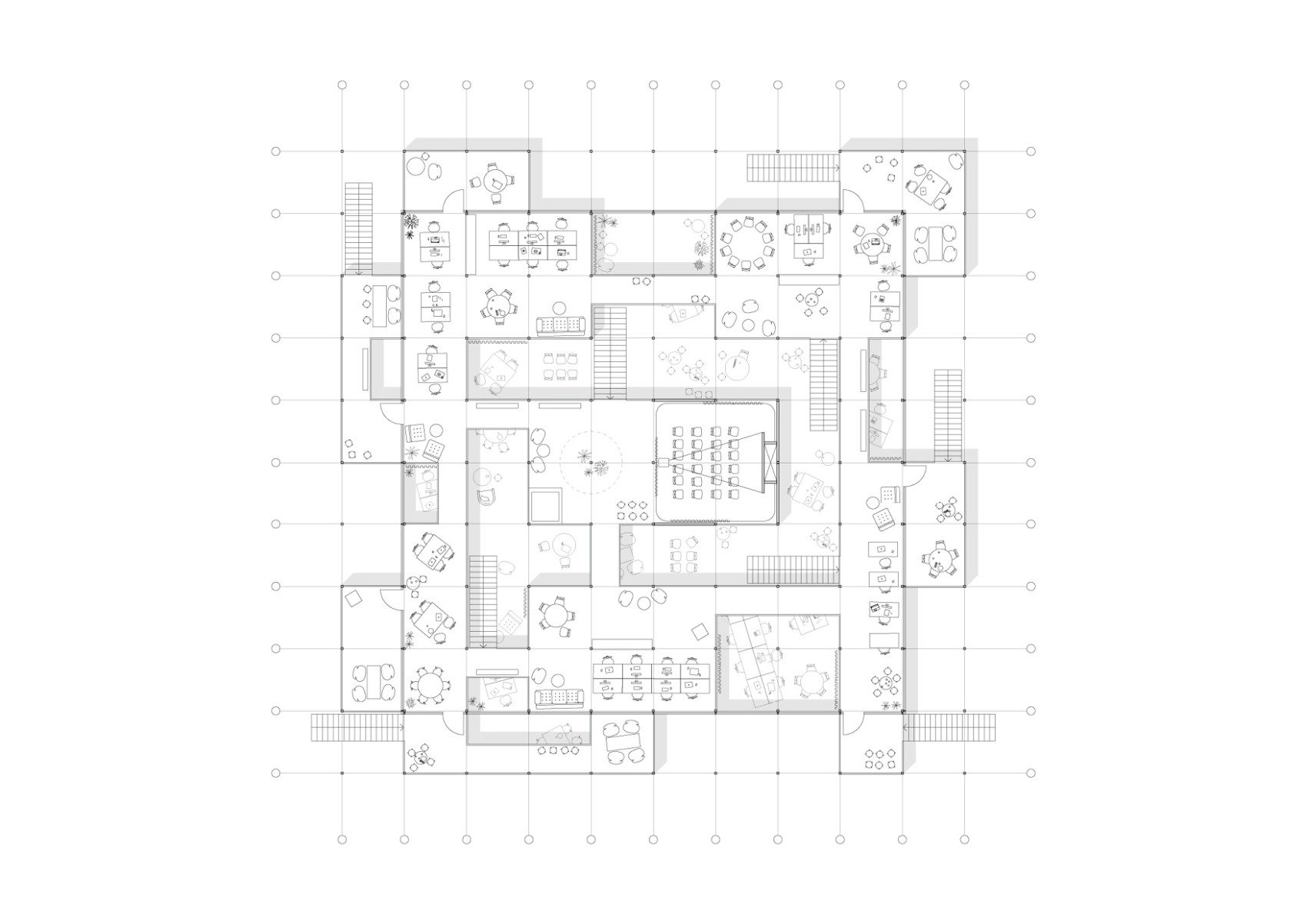
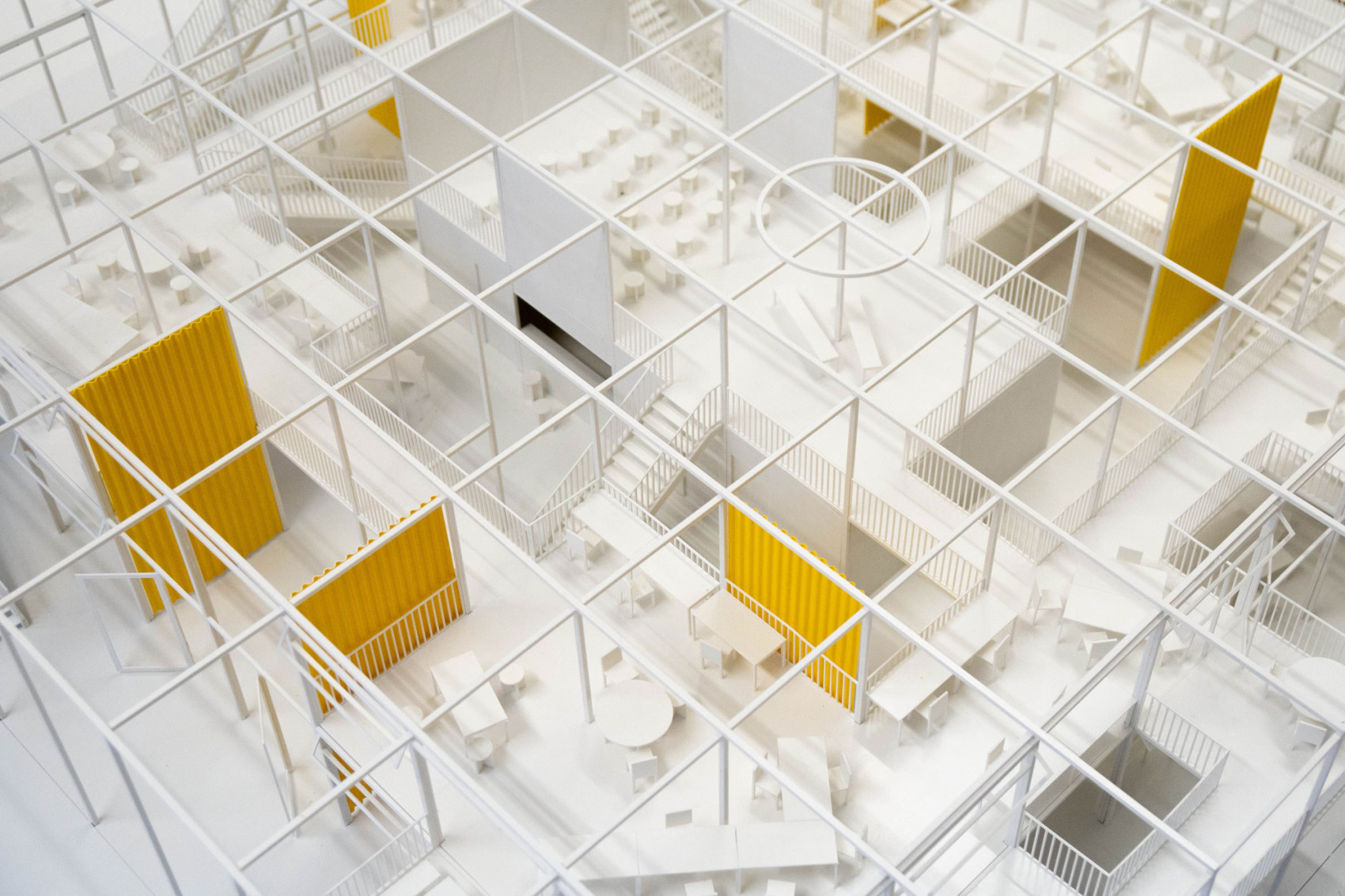
The building is designed without hierarchy and promotes interpersonal communication and interdisciplinary knowledge generation equally between students and teachers, presenting an alternative typology to the conventional lecture halls and unidirectional learning spaces. The building's organisational principle follows the idea of superstructure, allowing for continuous reconfiguration of the floor plan. This flexibility in layout makes the building responsive and adaptable to changing needs, ensuring it remains relevant as a new addition to the campus for a long time to come. The structure forms the basis for all activities and offers students maximum freedom in use. To create a sense of community across disciplines, the goal was to create an equally valued space in which there are no traffic areas or spatial separation between floors. Instead of fixed walls, zones were developed as islands within the space, accessible through their own stairs and entrances.
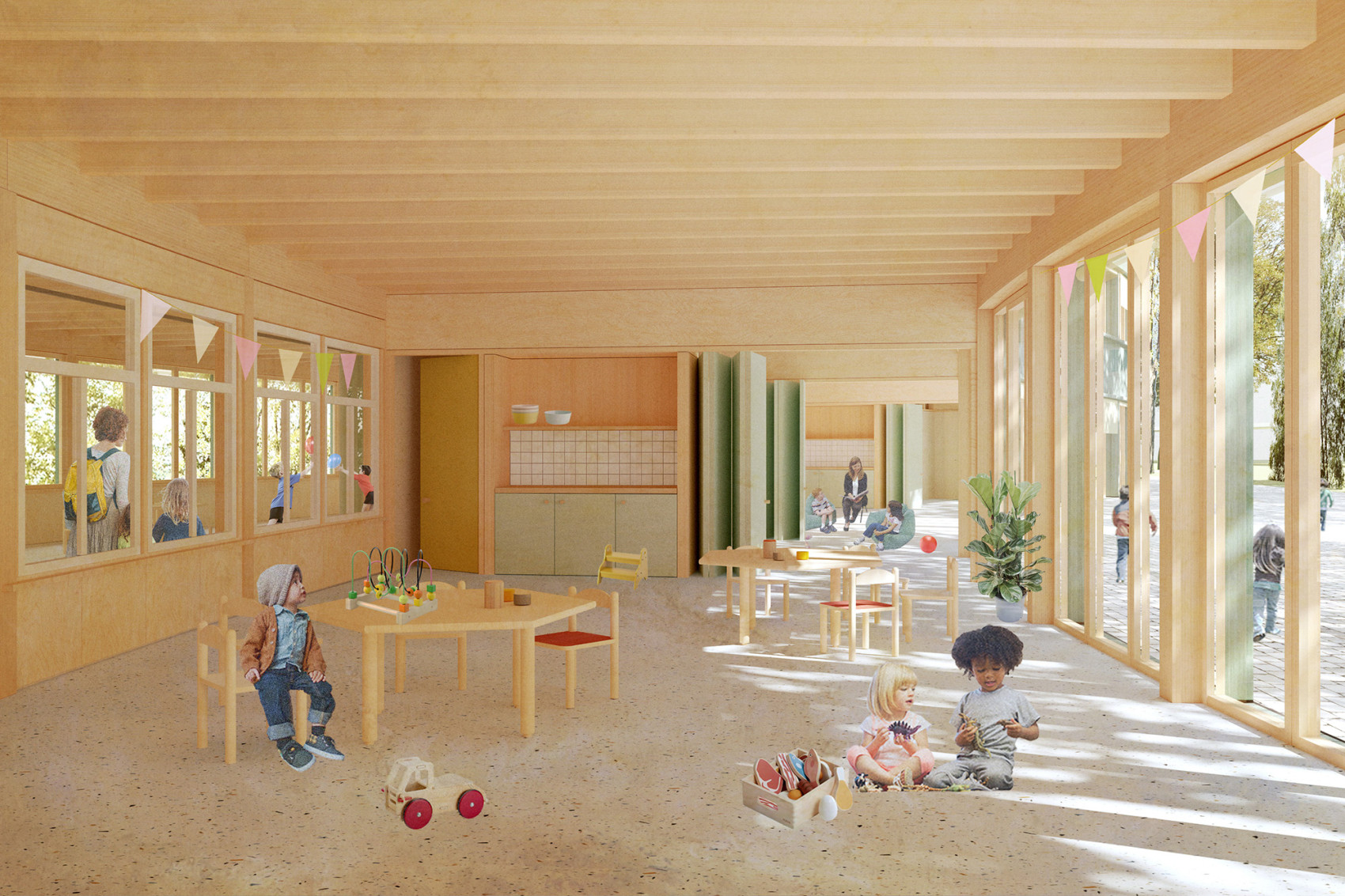
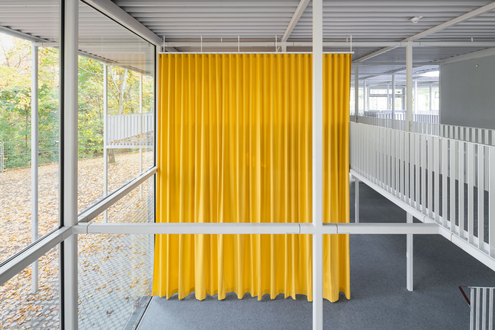
The student pavilion is also distinguished by a fully glazed façade that provides excellent daylight quality for all areas and seamlessly connects the interior and exterior spaces. Sound-absorbing curtains, carpet, and acoustic ceilings provide a pleasant room acoustics that allows for a conversational atmosphere.
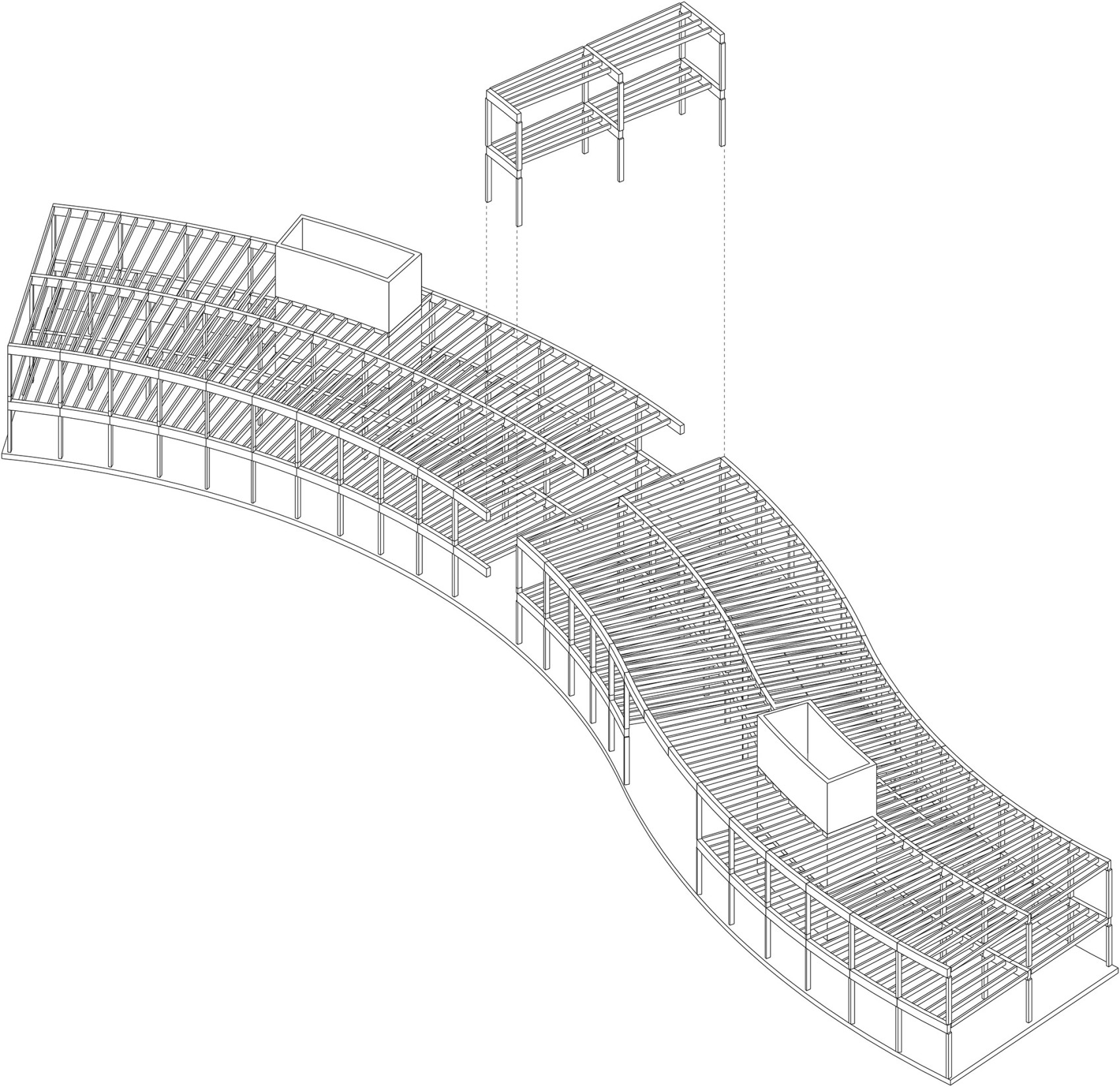
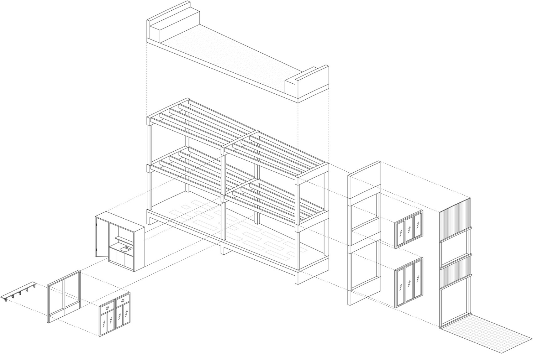
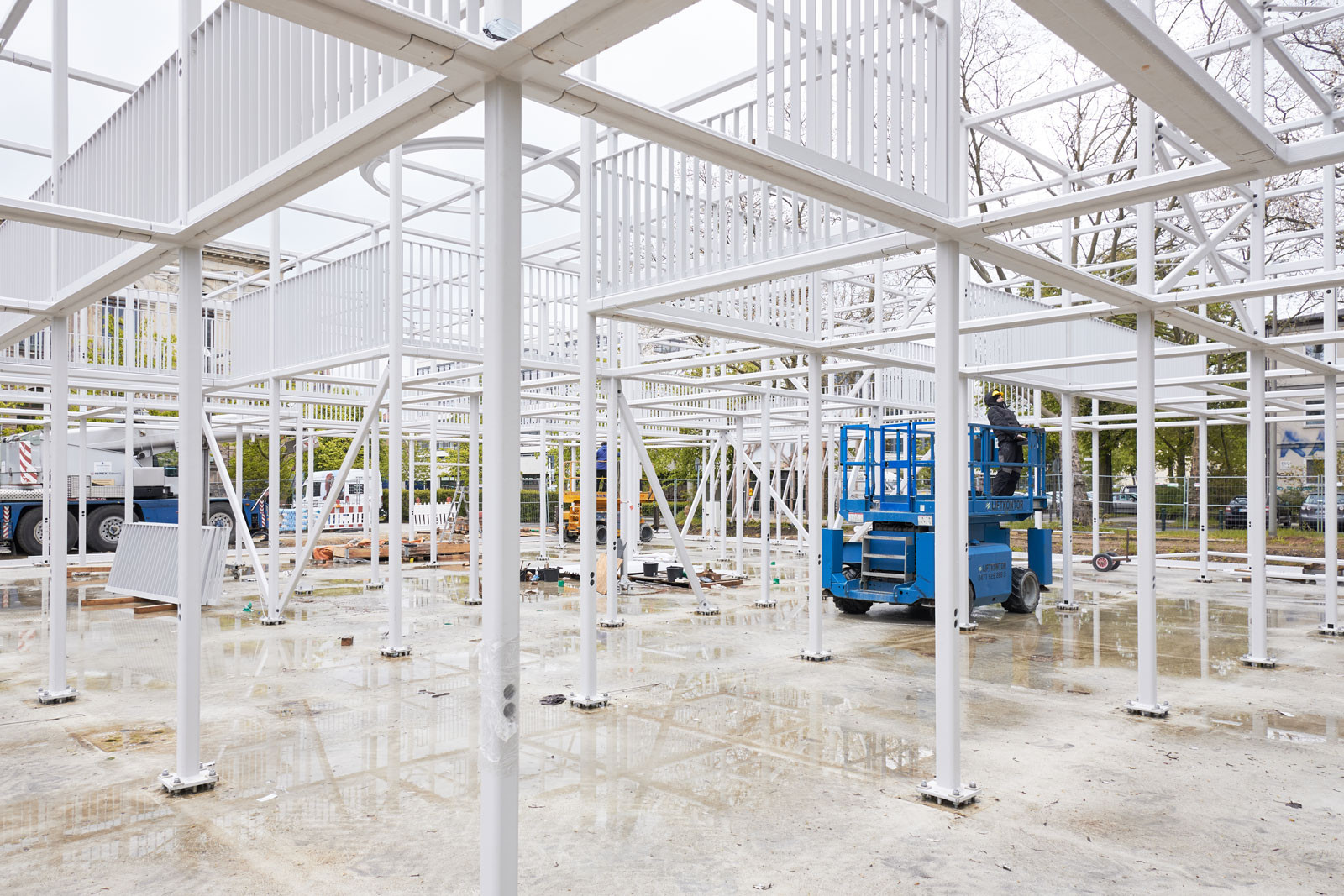
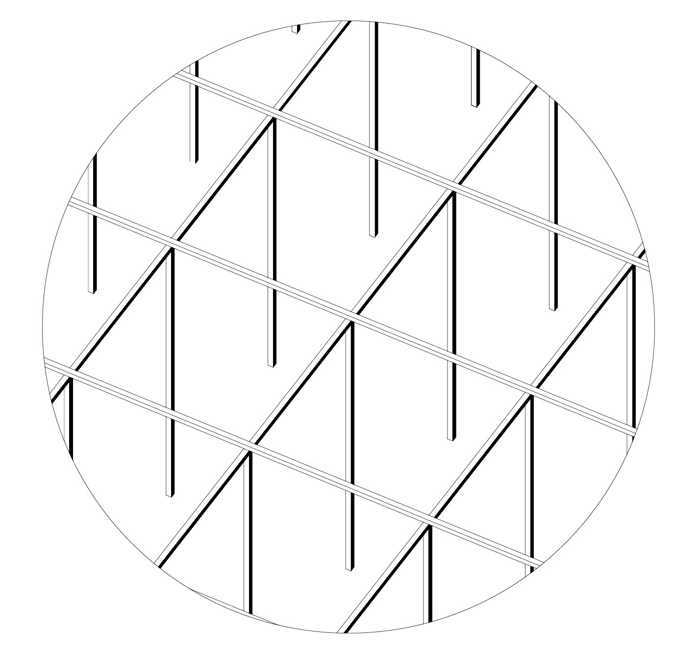
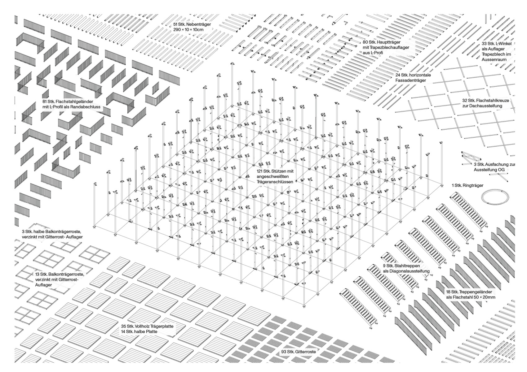
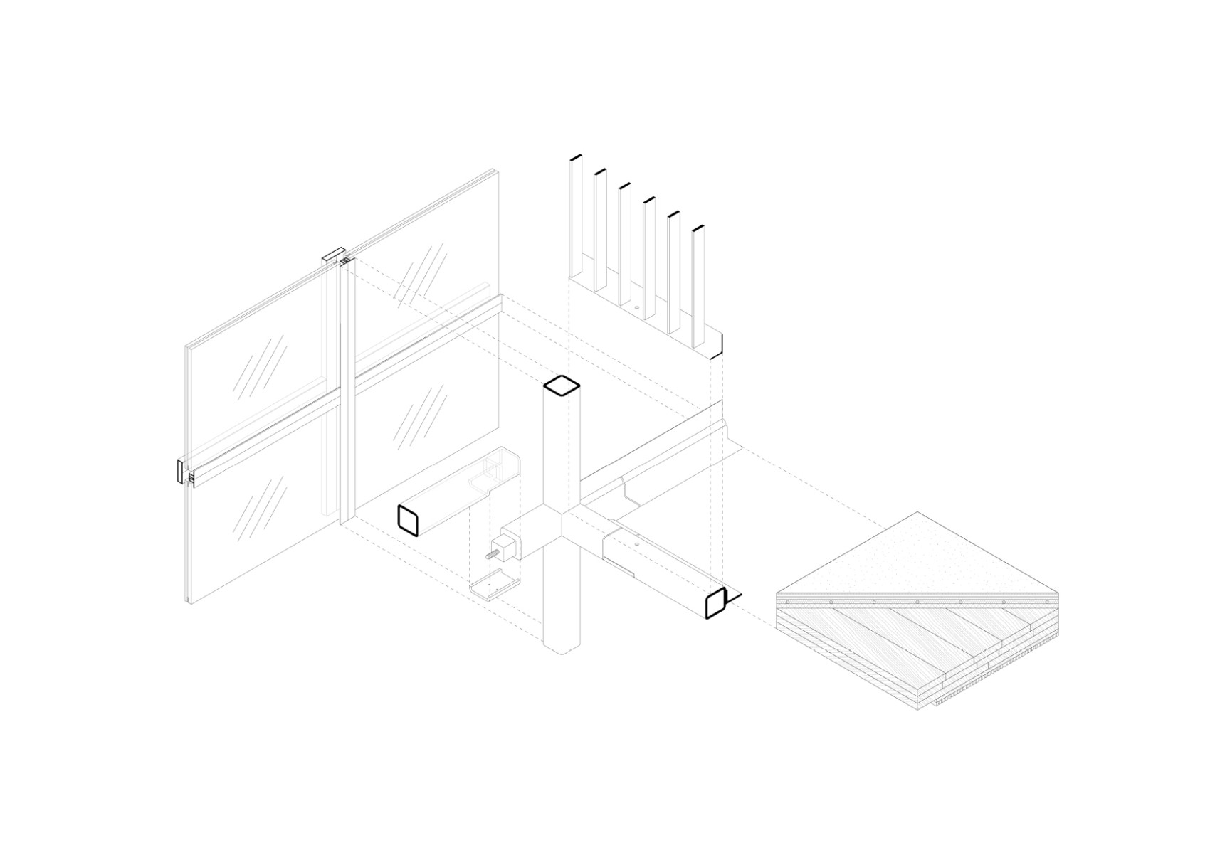
The student pavilion is an example of sustainable and flexible campus architecture. The steel-wood hybrid construction is completely demountable and allows for easy assembly and disassembly. The primary structure, consisting of beams and columns, is designed modularly on a square 3 x 3m grid and made up of the same 10 x 10cm square hollow profile. The timber floor slabs inserted into the beam frames are resting in place without glued or screwed fixings. The entire façade is also modular and screw-fixed. The entire building is demountable following the principle of “design for dissassembly”. Once obsolete, it could be taken apart and rebuilt in a different form in another location. Thus, the building acts as a potential future material resource as not only building materials but also entire building components can be extracted to be re-used in a future circular economy.
Project in collaboration with Gustav Düsing
Photos by Iwan Baan, Lemmart, Leonhard Clemens
Structural Engineering by Knippers Helbig
The student pavilion of the Technical University of Braunschweig is a two-story campus building designed for students of all disciplines. Located directly on the central campus, near a river, the building marks the entrance to the central university campus. Our goal was to create a multi-functional space that is accessible to all students and offers a contemporary learning environment as an addition to existing campus typologies. The result is an open-space concept that supports a wide range of activities and provides a flexible environment for group work, seminars, lectures and socializing.
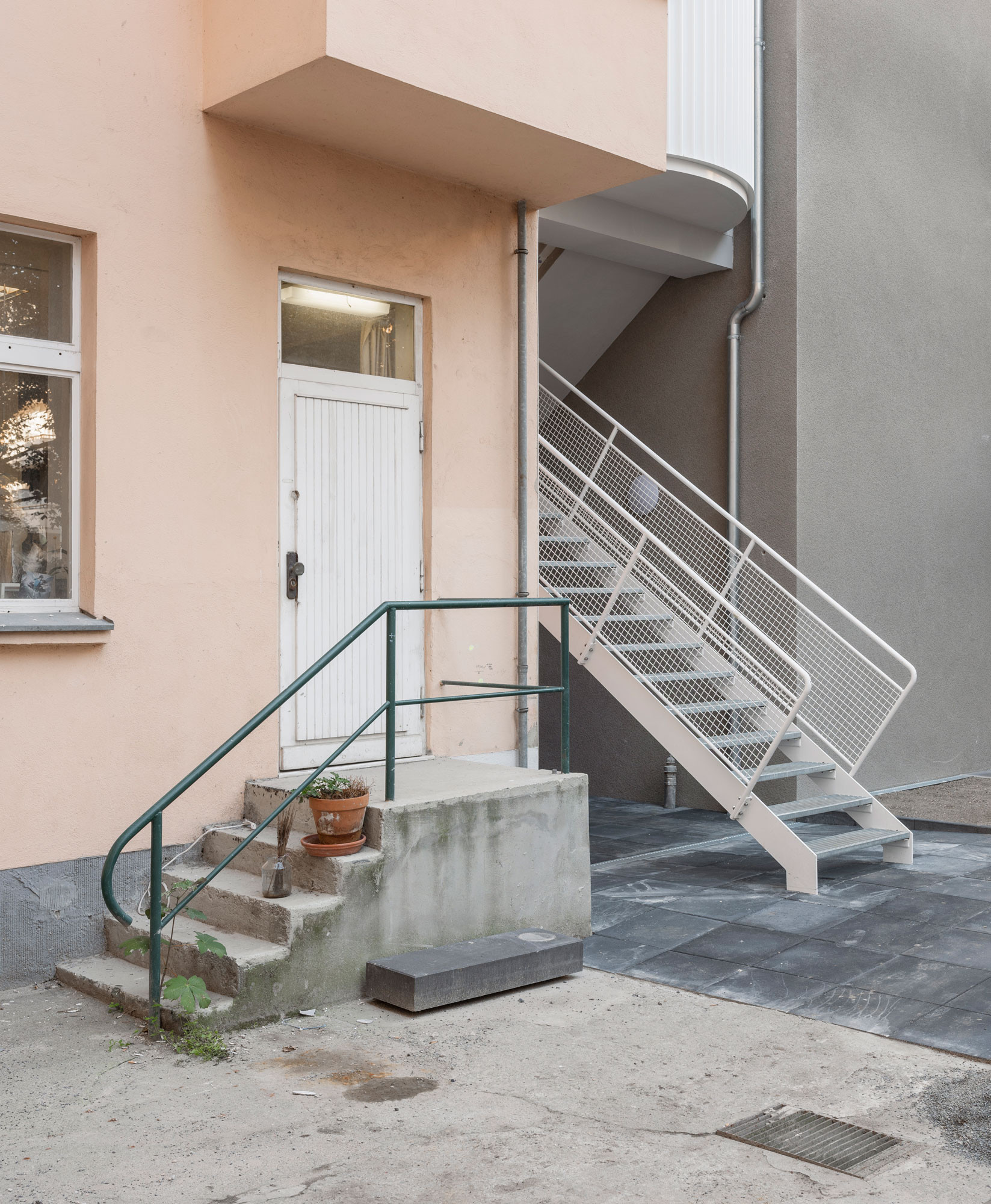
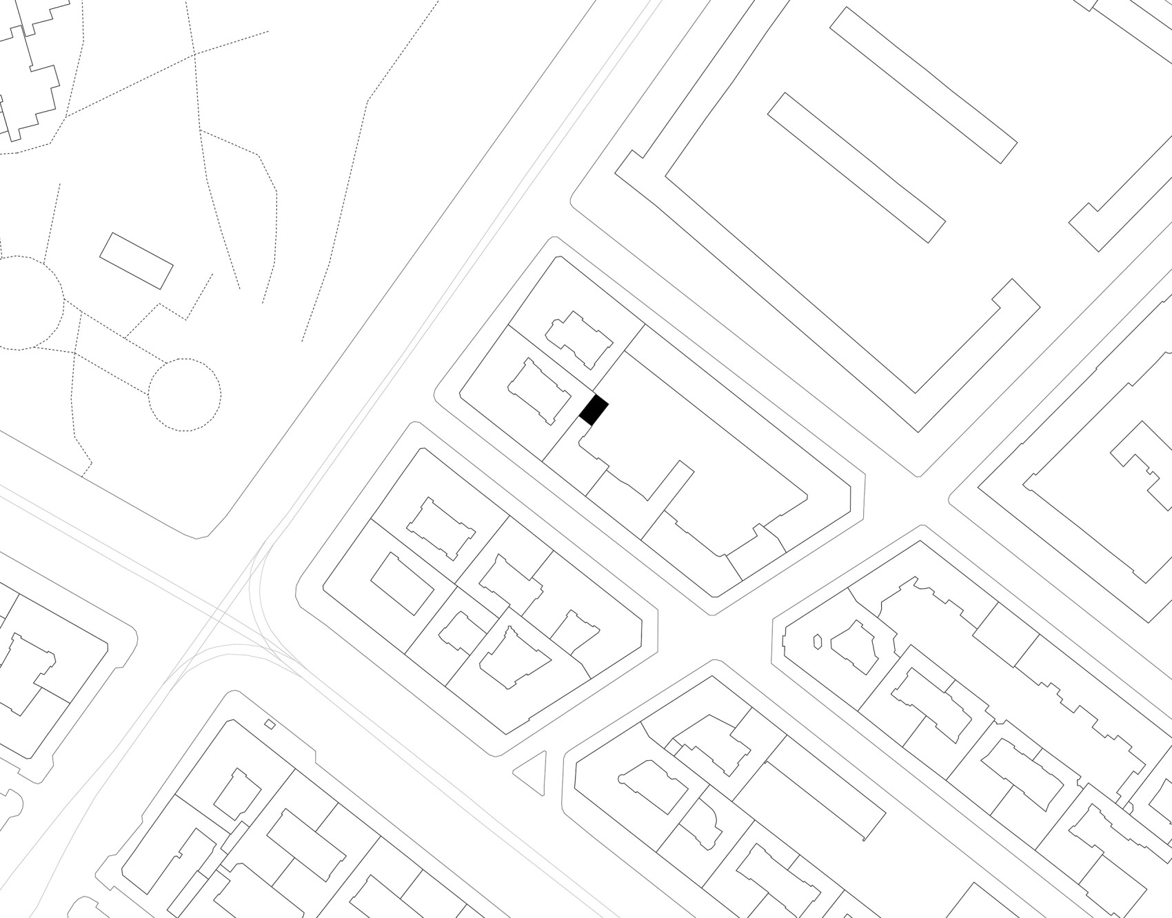
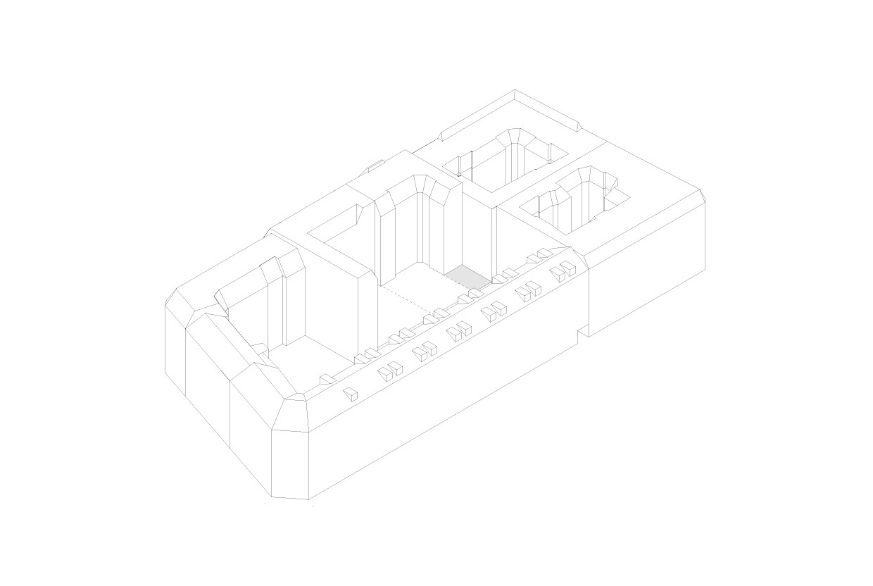
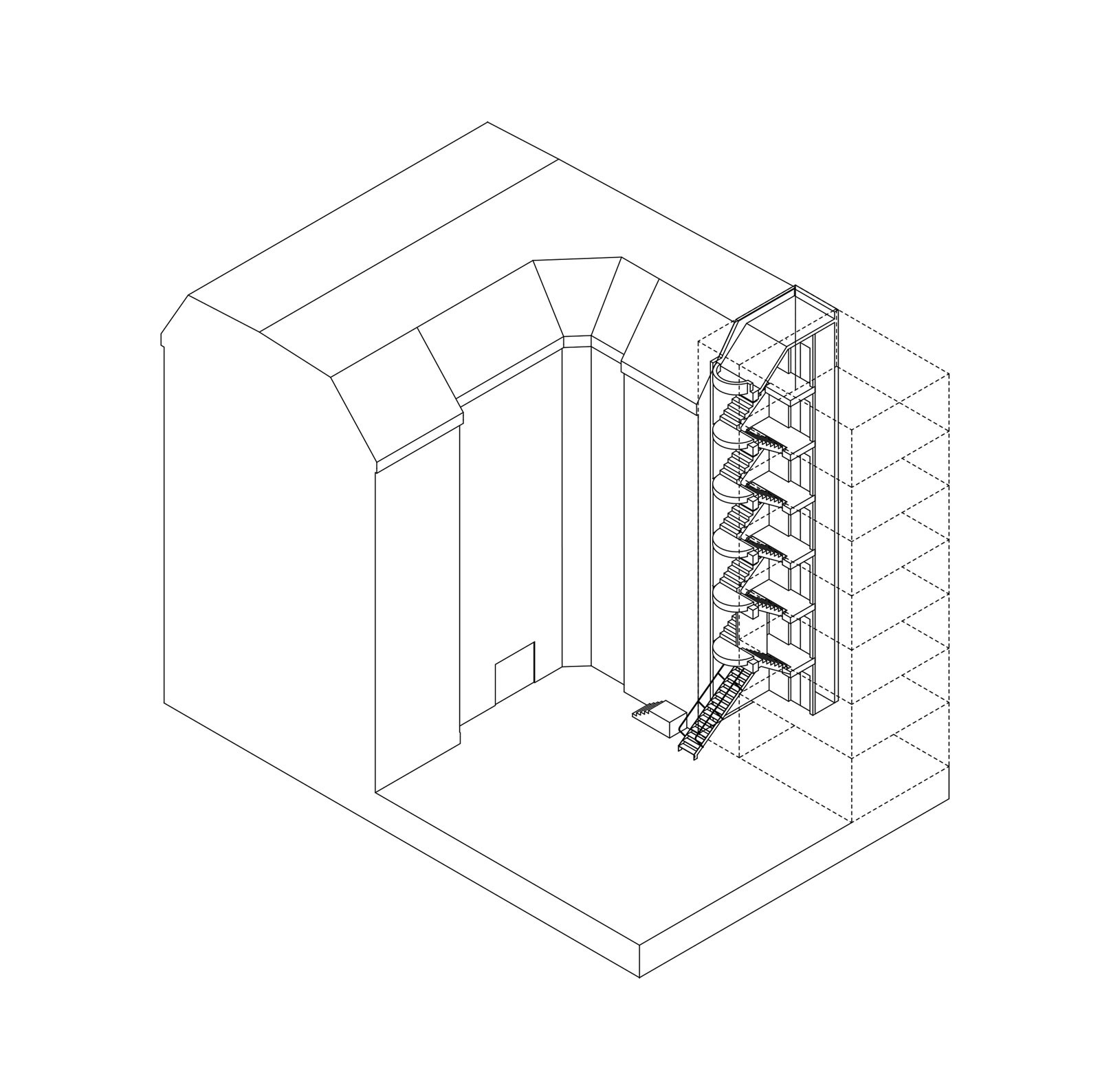
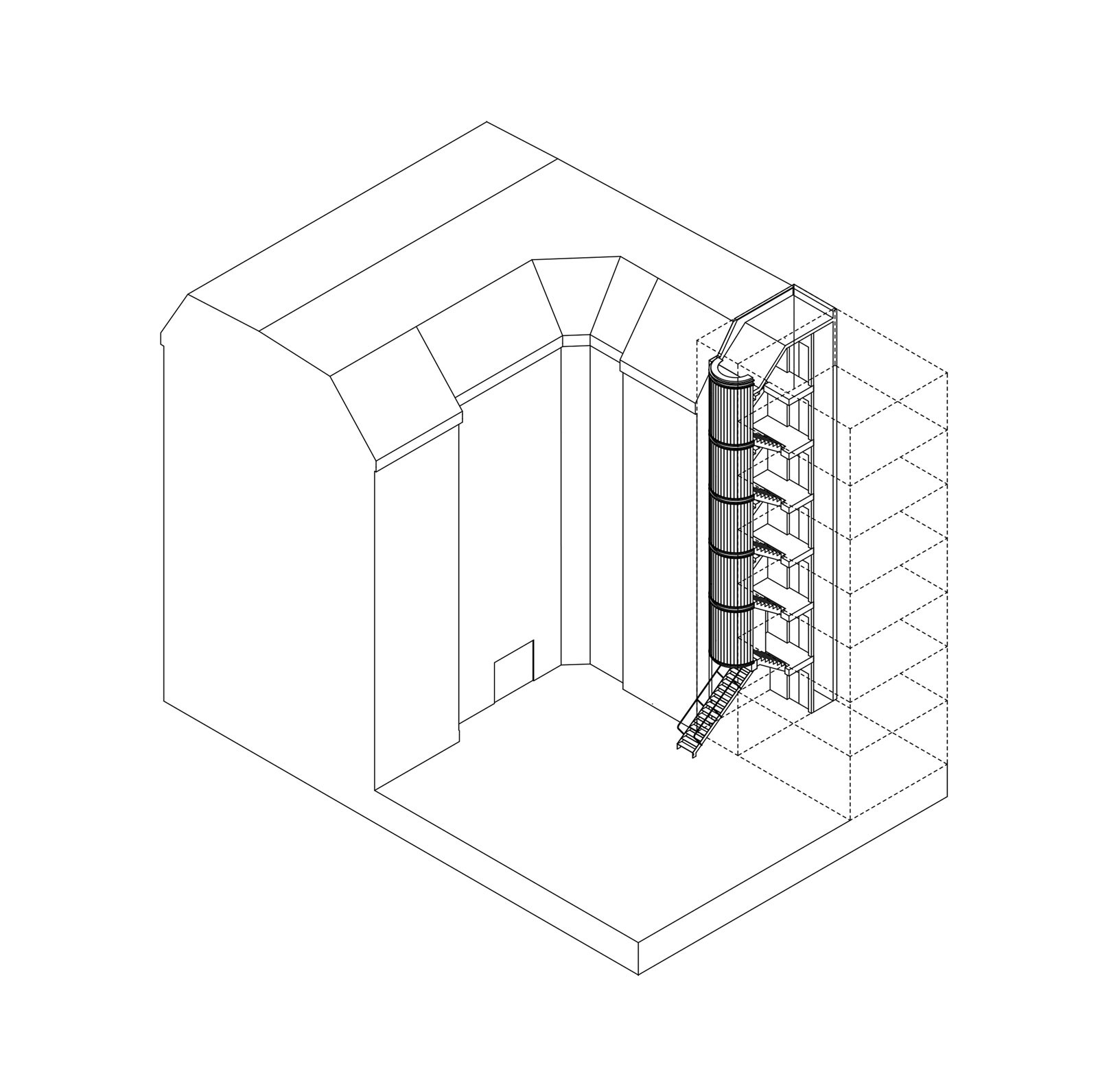
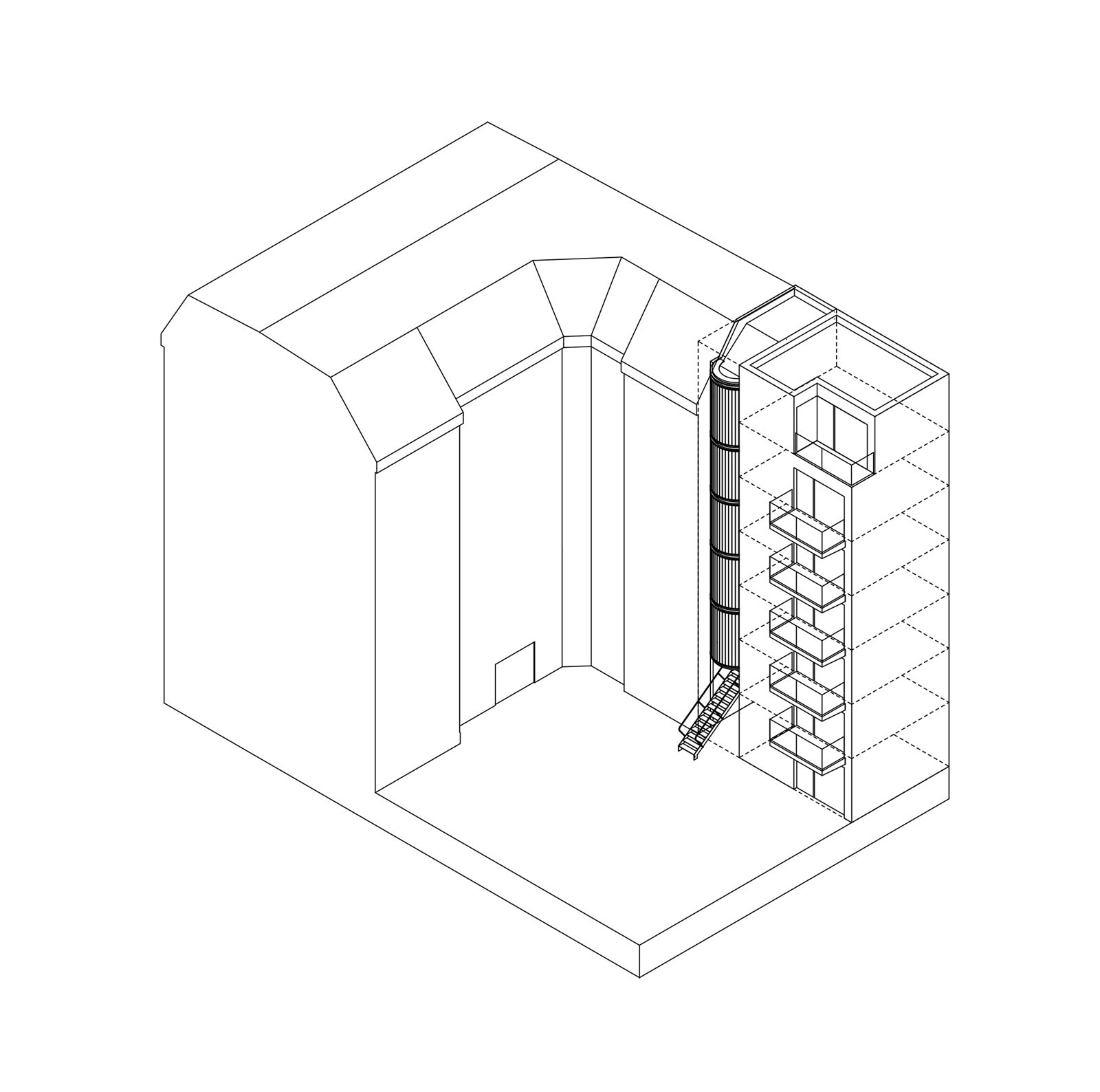
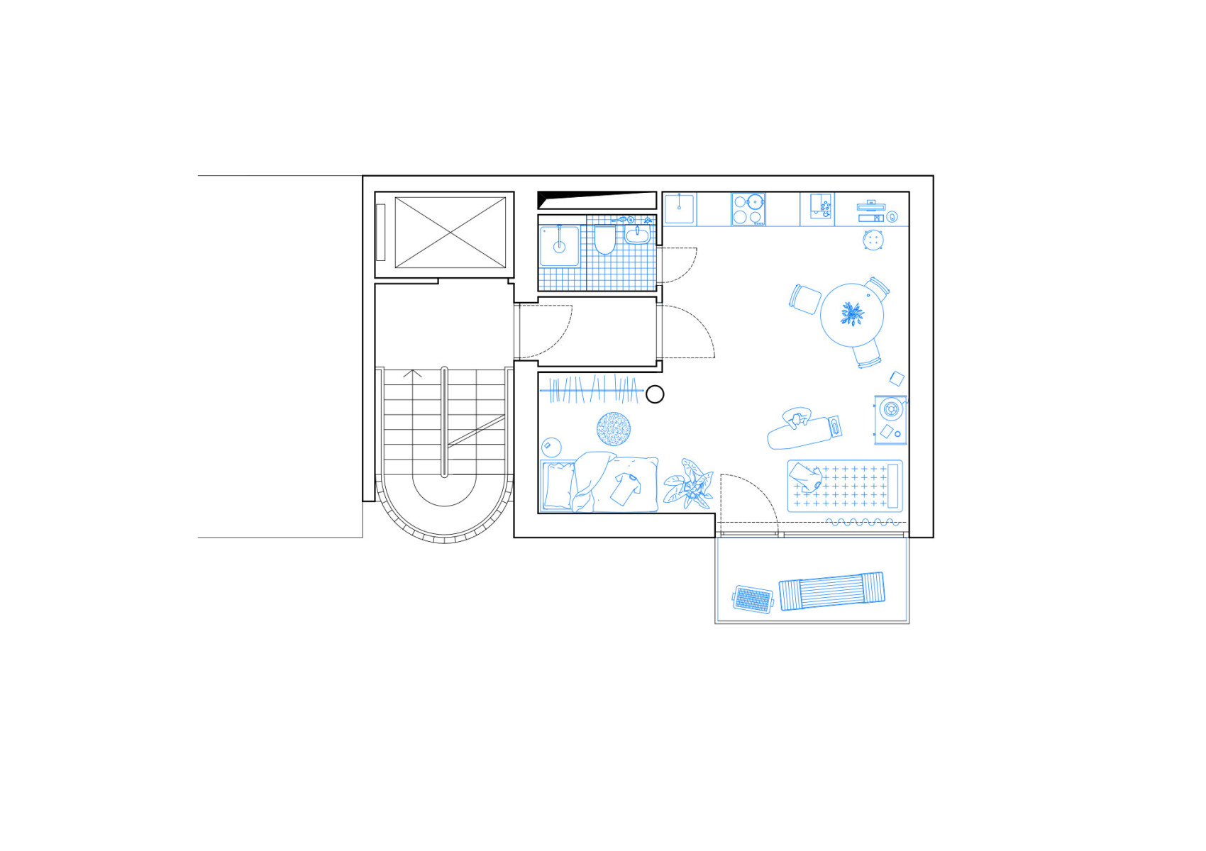
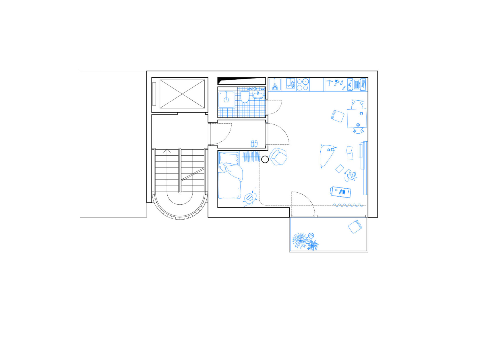
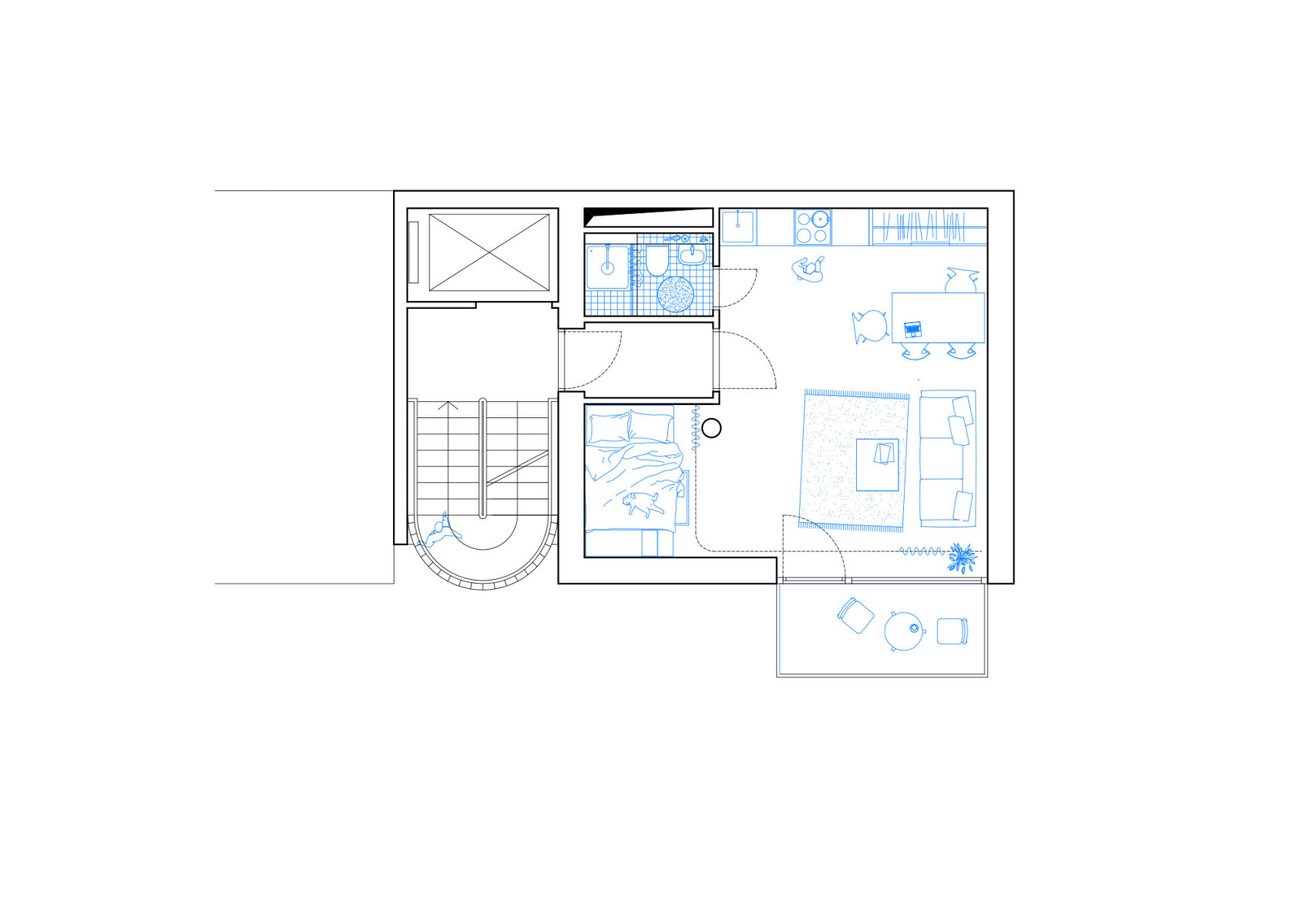
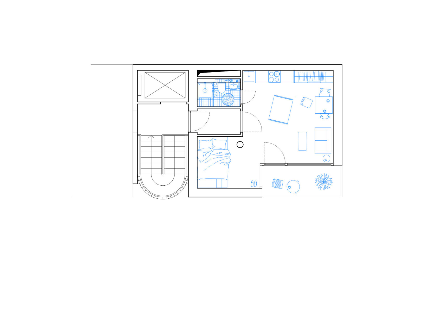
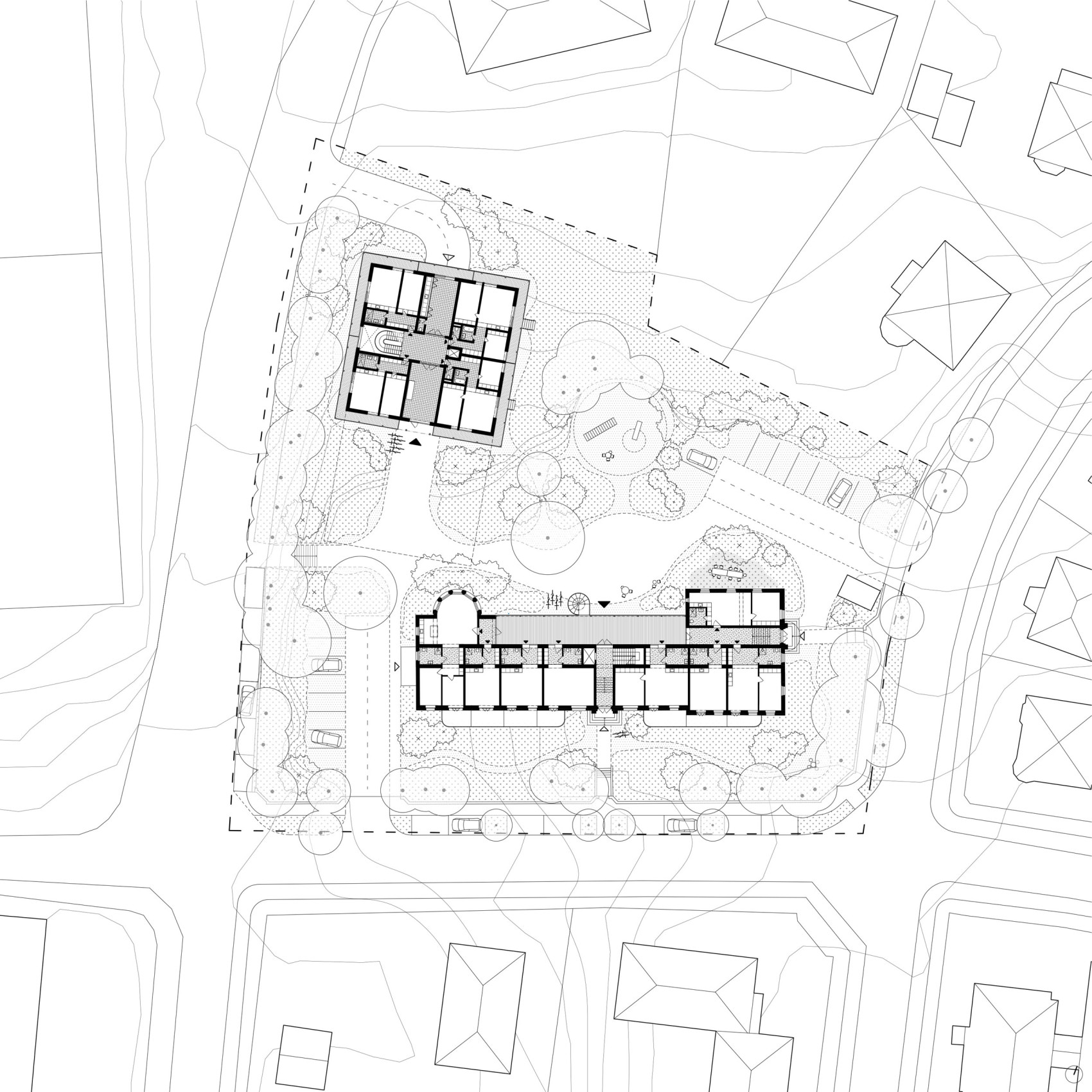
Berlin has moved from a green archipelago to a dense patch-work of urban strategies, historic fragments and architectural ambitions. The Berlin block, by default, provides the underlying generic context and perimeter to accumulate the vast growth and densification of the city. Confronted with a constant population growth as well a scarcity of land, the city has become subject to rising rents and property value exacerbating the ubiquitous demand for affordable and rentable housing. As a consequence plots of land previously too small to develop have become a point of departure for experimental architectural briefs challenging the way in which we conceive the urban block and inner-city housing. Small plots of land, fragmented and leftover of war-destroyed housing wings such as this project’s site can be found within many urban blocks; some forgotten, some logistically challenging, some subject to collective ownership or old lease agreements, some almost inaccessible; each with their own set of challenges but all providing a space for architectural experimentation in search for new types of housing and a solution to the challenges the city of Berlin is facing.
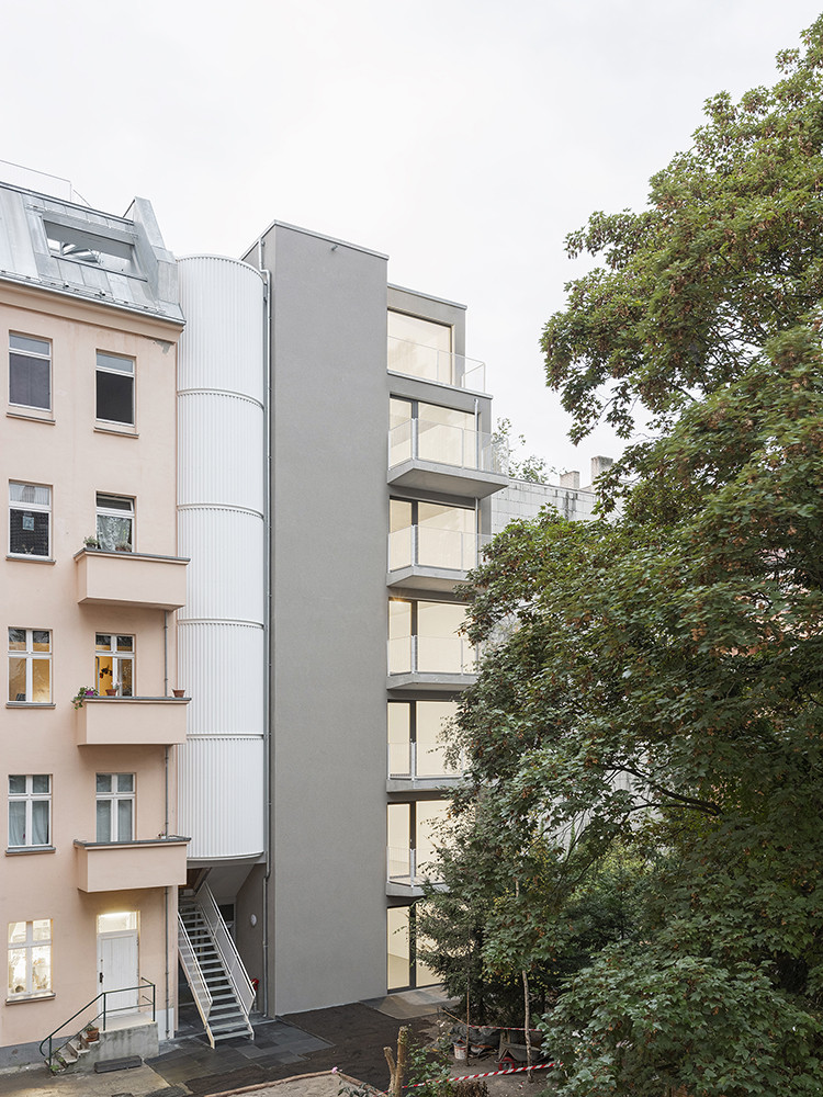
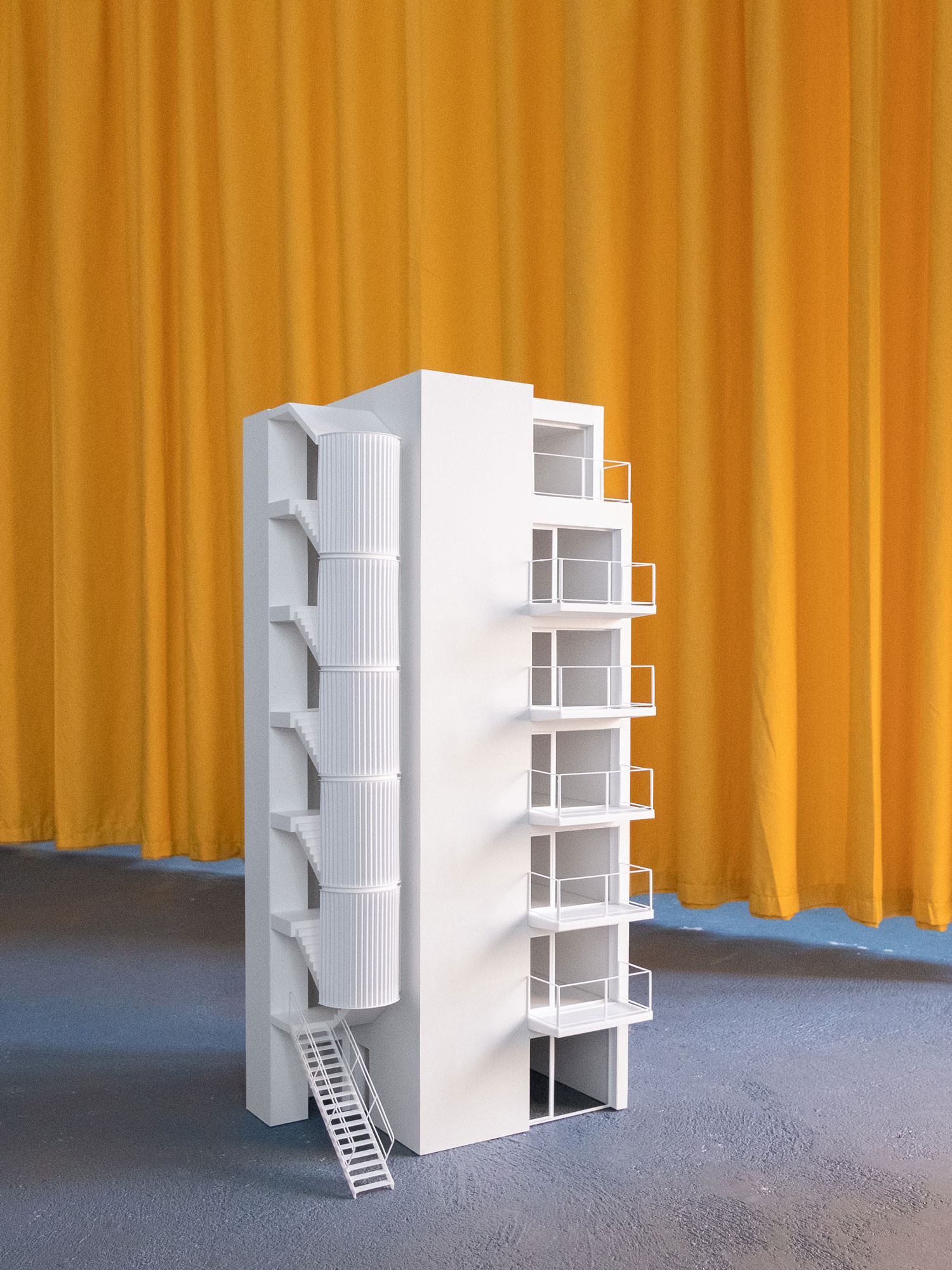
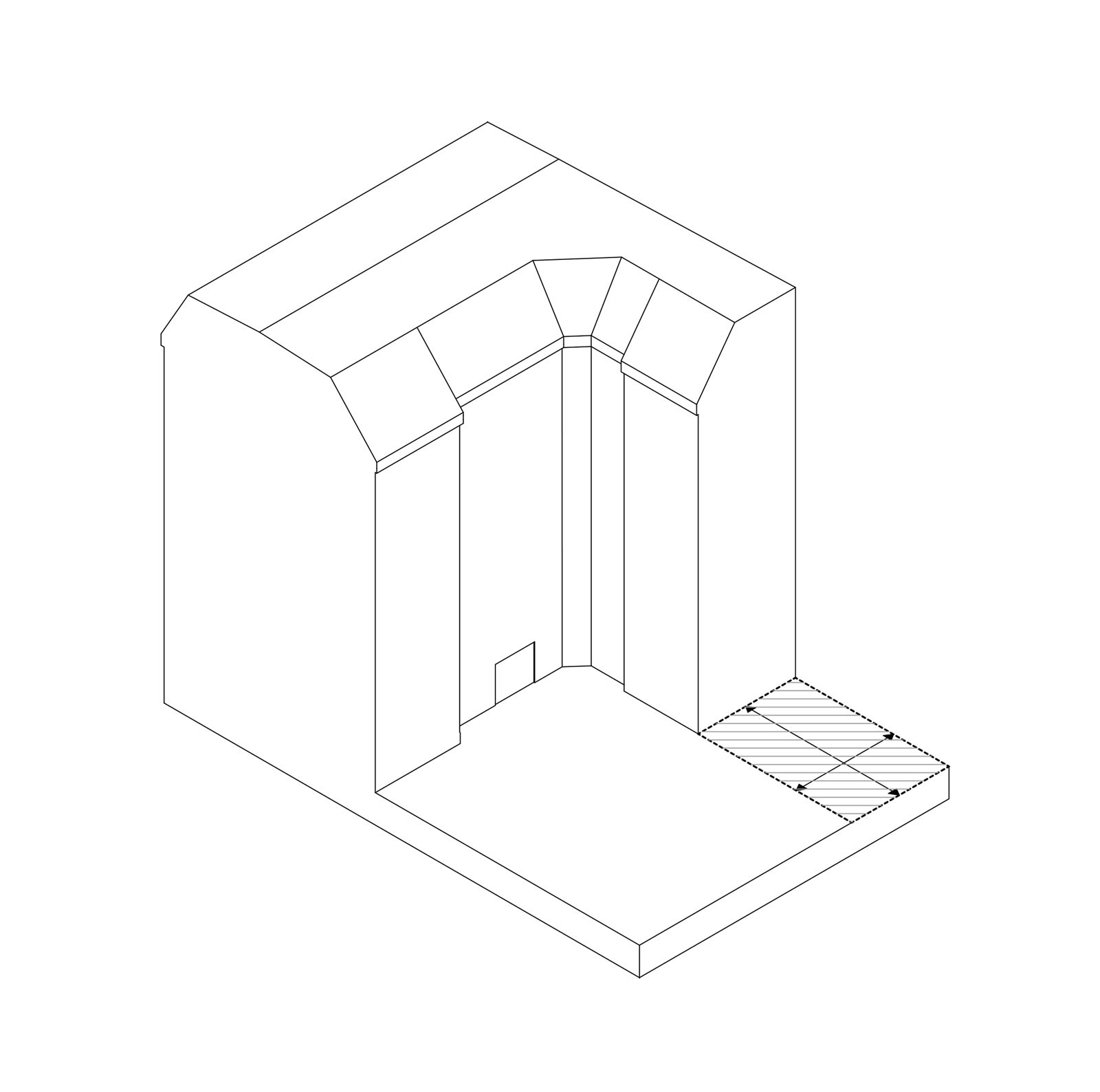
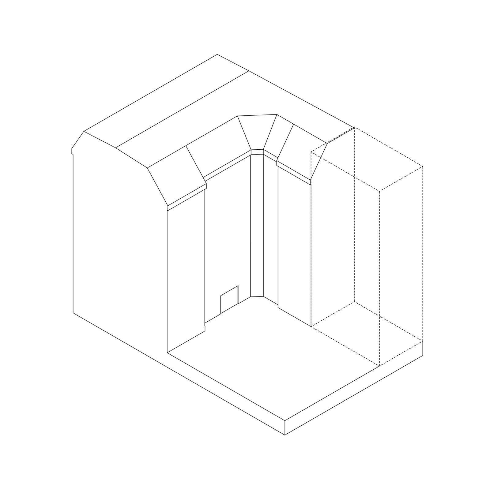
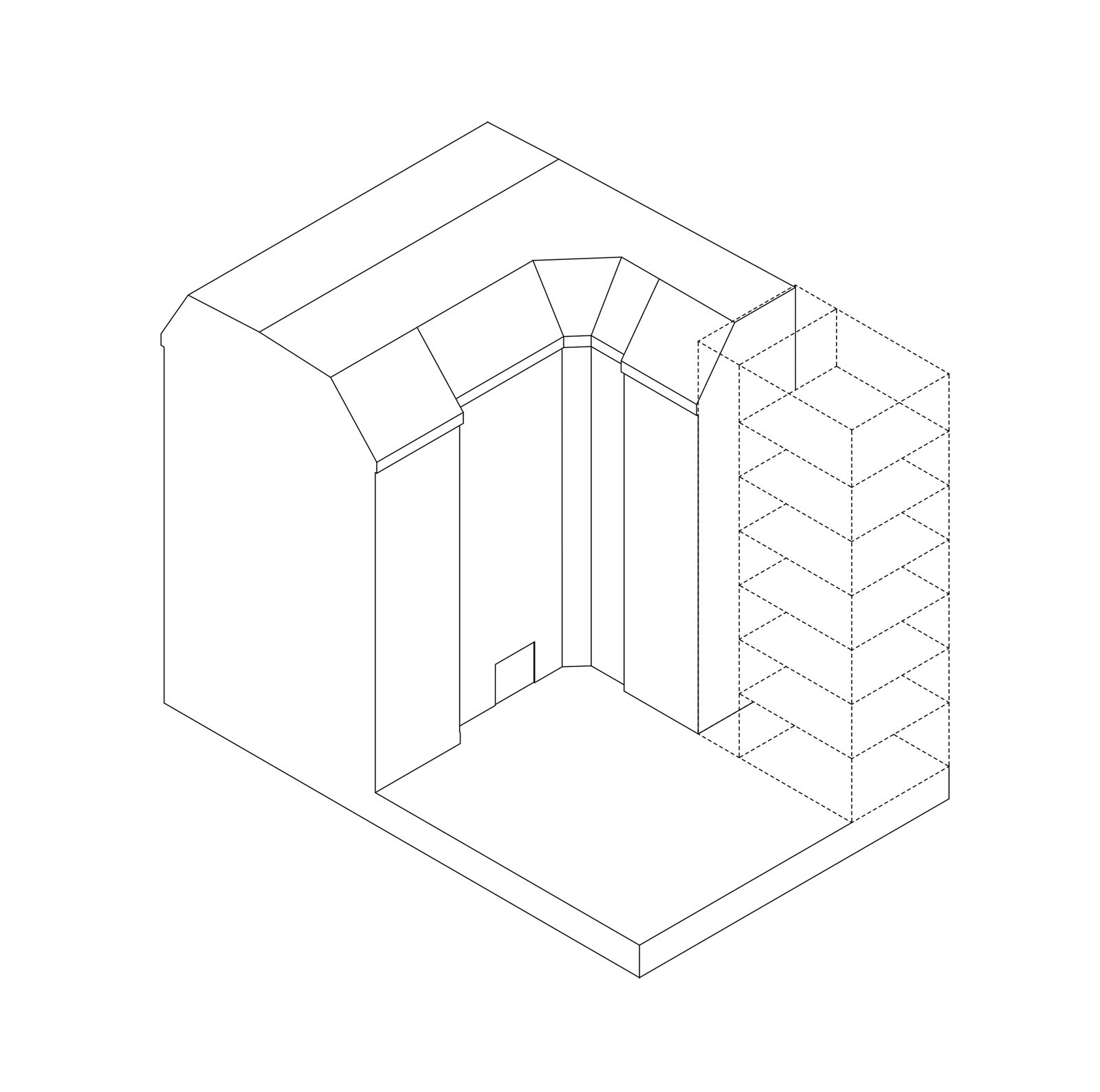
The challenges of this particular site, a plot of only 6x10 meters, lying logistically inaccessible in the depth of an existing courtyard and 3m above street level are coupled with a brief demanding cost- and area-effective planning in order to allow for a feasible development providing affordable dwelling for single tenants with a low income. While the spatial and regulatory constraints set clear boundaries, the project also challenges them. The limitations in area lead to an intricate configuration of the apartments, maximising their architectural qualities. Further, the project realises seven full storeys and avoids the standard regulatory set back at roof level, successfully completing the idea of a small housing tower.
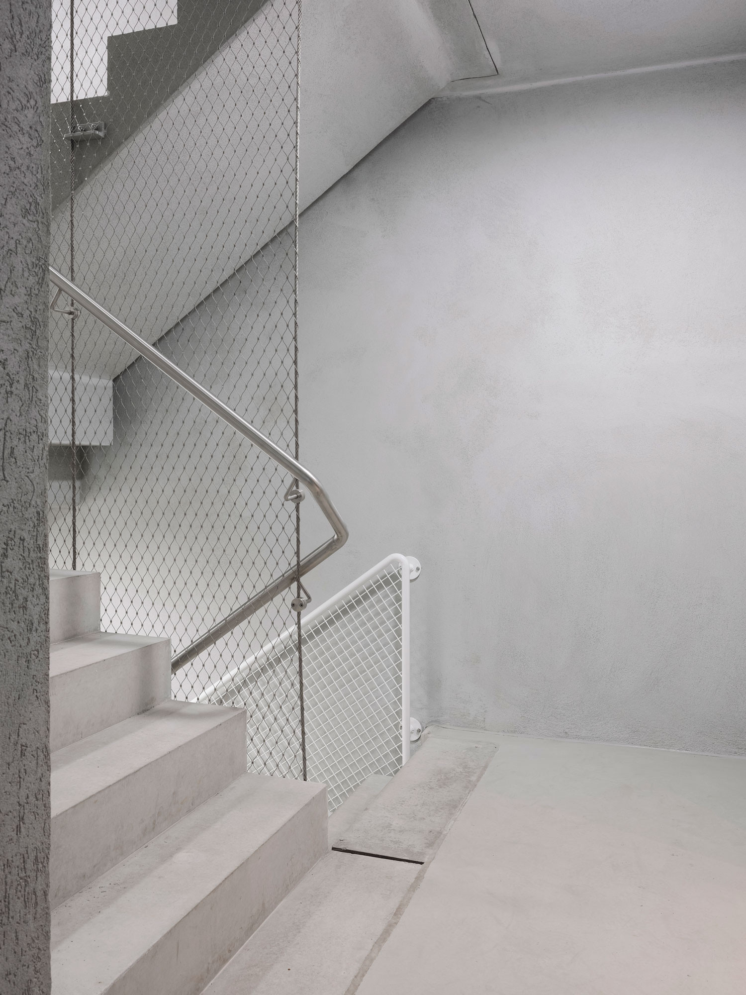
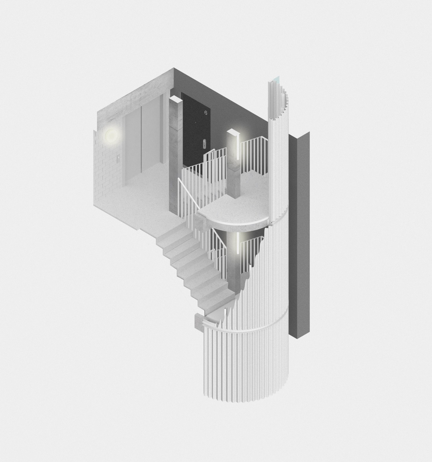
The project formally explores the proportions of a tower by placing all infrastructure next to the existing block, thus clearing space for flats at the end of the perimeter in order to distinctly separate the new addition from the existing housing block. The stairwell is articulated in stark contrast to the tower forming a distinct gesture to separate both new and existing buildings, thereby adding to the figure of the tower.
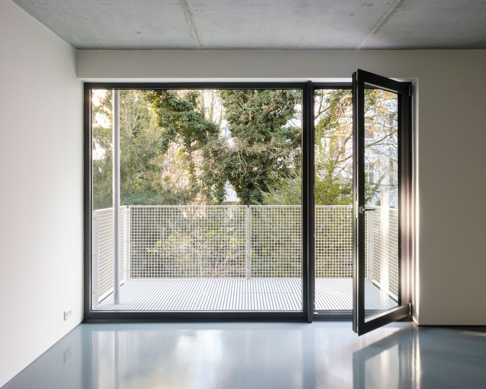
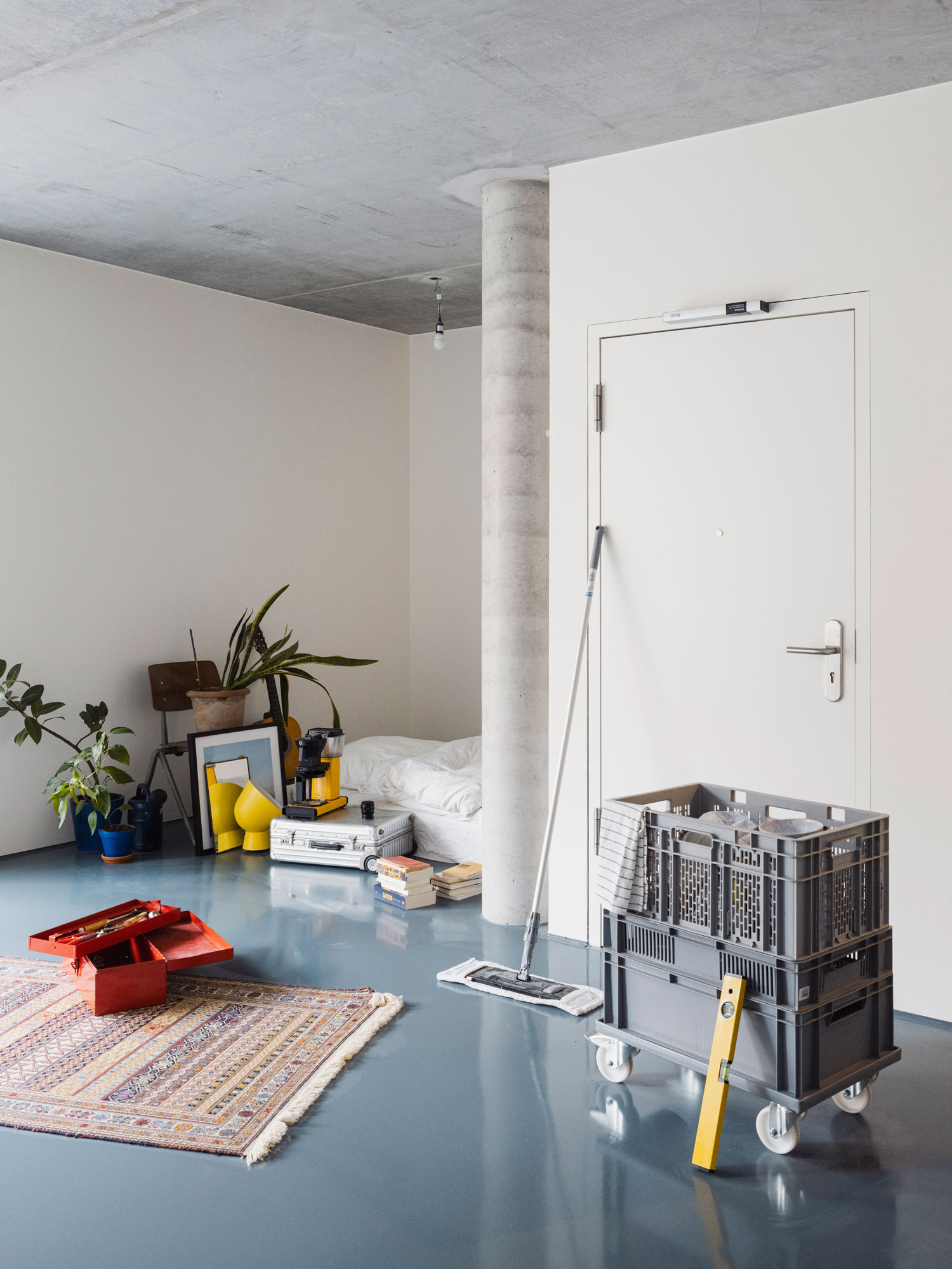
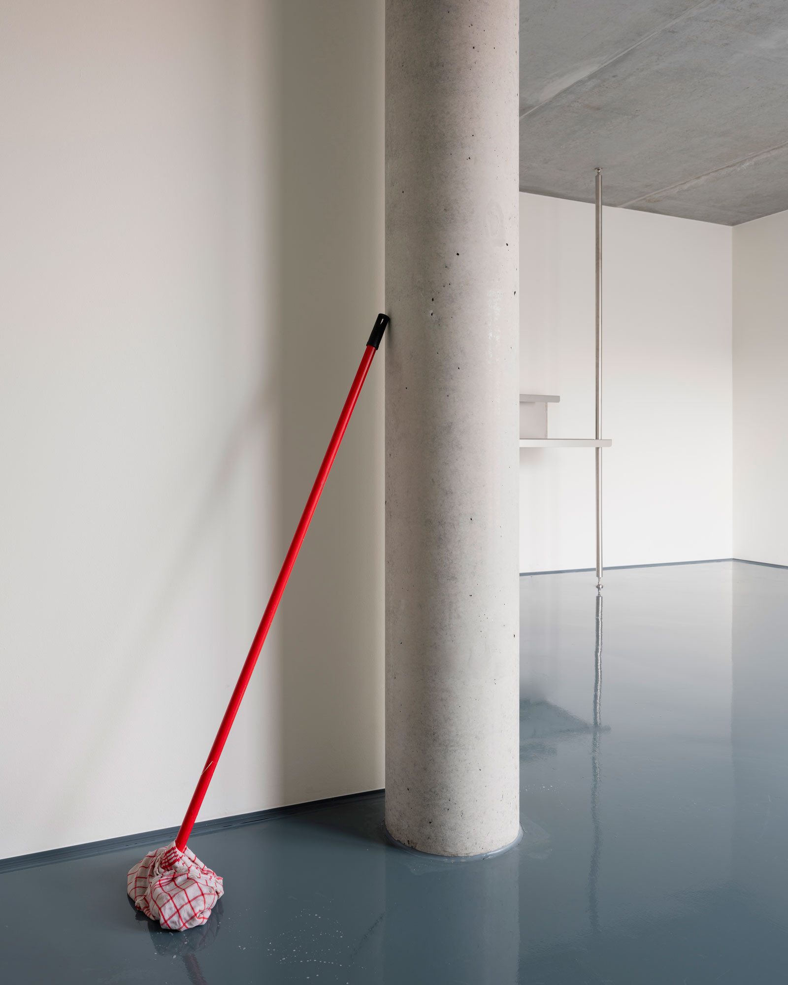
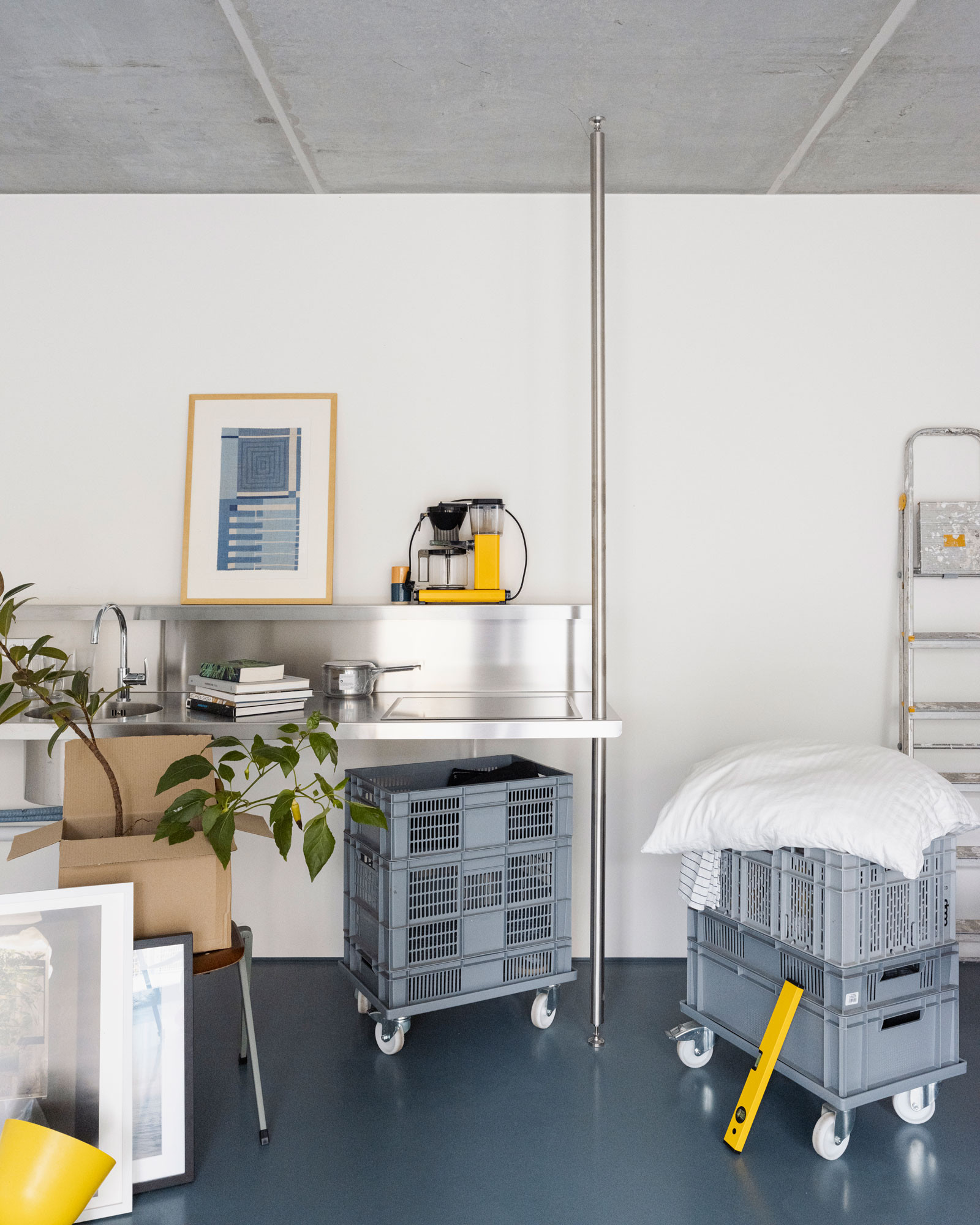
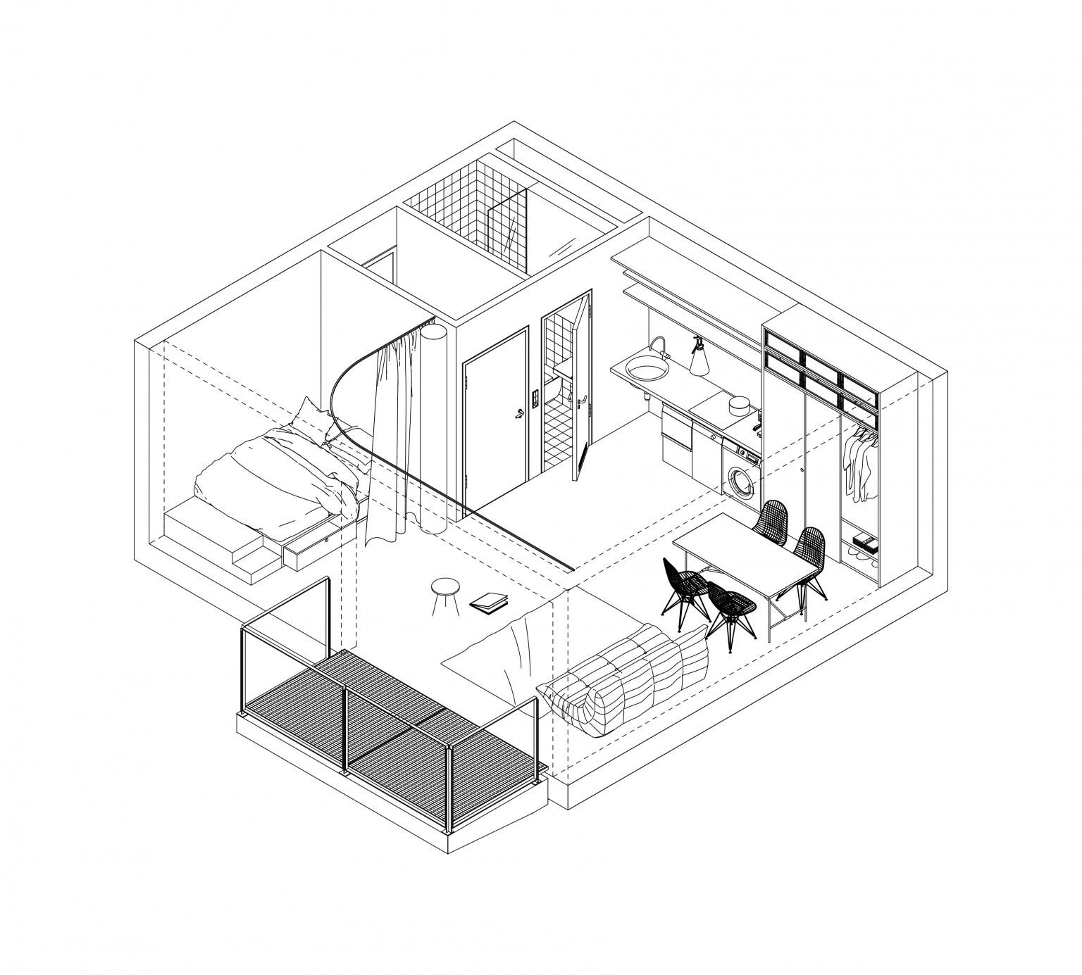
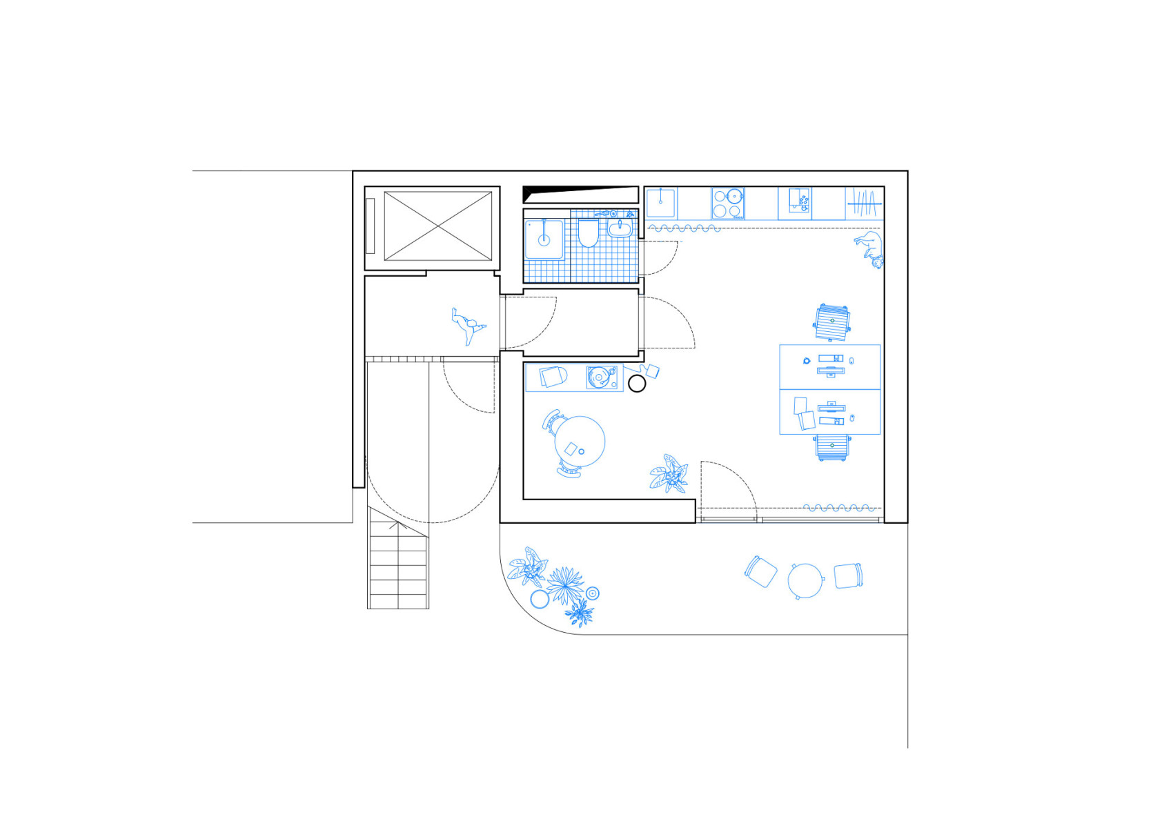
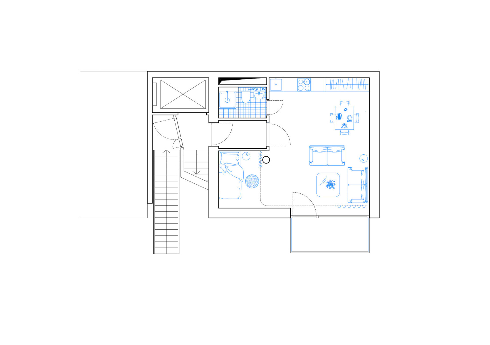
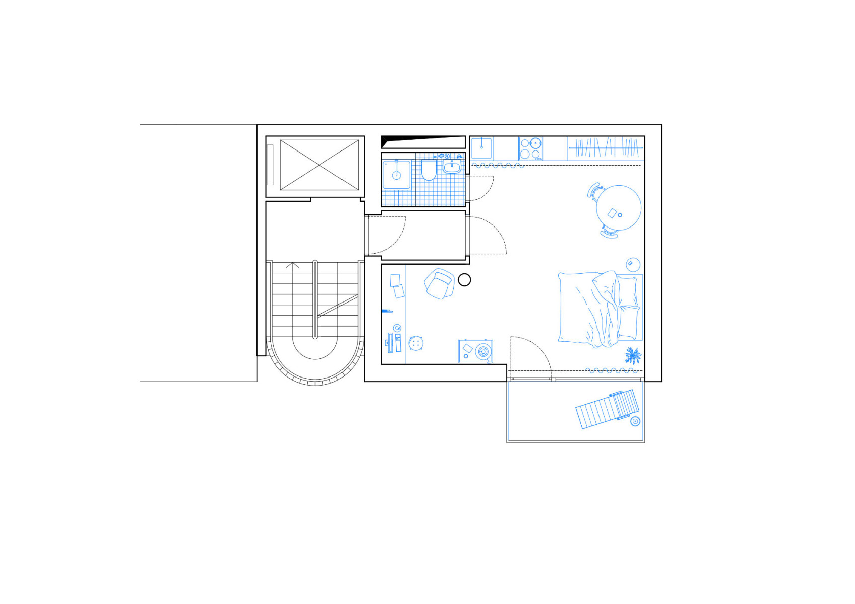
The generic layout of each flat, its utmost reduction to what is needed, offers a flexible appropriation and adaption by its inhabitants serving as a petri dish and framework for various forms of inhabitation. While being only 38m² small, each apartment provides all functional necessities and spatial qualities a studio flat needs. All ameneties such as bathroom, kitchenette and storage are pushed agains the back wall, leaving a spacious open plan living area to be adapted by each inhabitant. The entrance hall and bathroom act as an acoustic barrier between the stairwell and the living spaces while forming a niche that works as a sleeping area, seperable from the main living room with curtains. All drywalling is reduced in height, clearing storage space above bathroom and hall.
Project in collaboration with Leonhard Clemens
Photos by Leonhard Clemens
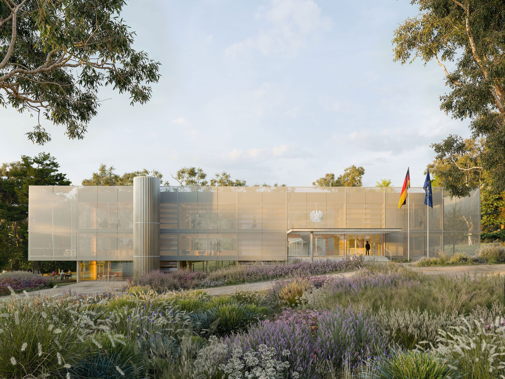
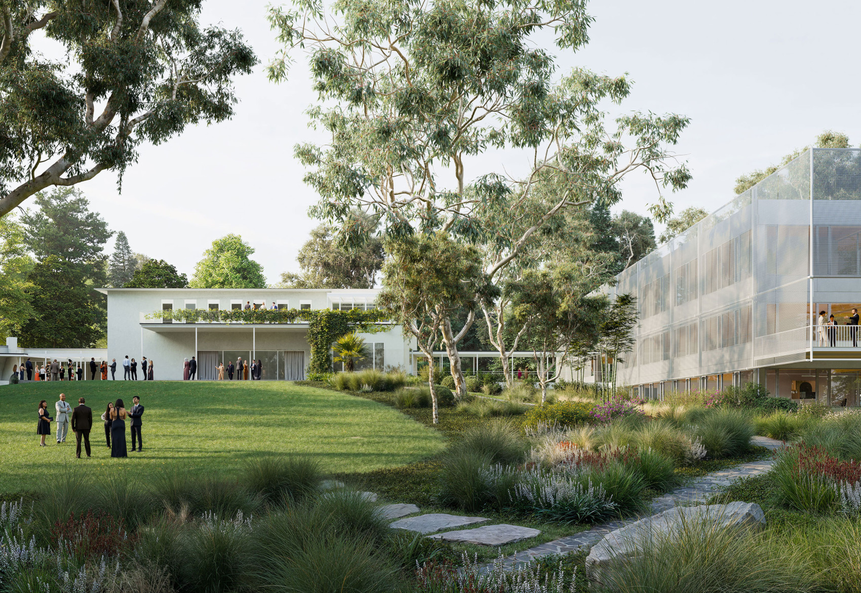
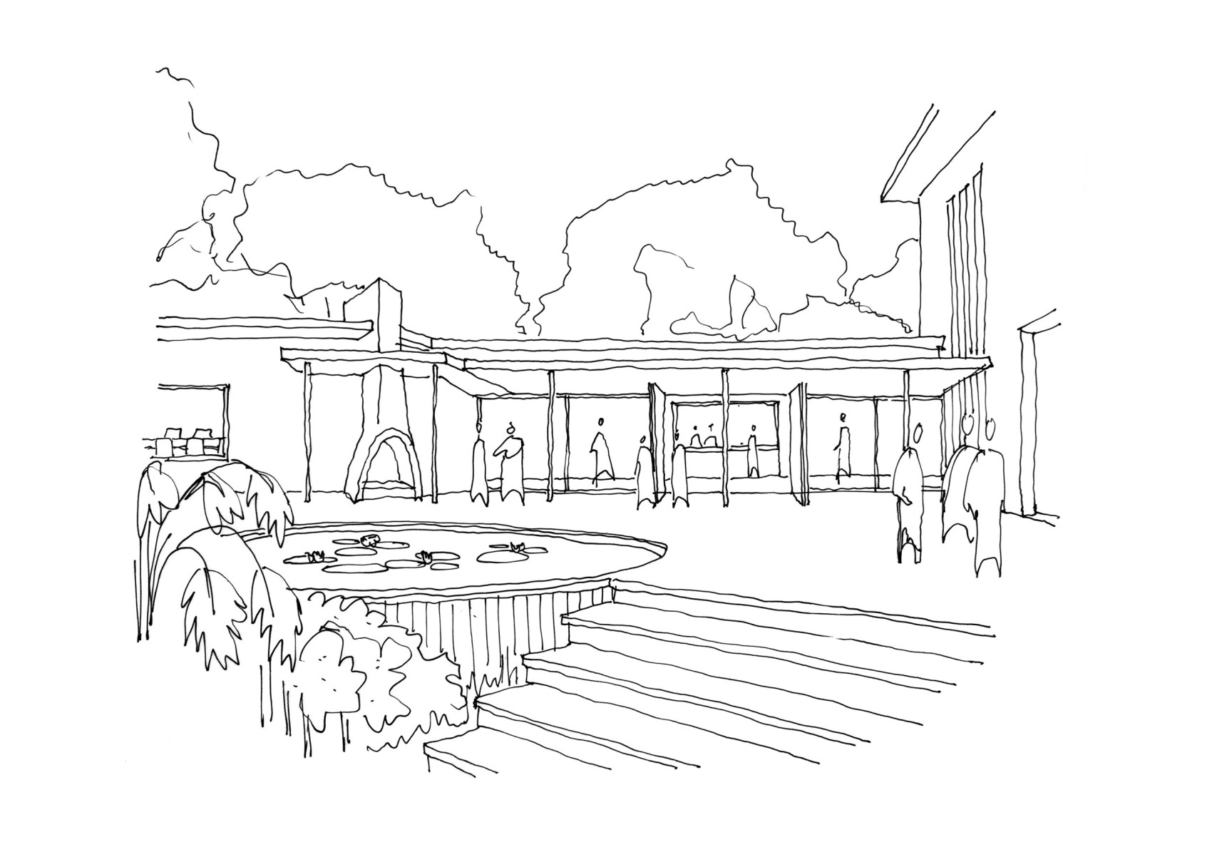
Project in collaboration with Kerstin Thompson Architects.
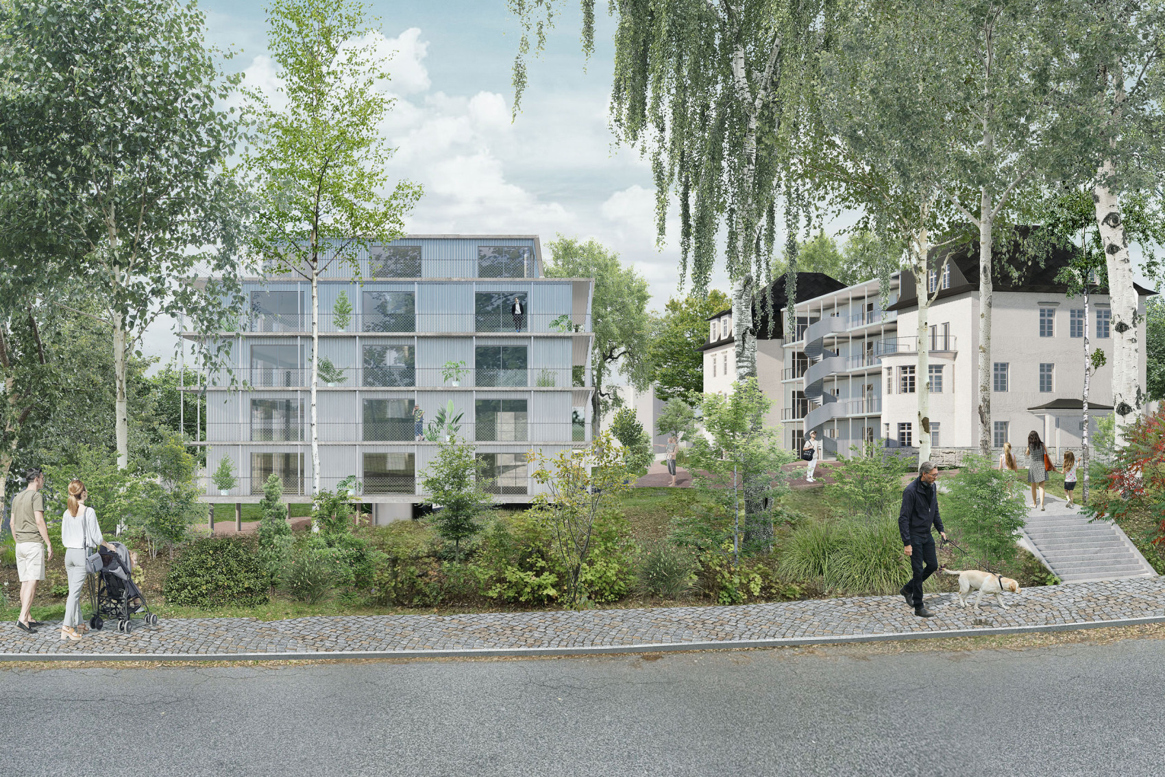
Project in collaboration with Atelier Gram.

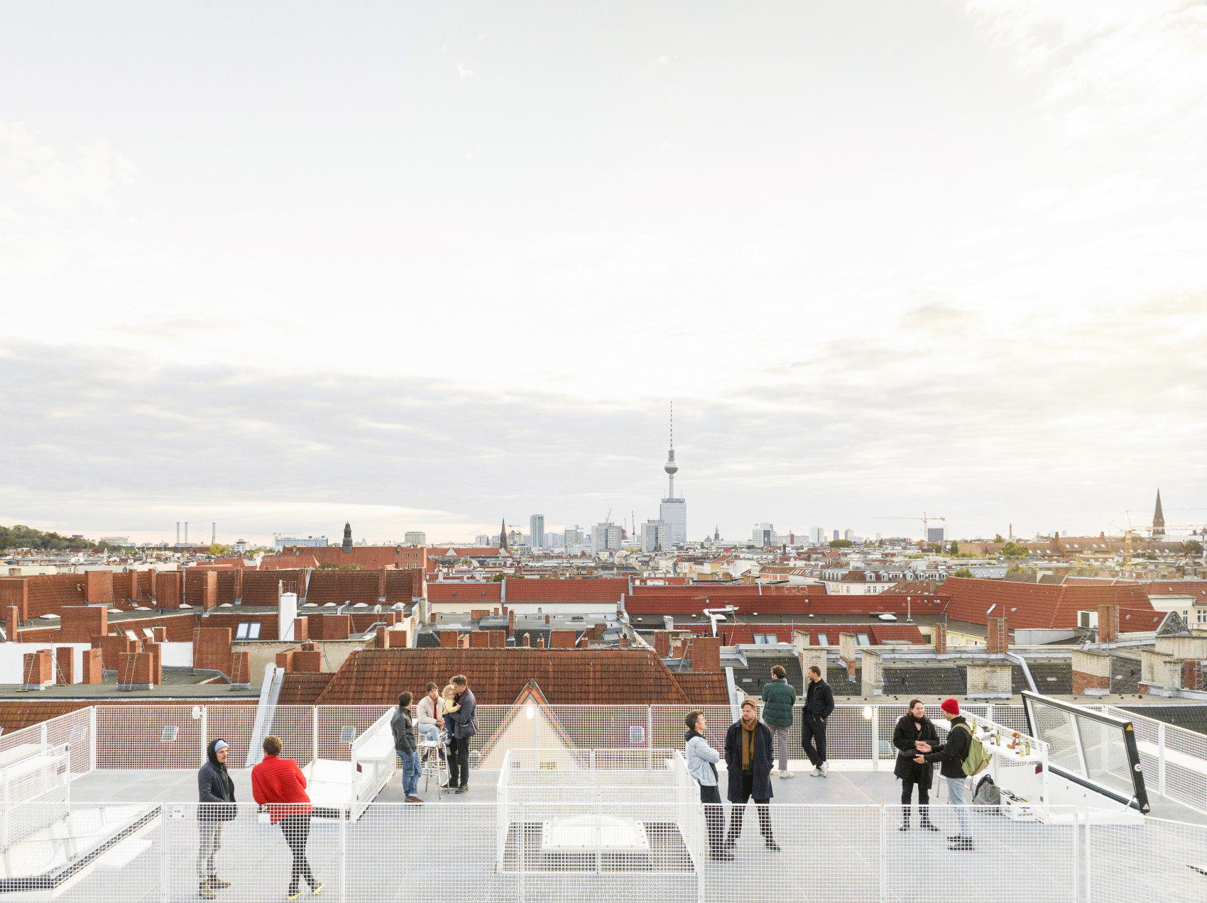
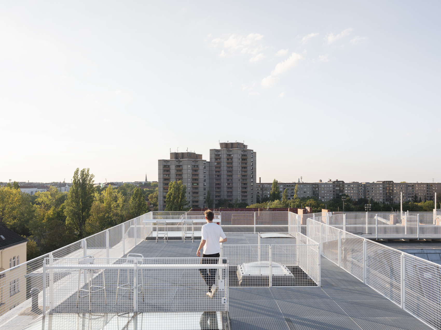
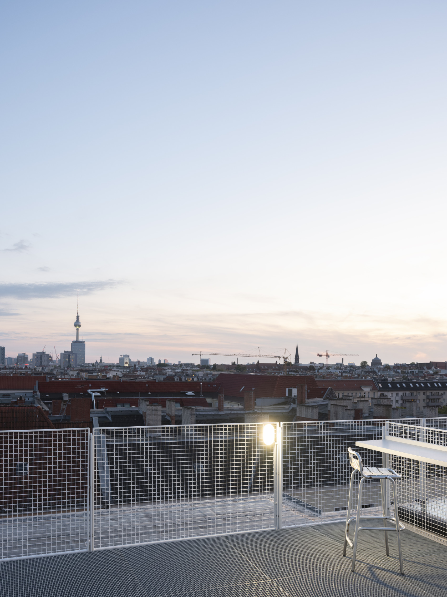
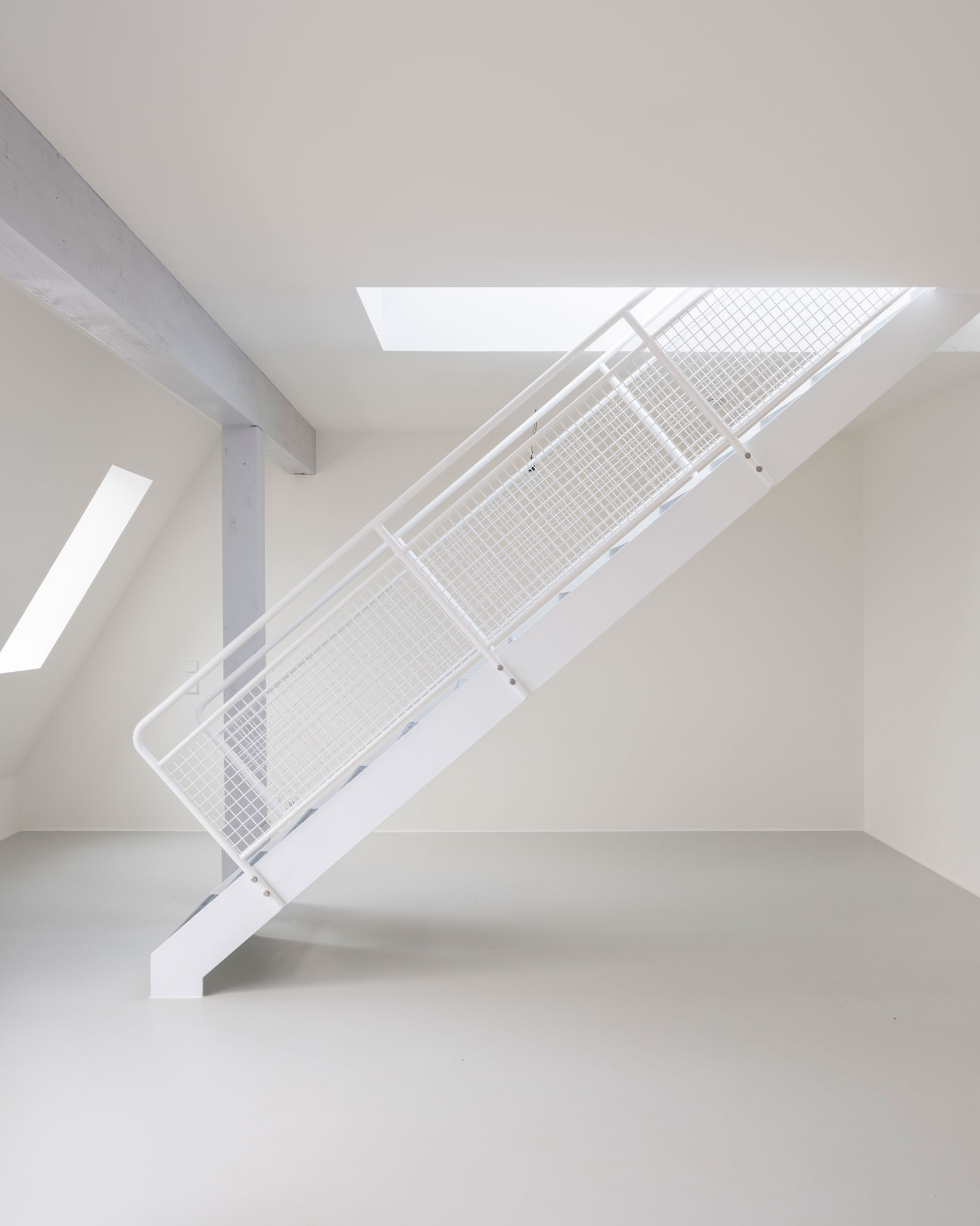
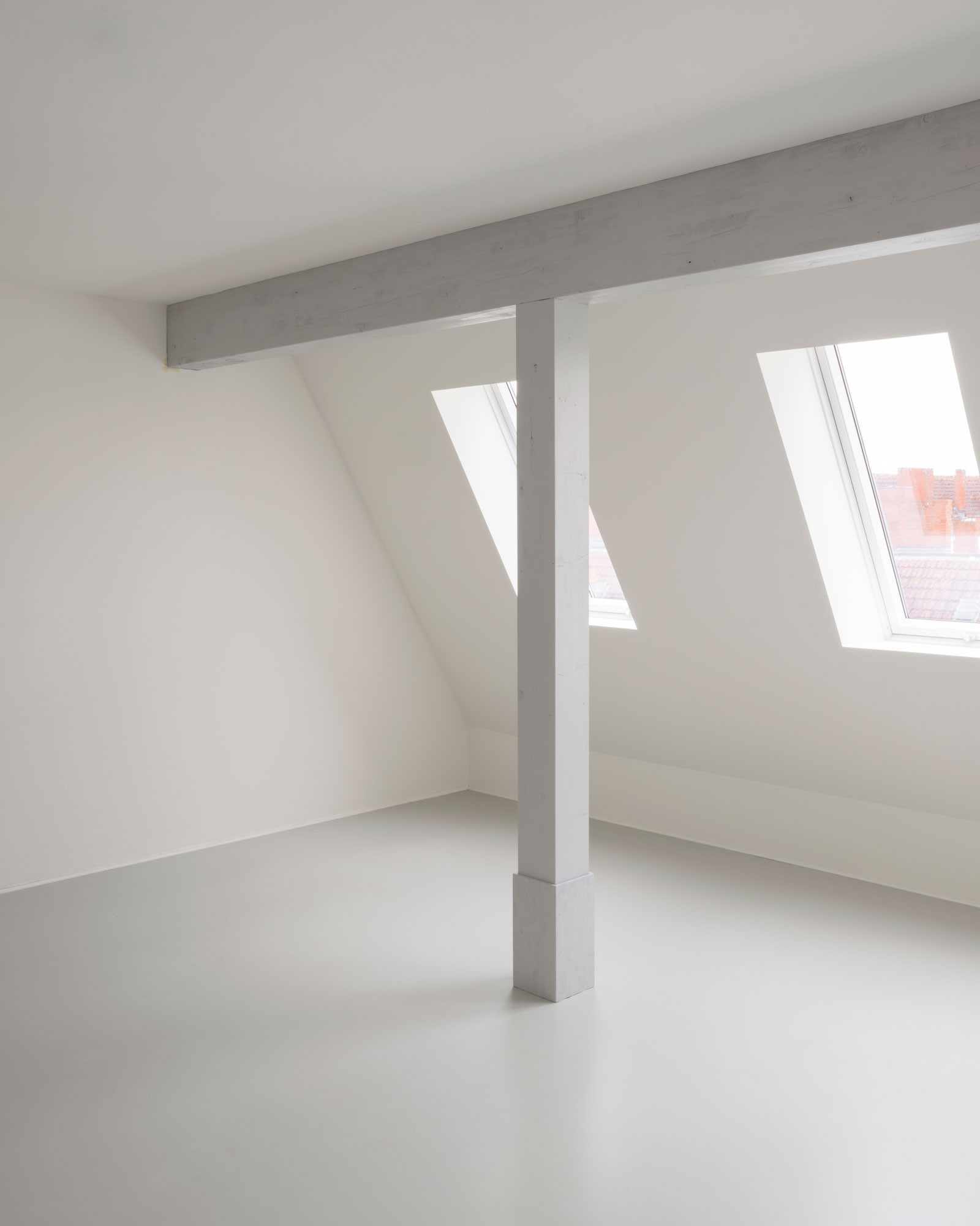
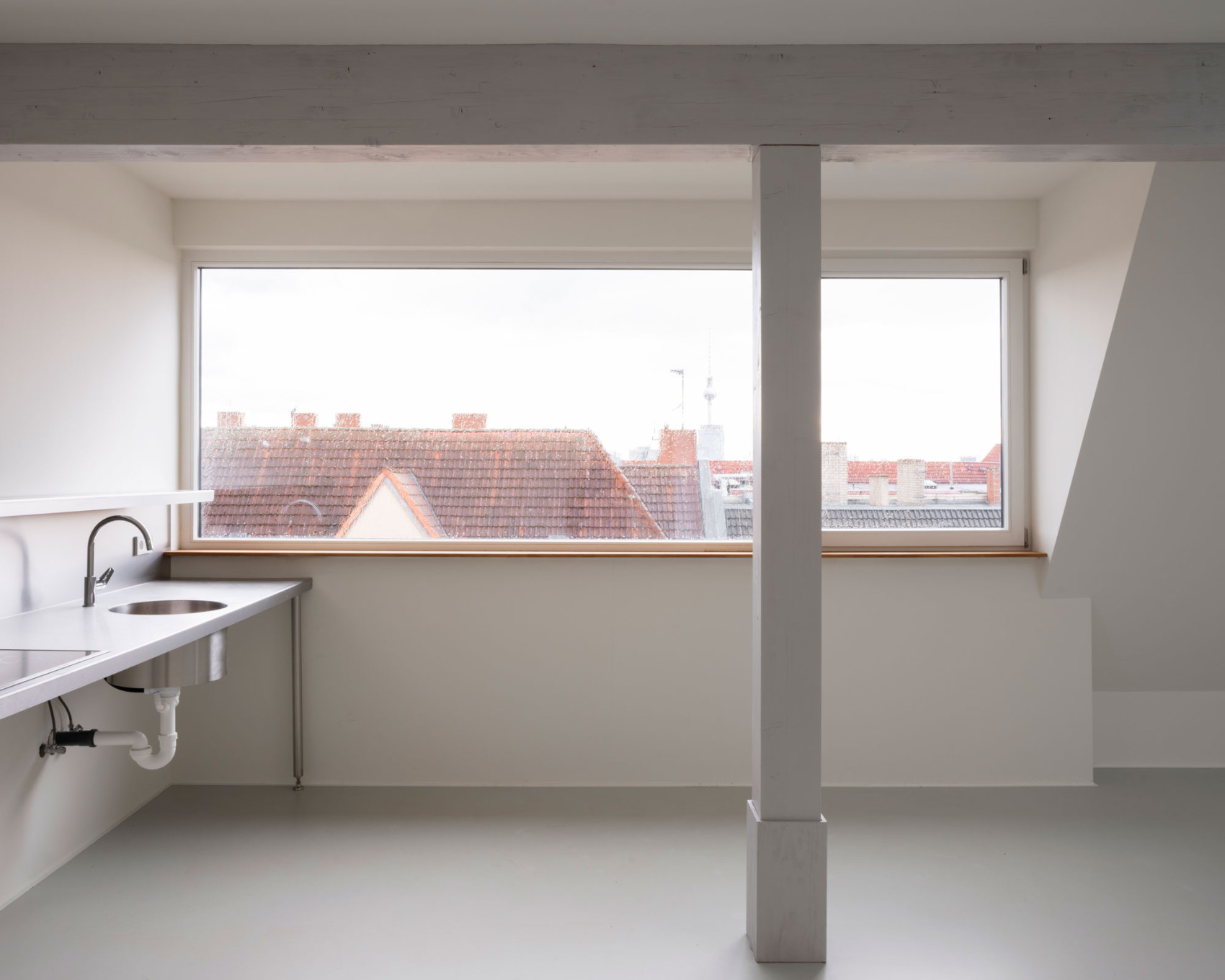
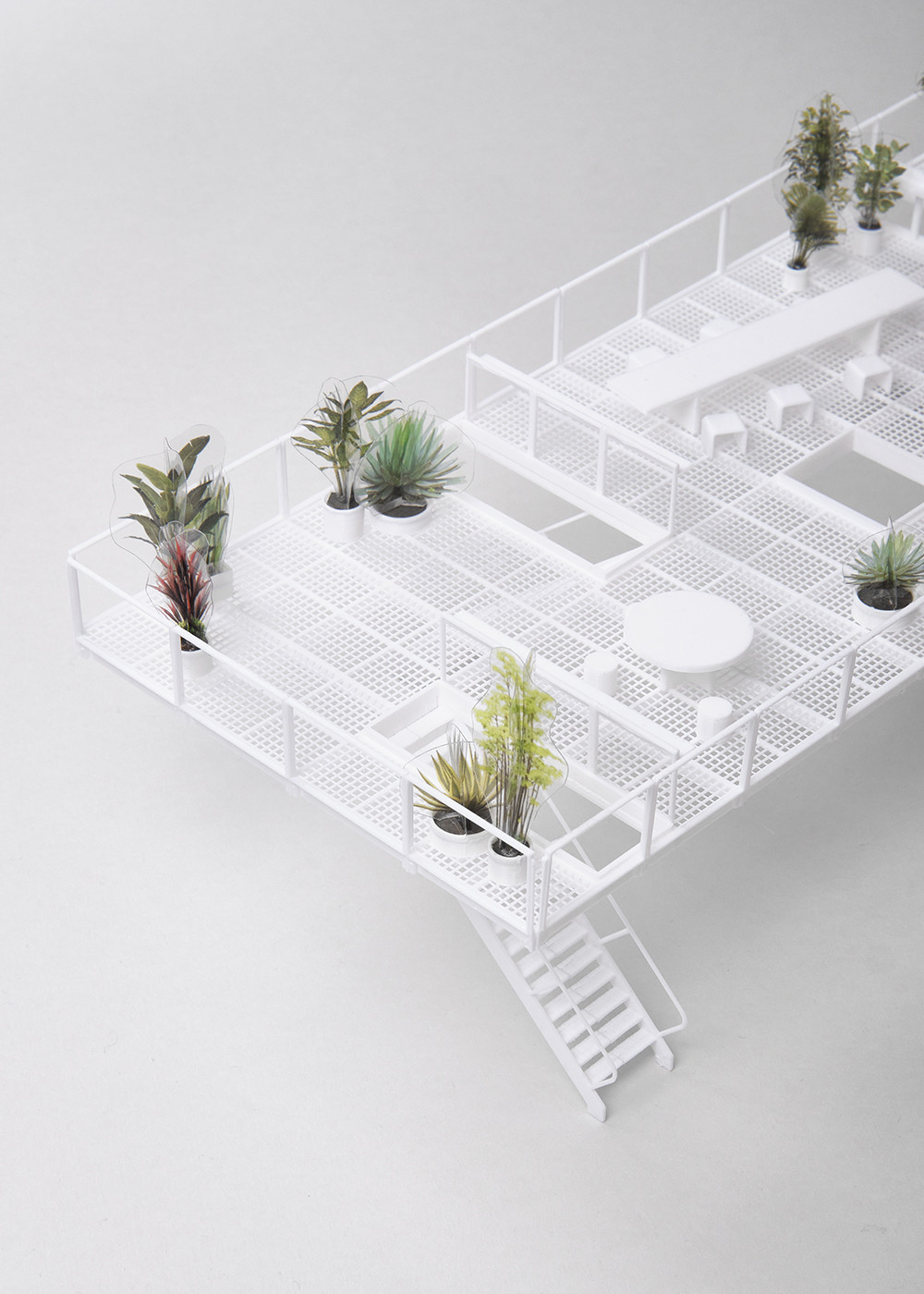
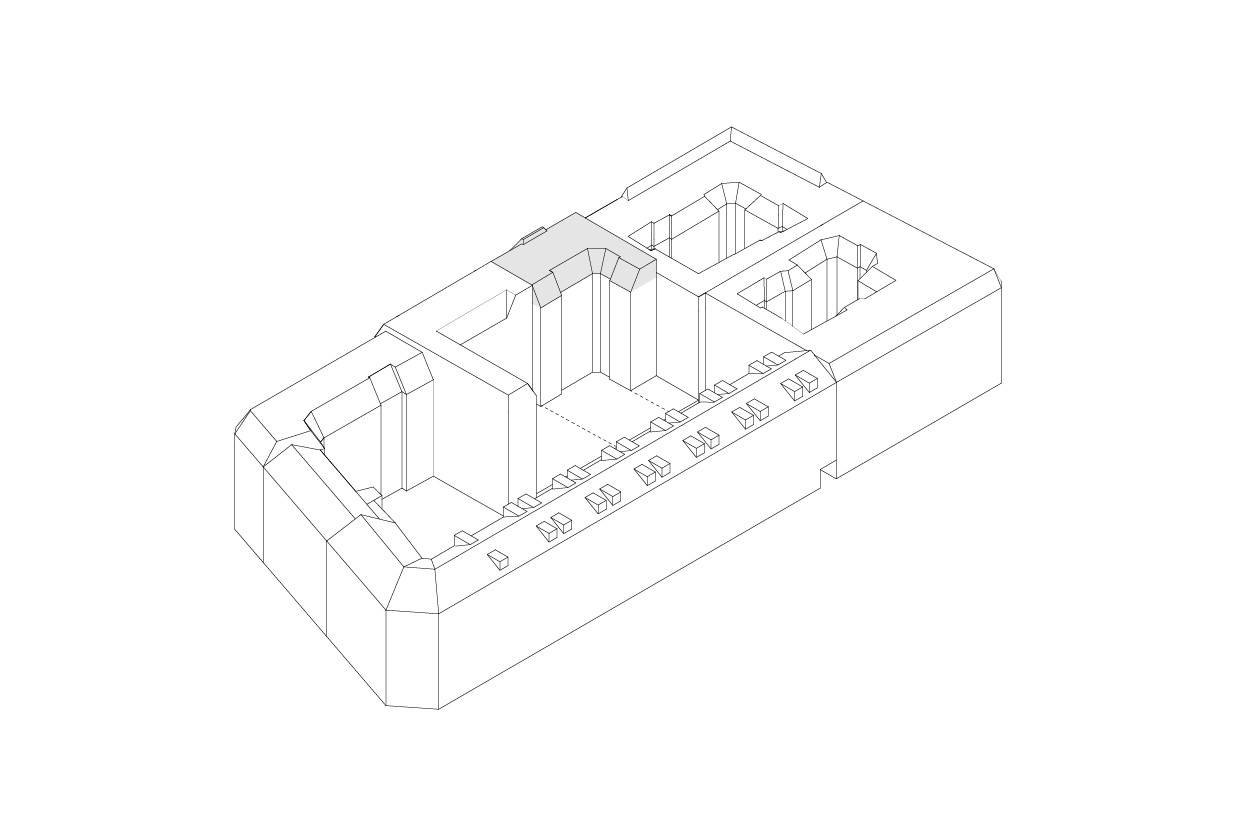
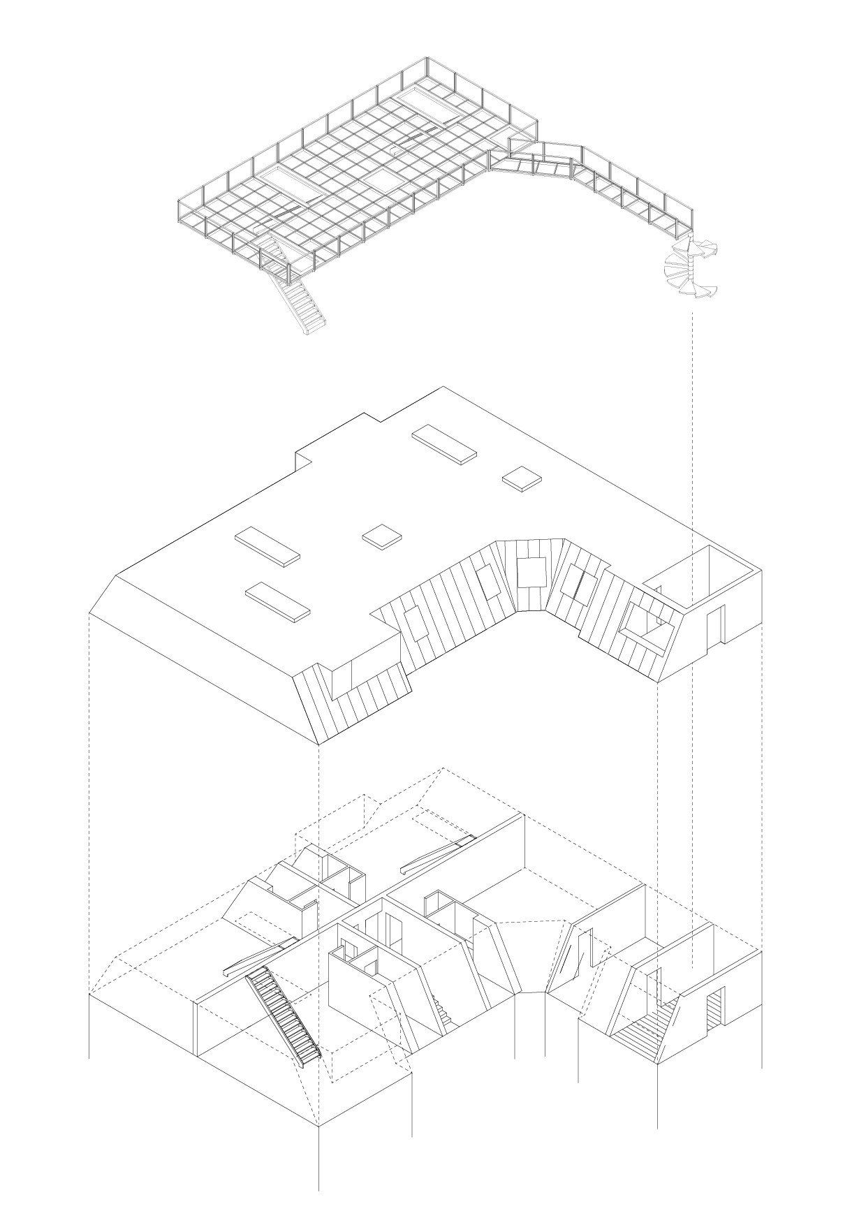
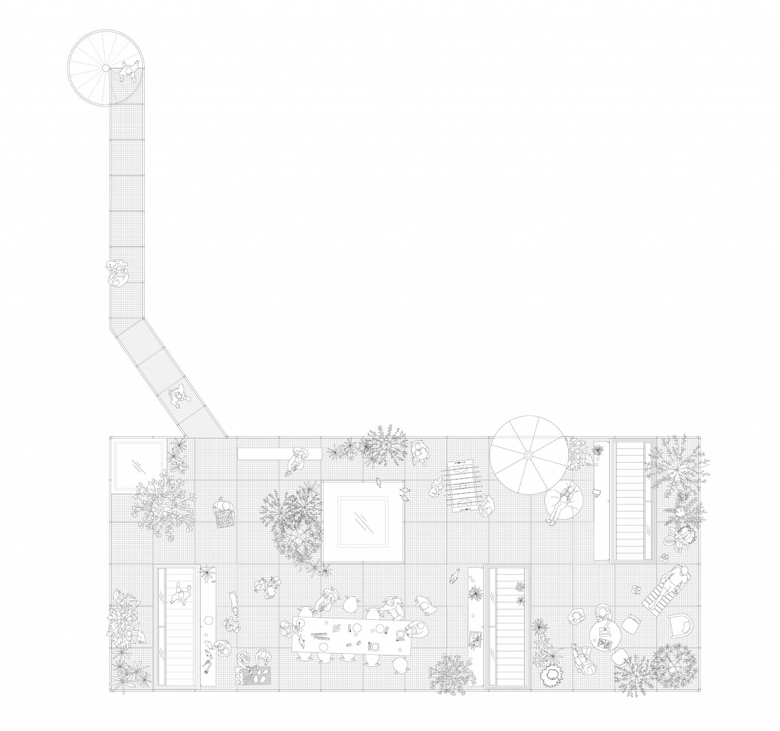
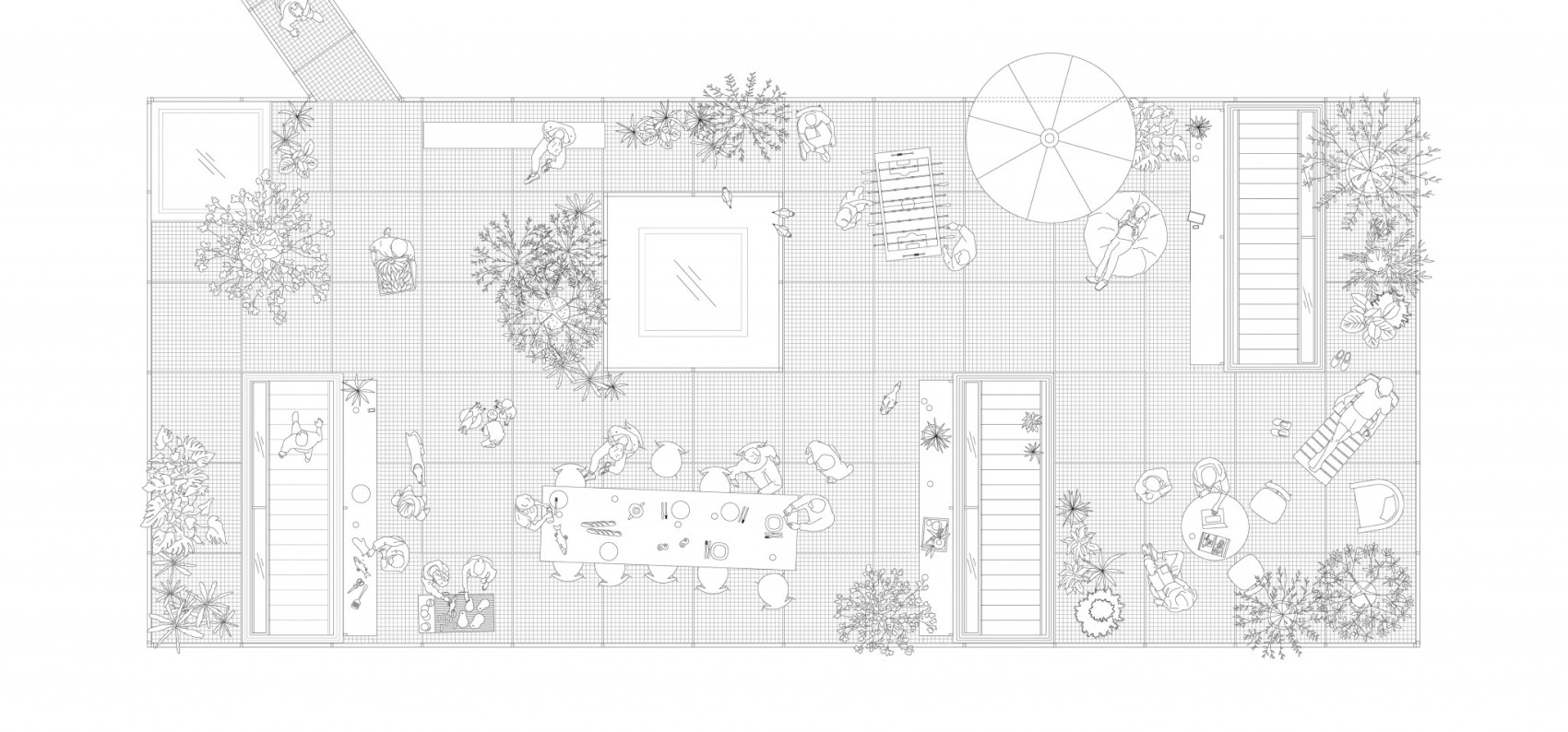
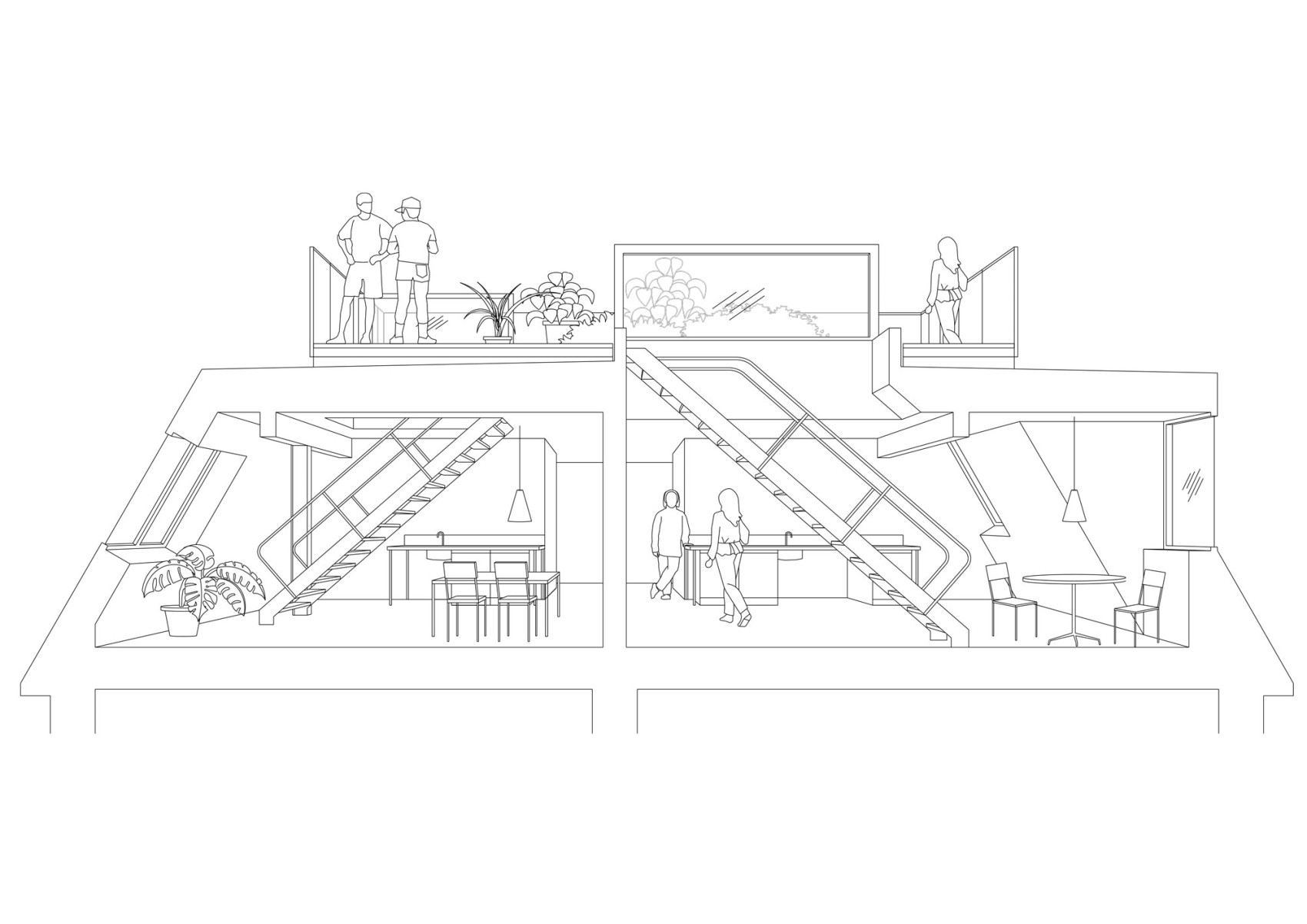
One of the greatest difficulties in urban housing construction is to create generous communal areas without losing private usable space. Time and again, the economic pressure of housing projects leads to extreme space efficiency and thus to the loss of communal ideas.
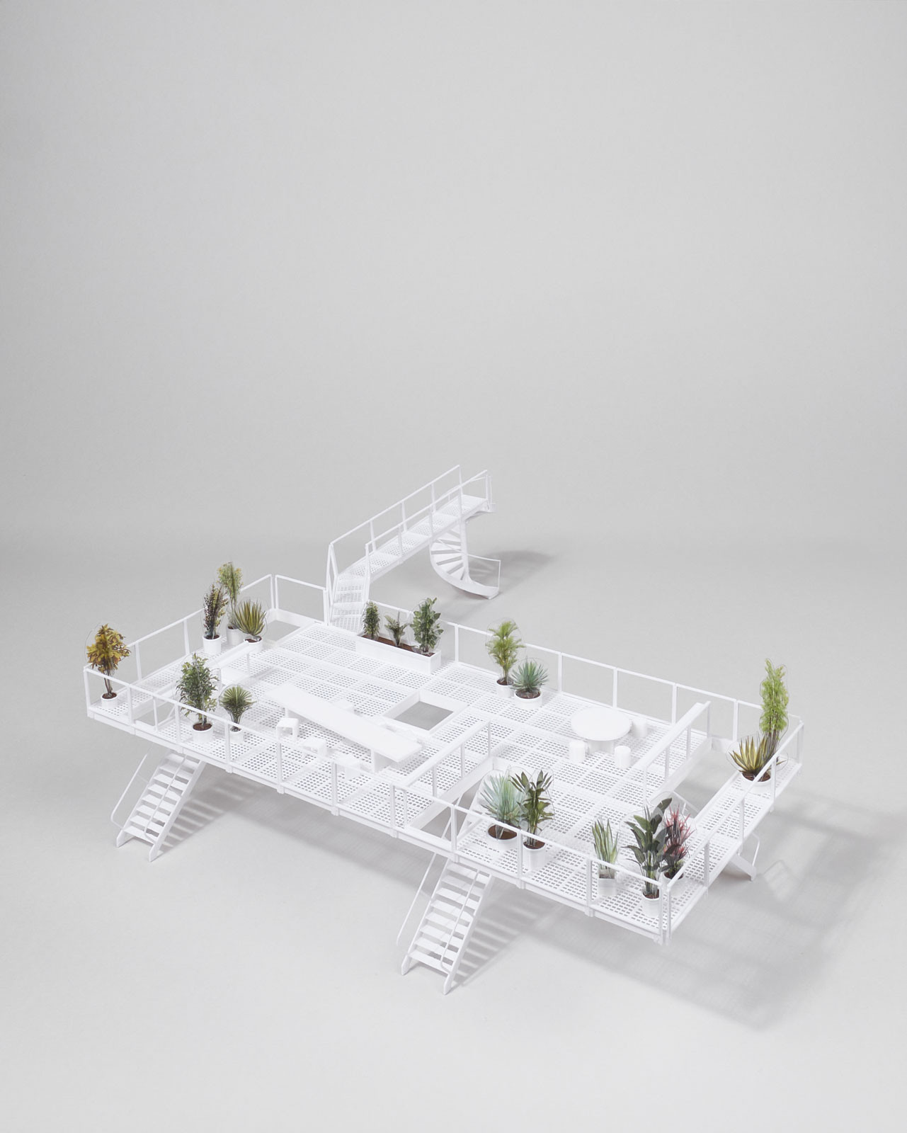
The roof extension of this Berlin apartment block proves the opposite is possible: the roof was extended and fitted with a large, communal roof terrace. Accessible to all residents of the building, the terrace not only offers sweeping views over the city, but above all new collective outdoor spaces. At the same time, contrary to what one might expect, the generosity of the roof terrace is not a lavish luxury, but rather the skilful interpretation of Berlin's building regulations, which stipulate a second structural escape route via the roof. The result is not only a total of four new rental apartments, but above all communal qualities for the residents of the entire building.
While three of the top-floor flats have direct access to the terrace, the fourth flat and the rest of the building have access via an access walkway connected to a stairwell. The roof terrace is understood as a communal area for collective appropriation, whereby the boundaries between private and collective areas are constantly being re-explored.
Project in collaboration with Leonhard Clemens
Photos by Leonhard Clemens & Clemens Wronski
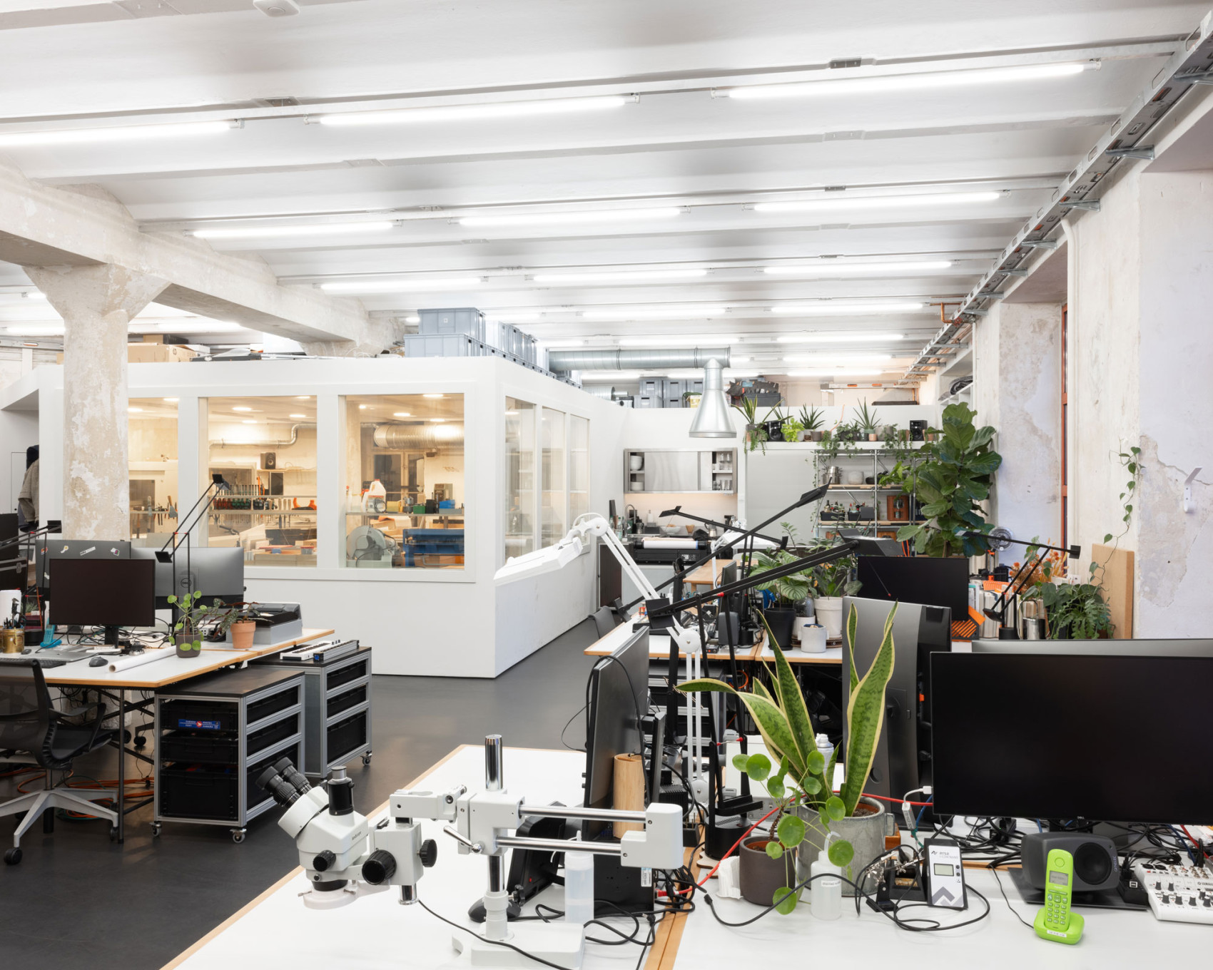
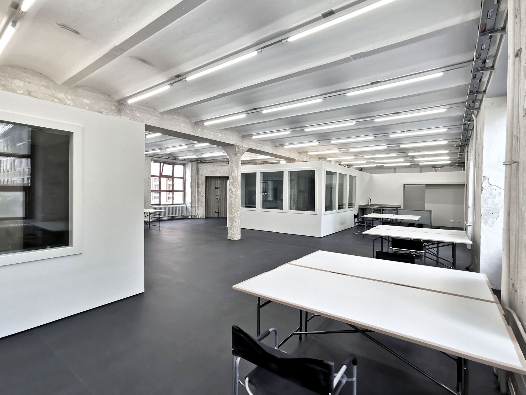
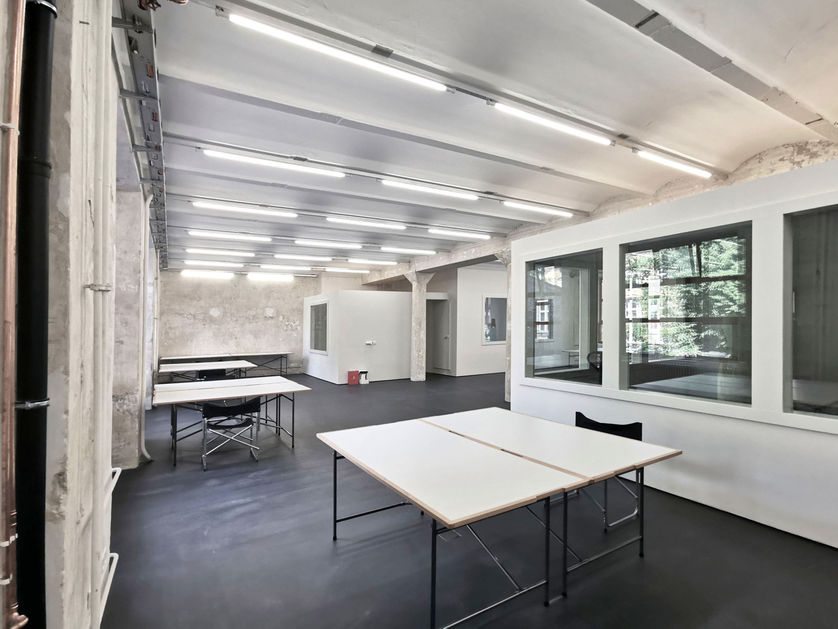
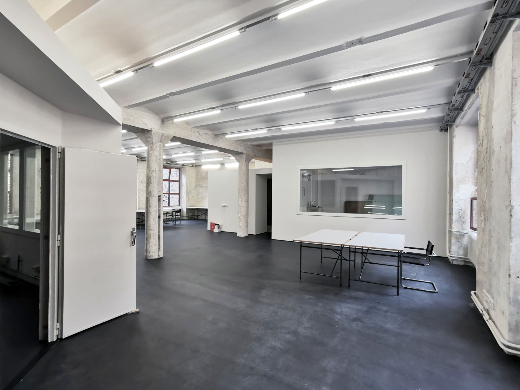
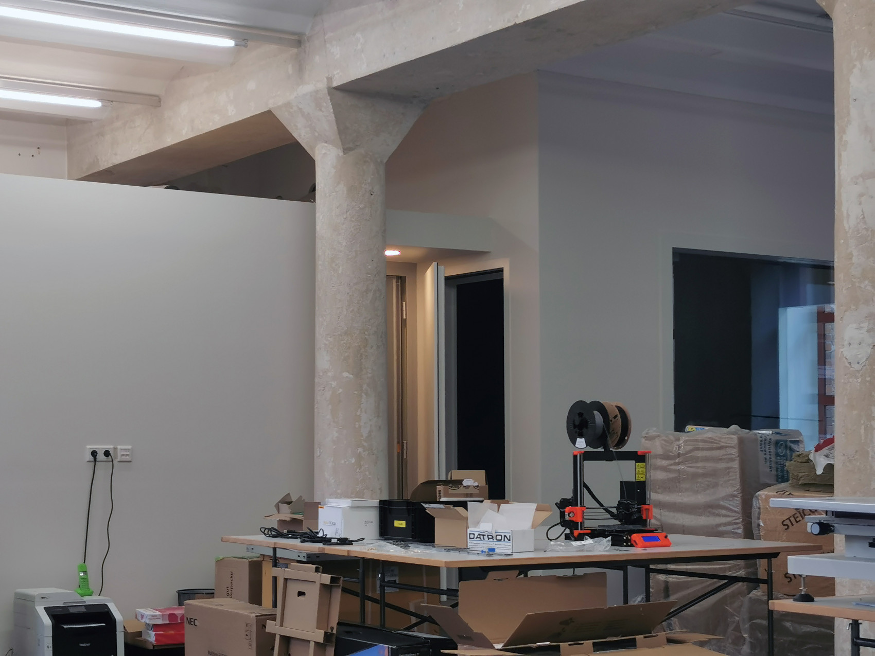
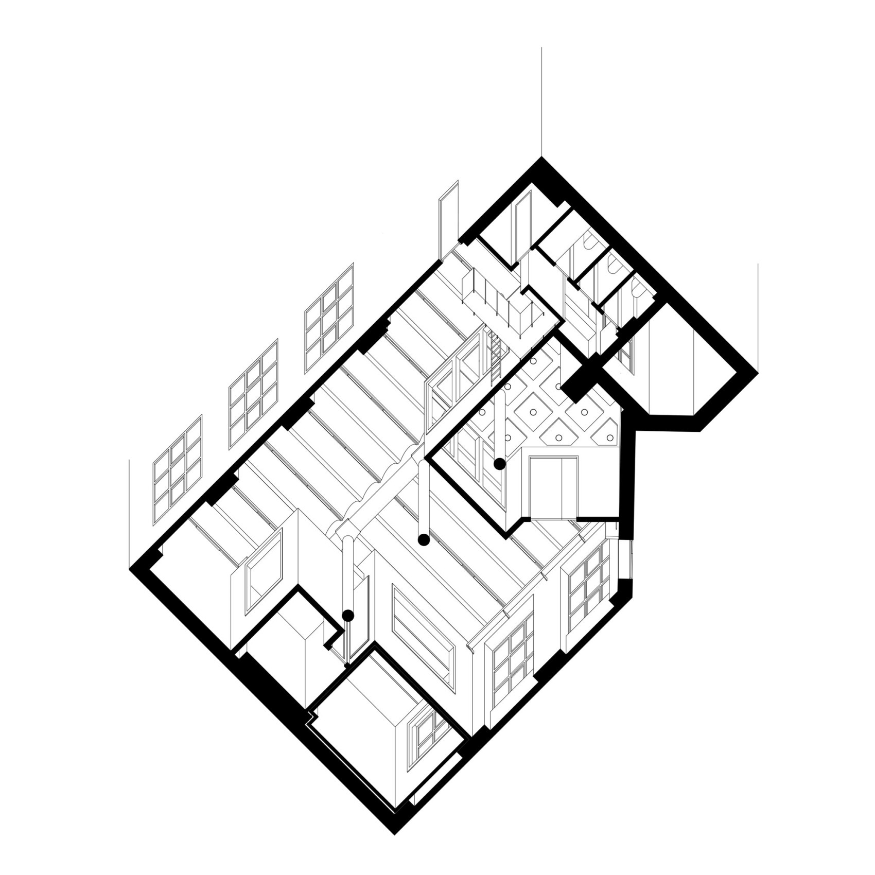
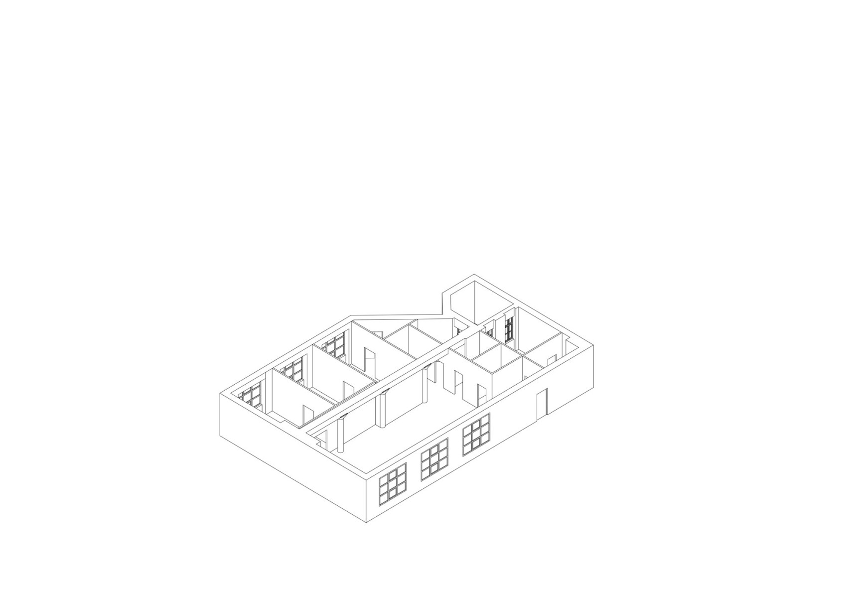
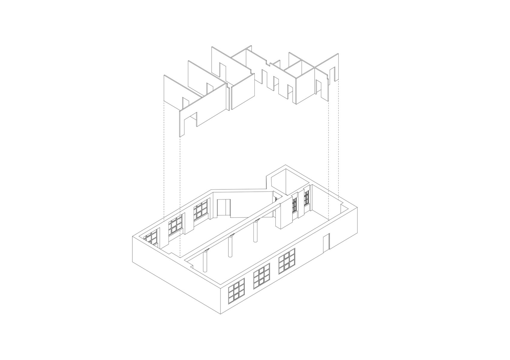
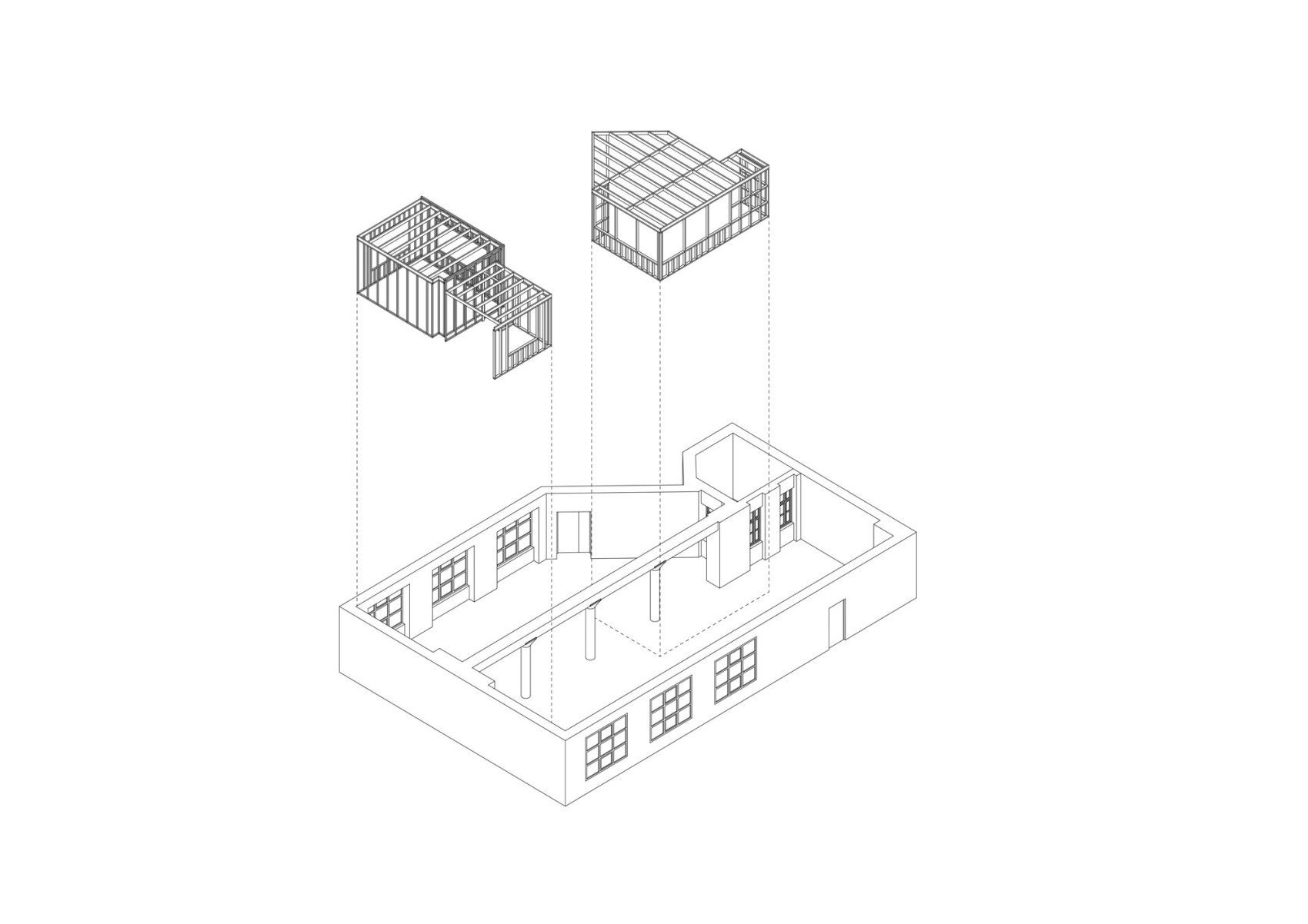
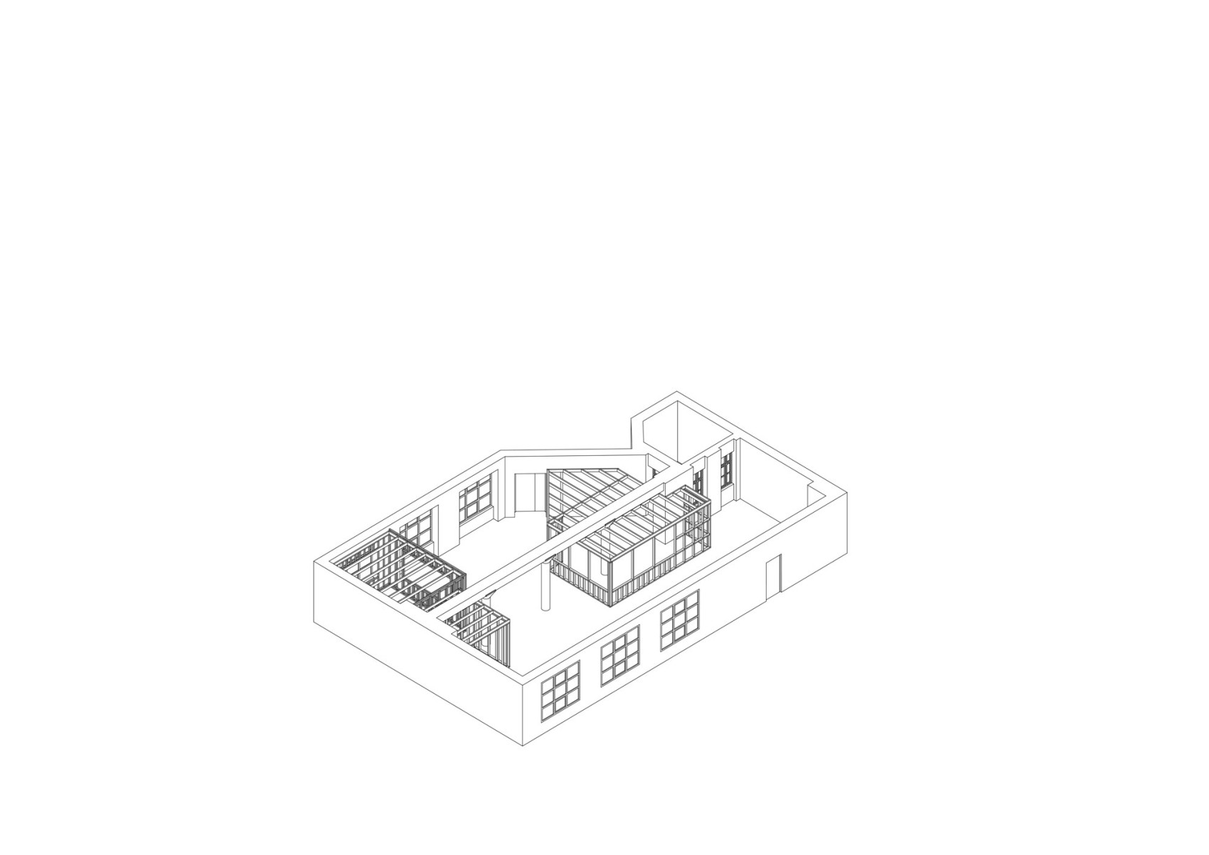
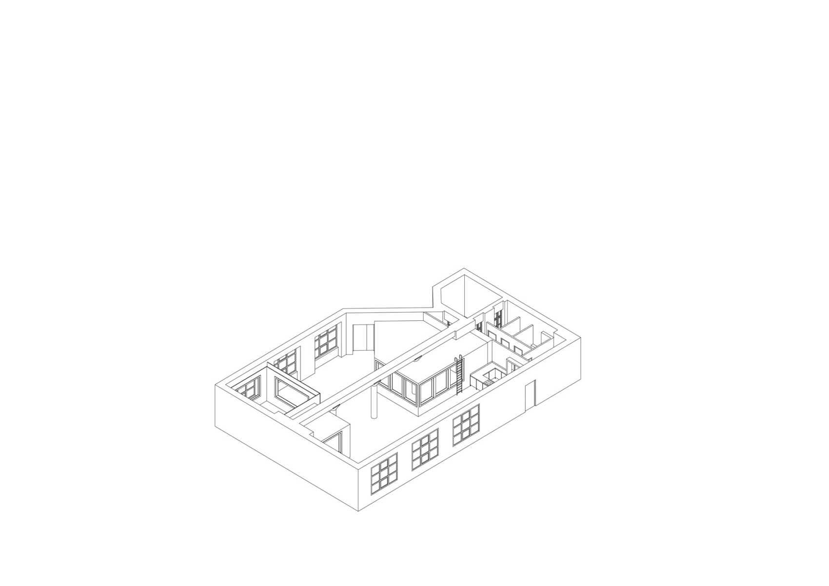
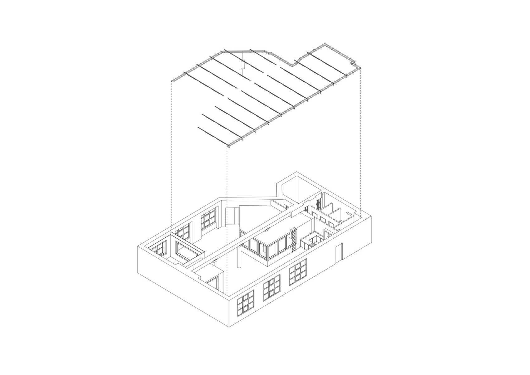
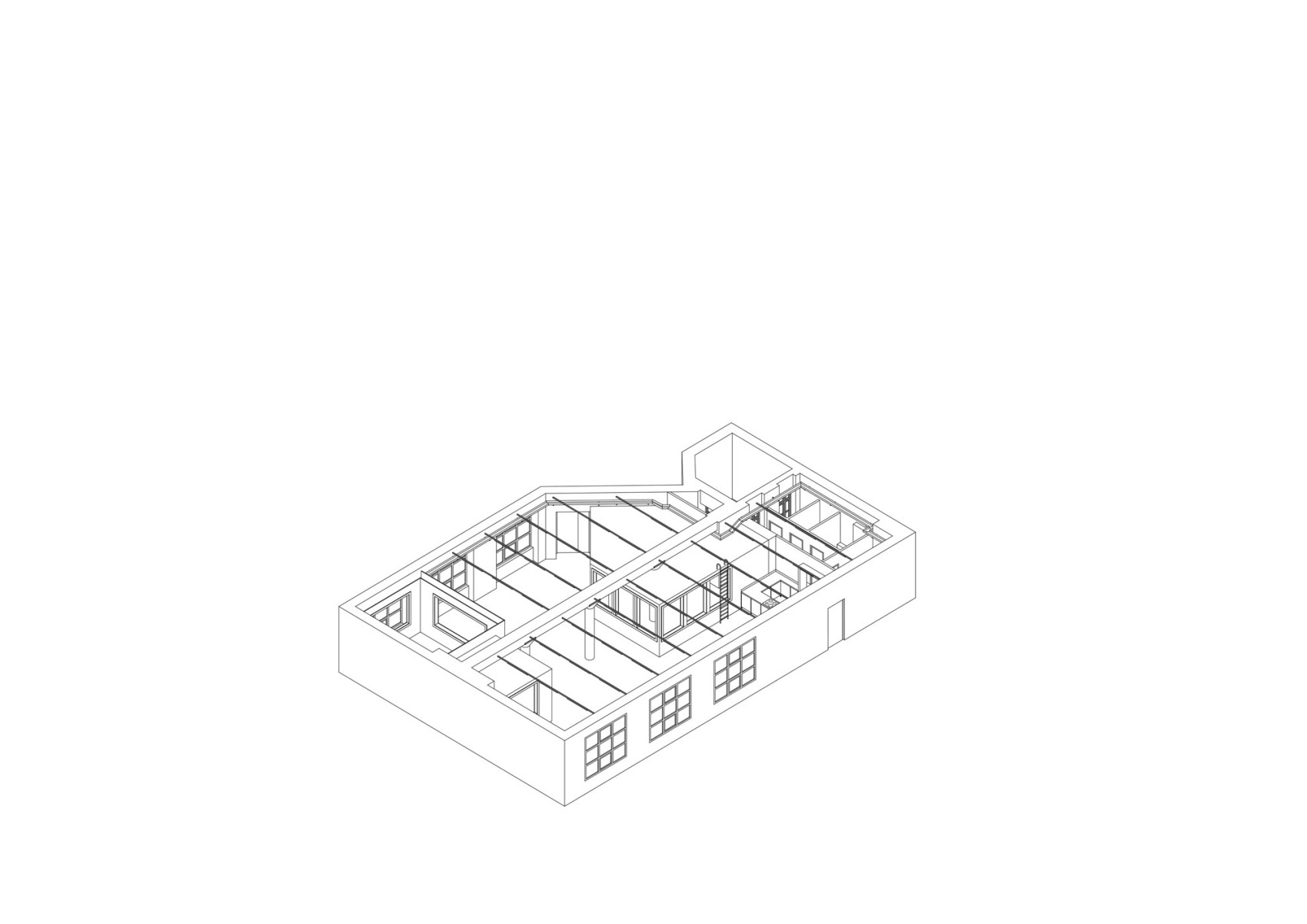
KORG Studios in Berlin is the Japanese manufacturer's experimental offshoot for the development of new electronic musical instruments in Berlin led by Tatsuya Takahashi.
Similar to the artistic but highly technical design processes for electronic musical instruments, the architecture of the project is based on an experimental design process. The result is not only a high-quality interior design, but also a prototypical working method for transformation, maintenance and repair, as well as an extremely adaptable and multi functional spatial structure that can be used for a wide variety of purposes within a very limited spatial framework: KORG Studios is simultaneously a workshop, recording studio, library, flexible office space and cooking and social space at once.
The project followed a circular approach. Starting with the demolition of the existing building, all usable materials were collected, repaired and then reused. The mineral insulation wool of the drywall was recycled, the cable trays were removed, cleaned and reinstalled and old large-format drywall panels were reused. Instead of relying on standardized building systems, countless special solutions were sketched, developed in detail and often built in-house. This resulted in a whole catalog of innovations: from the supporting structure to lights, acoustic windows, tables, etc.
Project in collaboration with Felix Xylander-Swanell
Photos by Leonhard Clemens
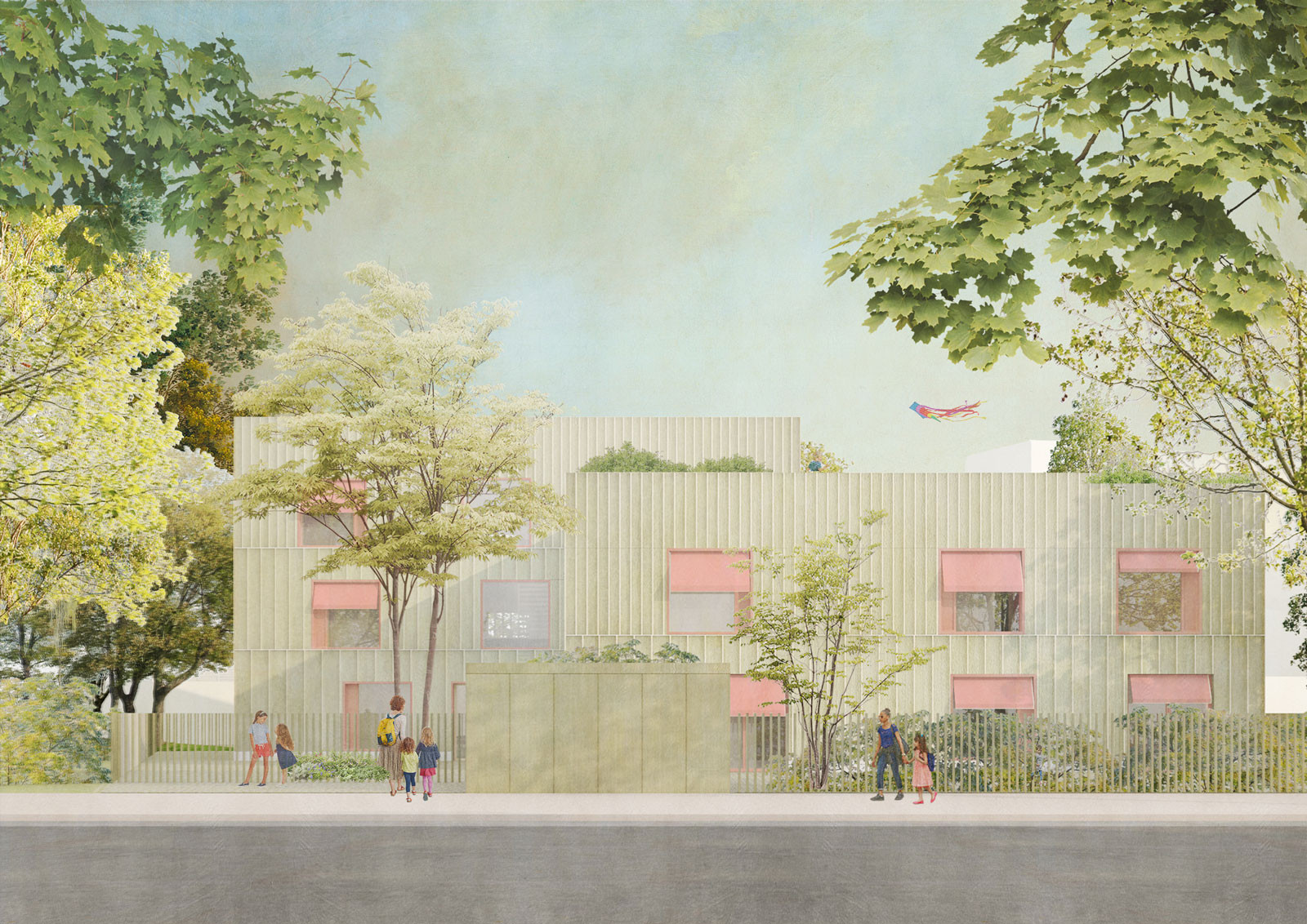
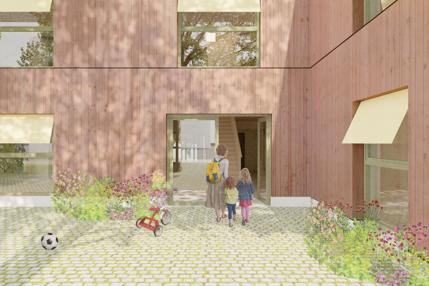
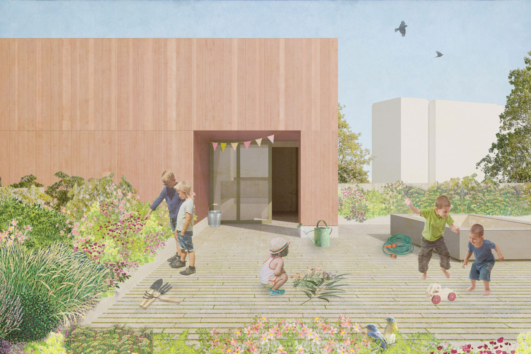
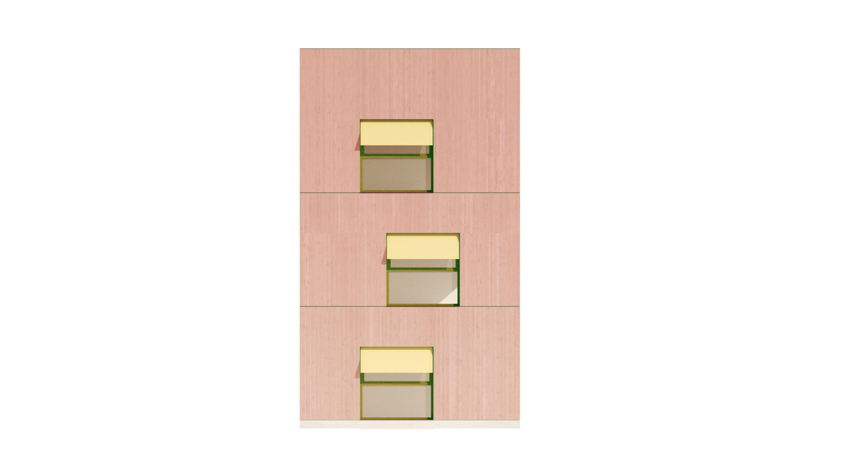
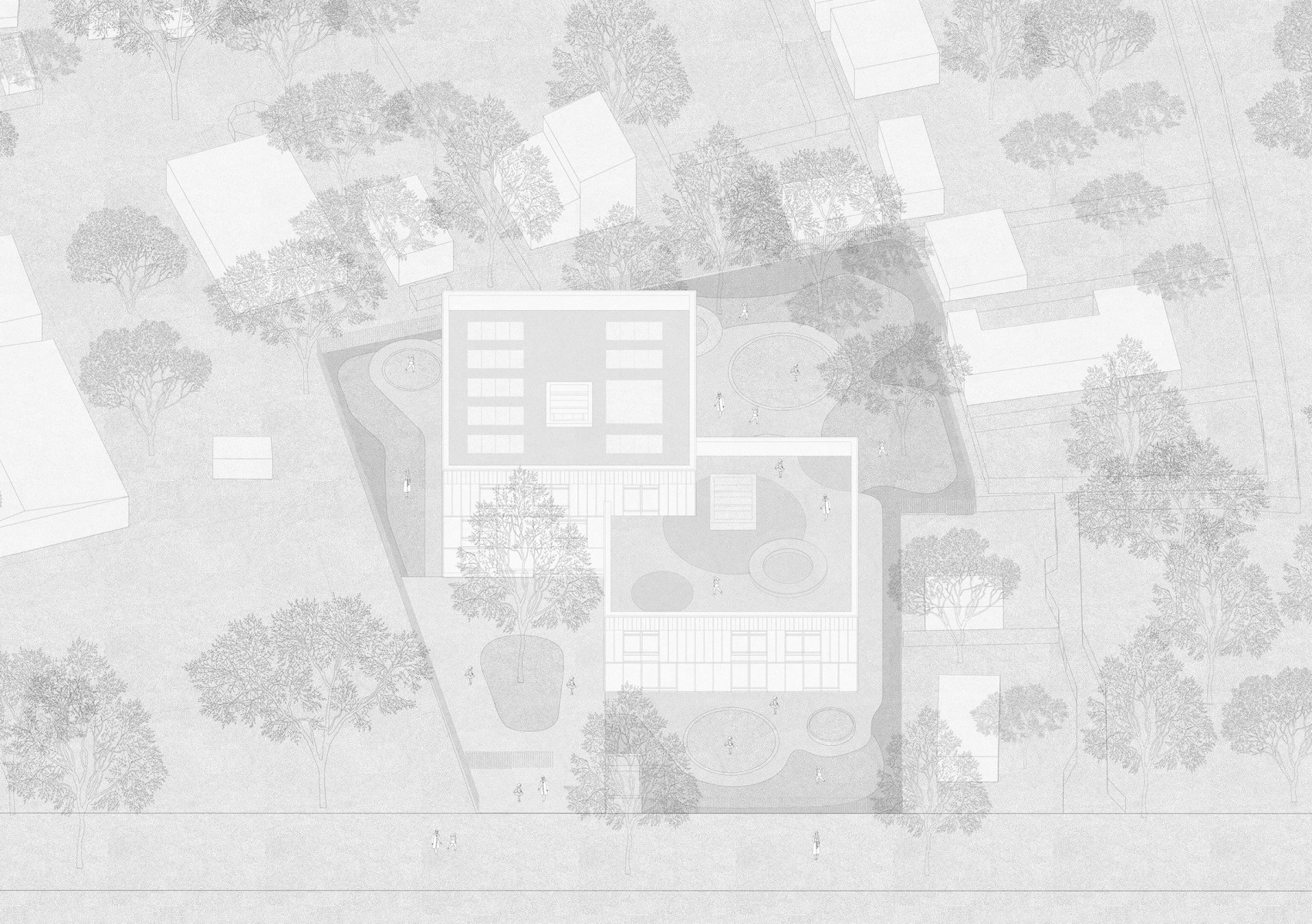
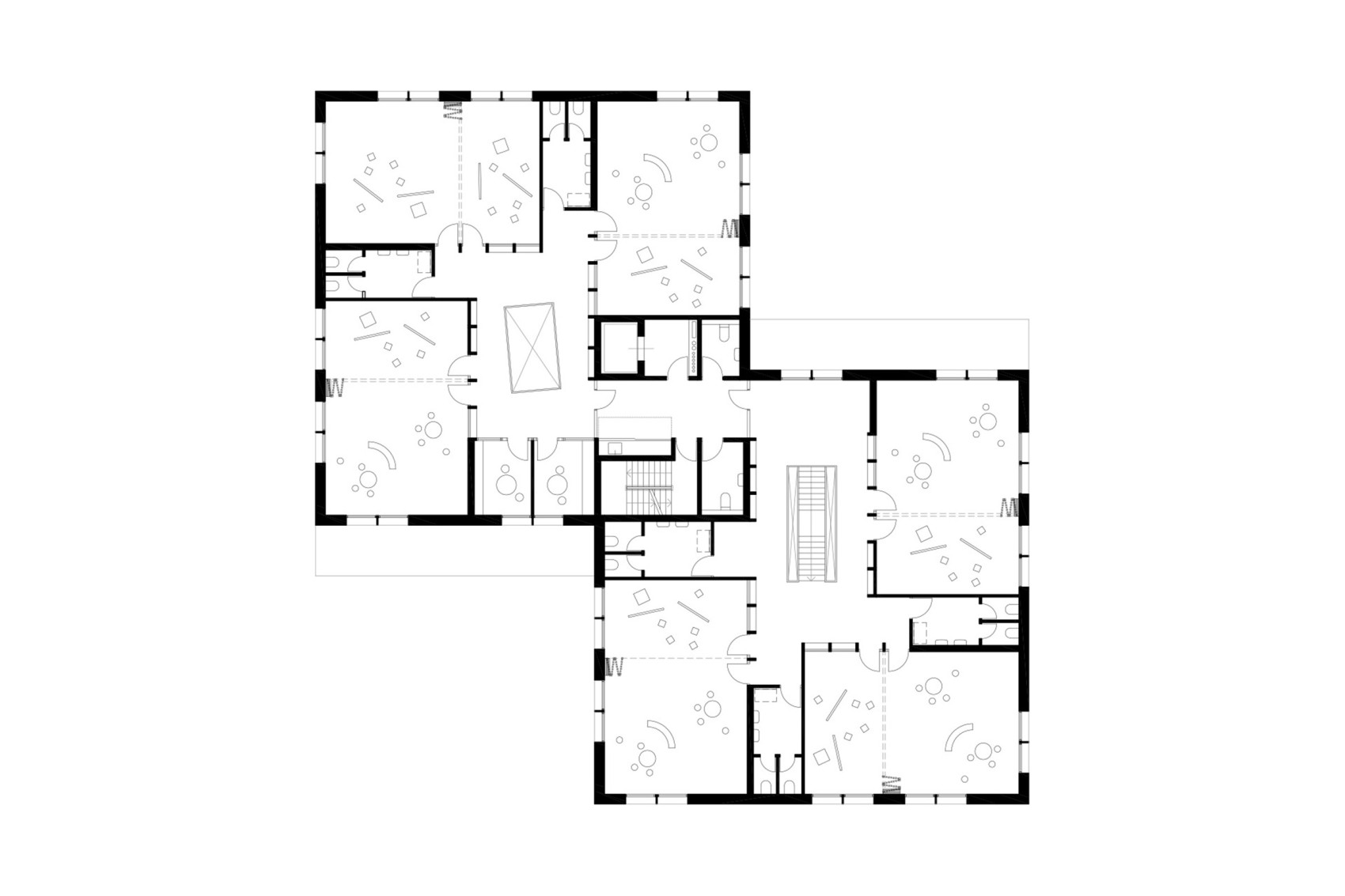
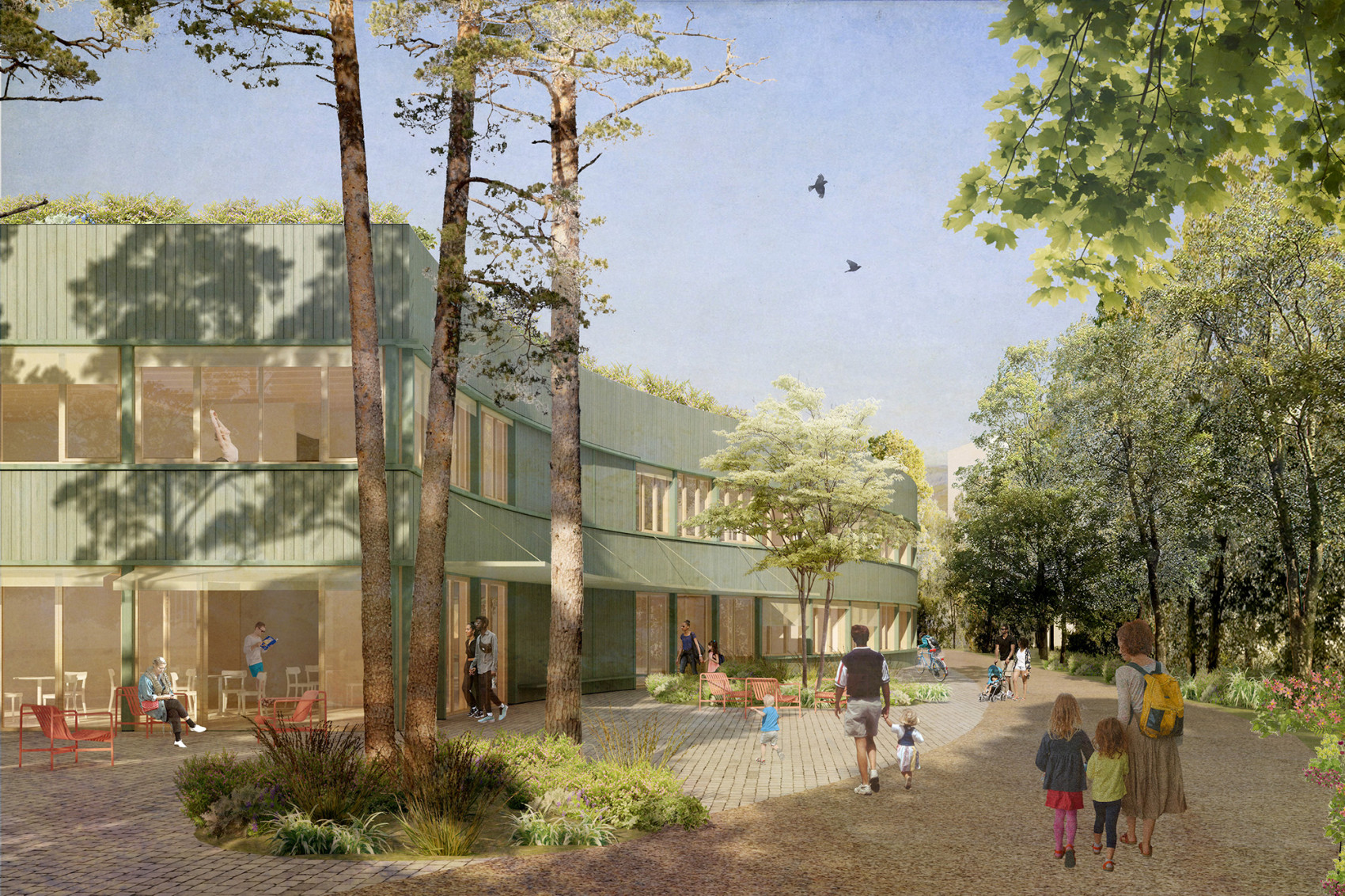
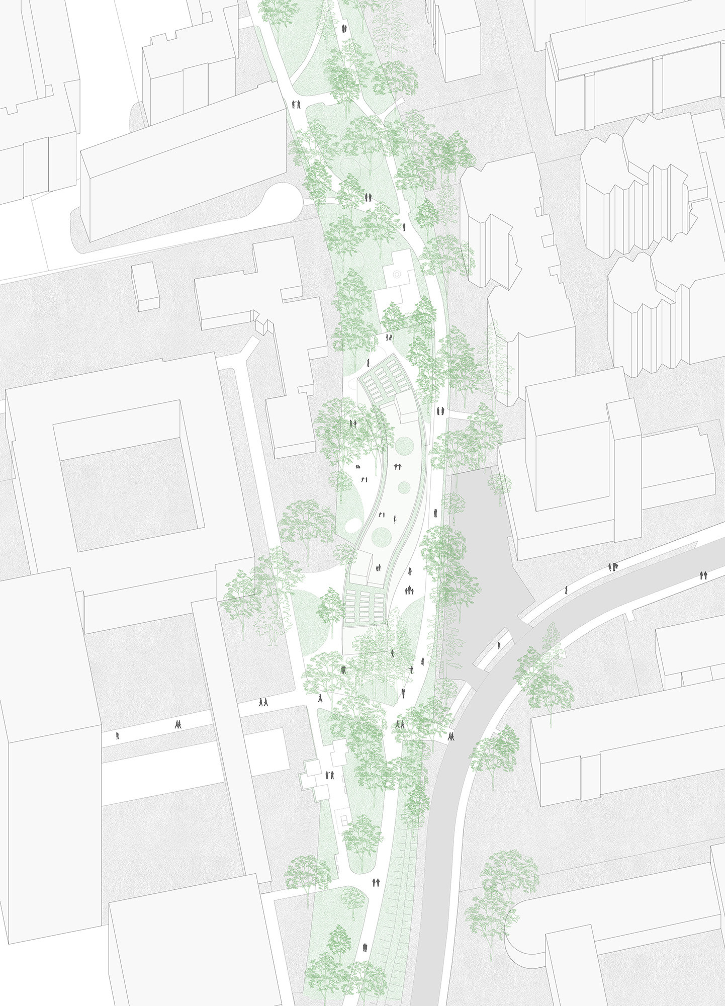
Both internally and externally, the architecture of the Kindergarten pursues ideas of community. Embedded in an environment of social and neighborhood infrastructure, the adventure playground, a children's farm and an allotment garden settlement, the Kindergarten expands this social urban landscape. This is achieved not only by providing childcare for 142 children, but also through staggering of two interconnected buildings, creating green spaces of different sizes with near-natural play facilities.
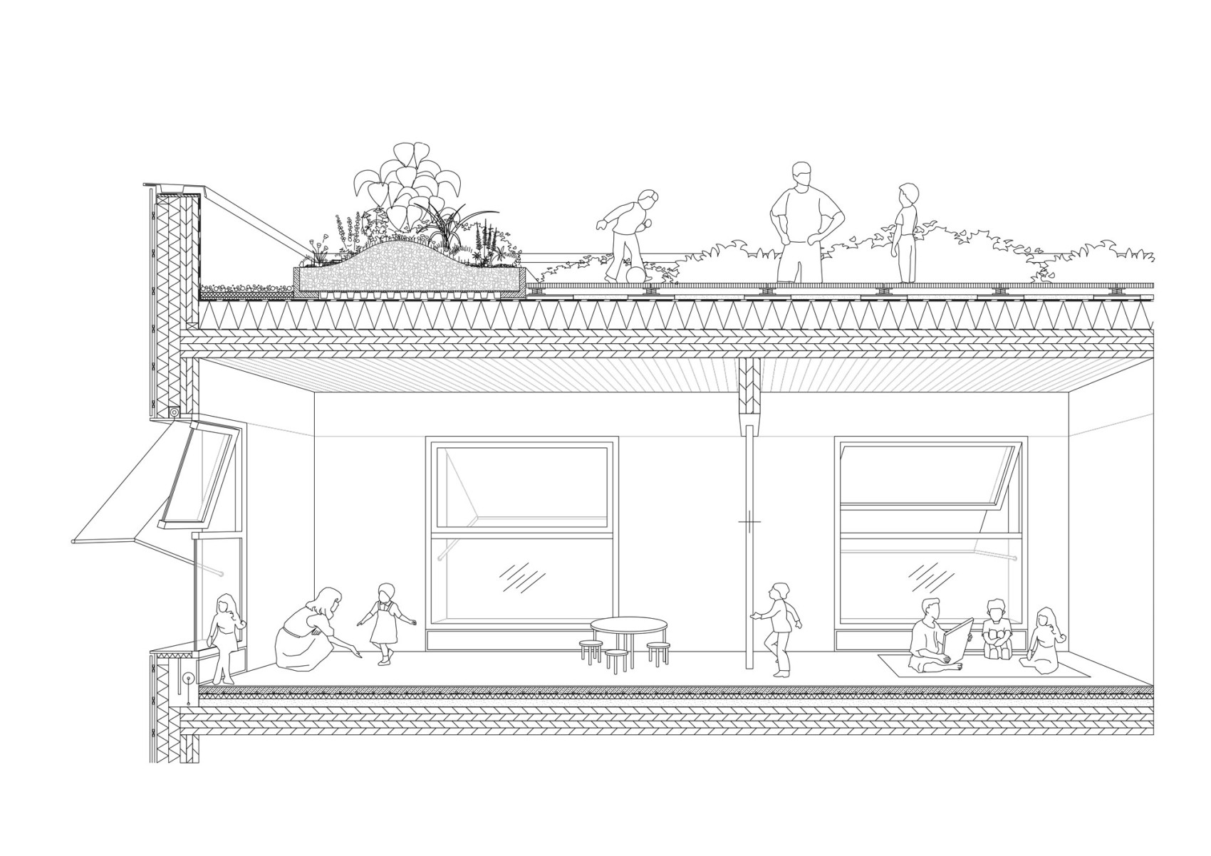
The roof areas form a special element which, on the one hand, create an extended educational offer as intensively greened roof gardens. The combination of photovoltaics with extensive greening makes an innovative contribution to the design and use of urban roof areas and the promotion of biodiversity, rainwater use and the creation of new types of communal areas.
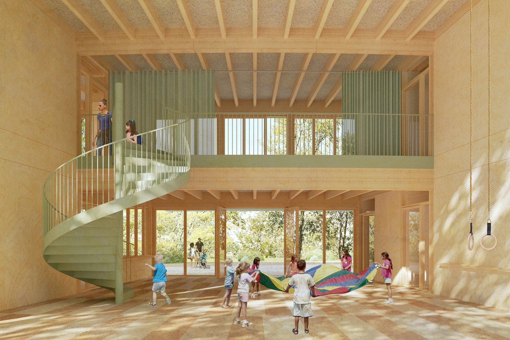
Inside the daycare center, the communal concept is continued through multifunctional access areas. The highly efficient yet generous spatial structure gives arriving, picking up and gathering an important role in its use.
The project pursues the highest sustainability goals by being almost self-sufficient in terms of energy and also creates pleasant room comfort in all seasons thanks to innovative natural ventilation. From the supporting structure to the interior fittings, the house is designed as a solid timber construction and makes use of the insulating and recyclable properties of the material.
Project in collaboration with Guillen Esteras Architects
Structual Engineering by Knippers Helbig, Berlin
Climate concept by Transsolar Climate Engineering
Landscape by mesh Landschaftsarchitektur
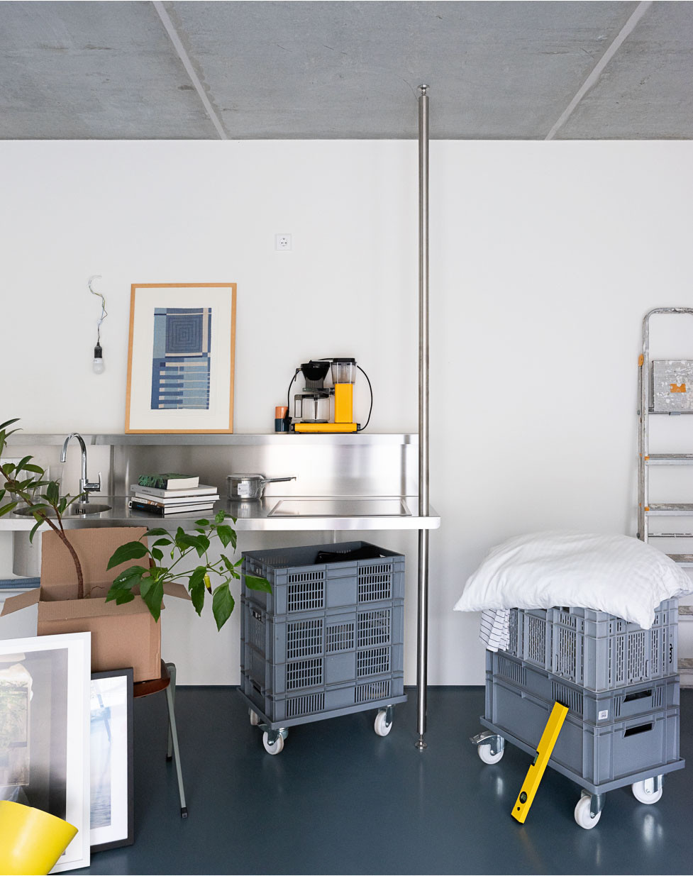
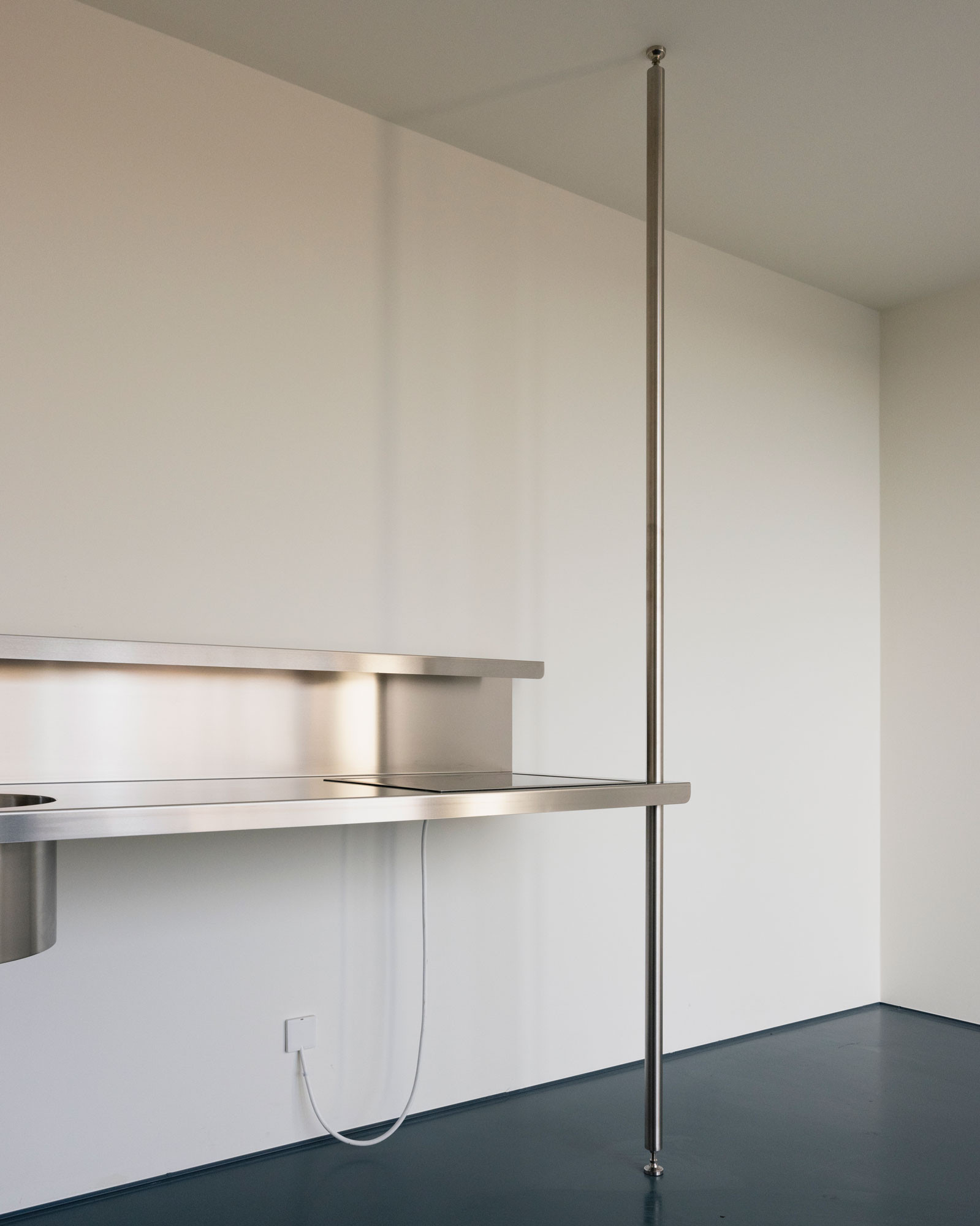
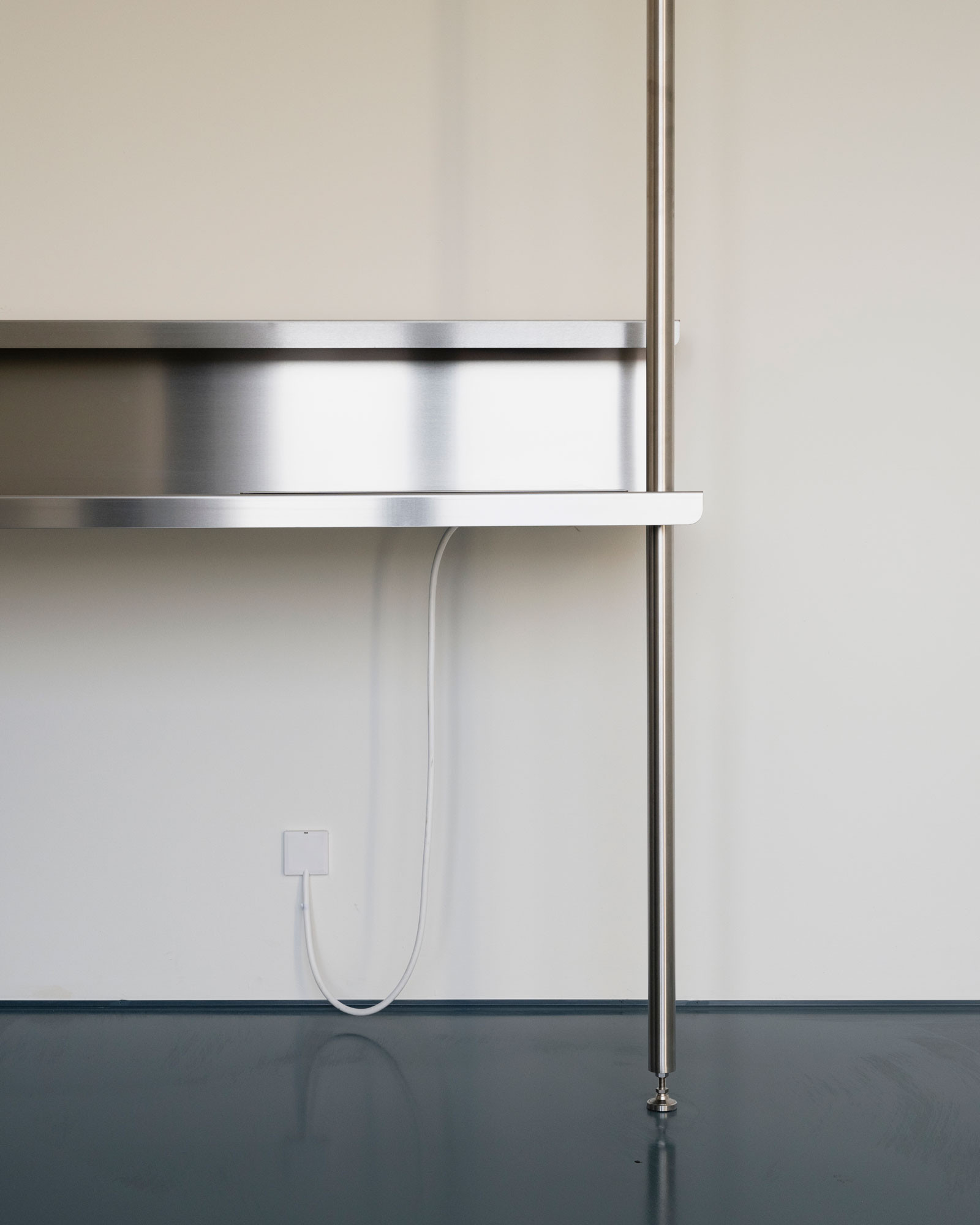
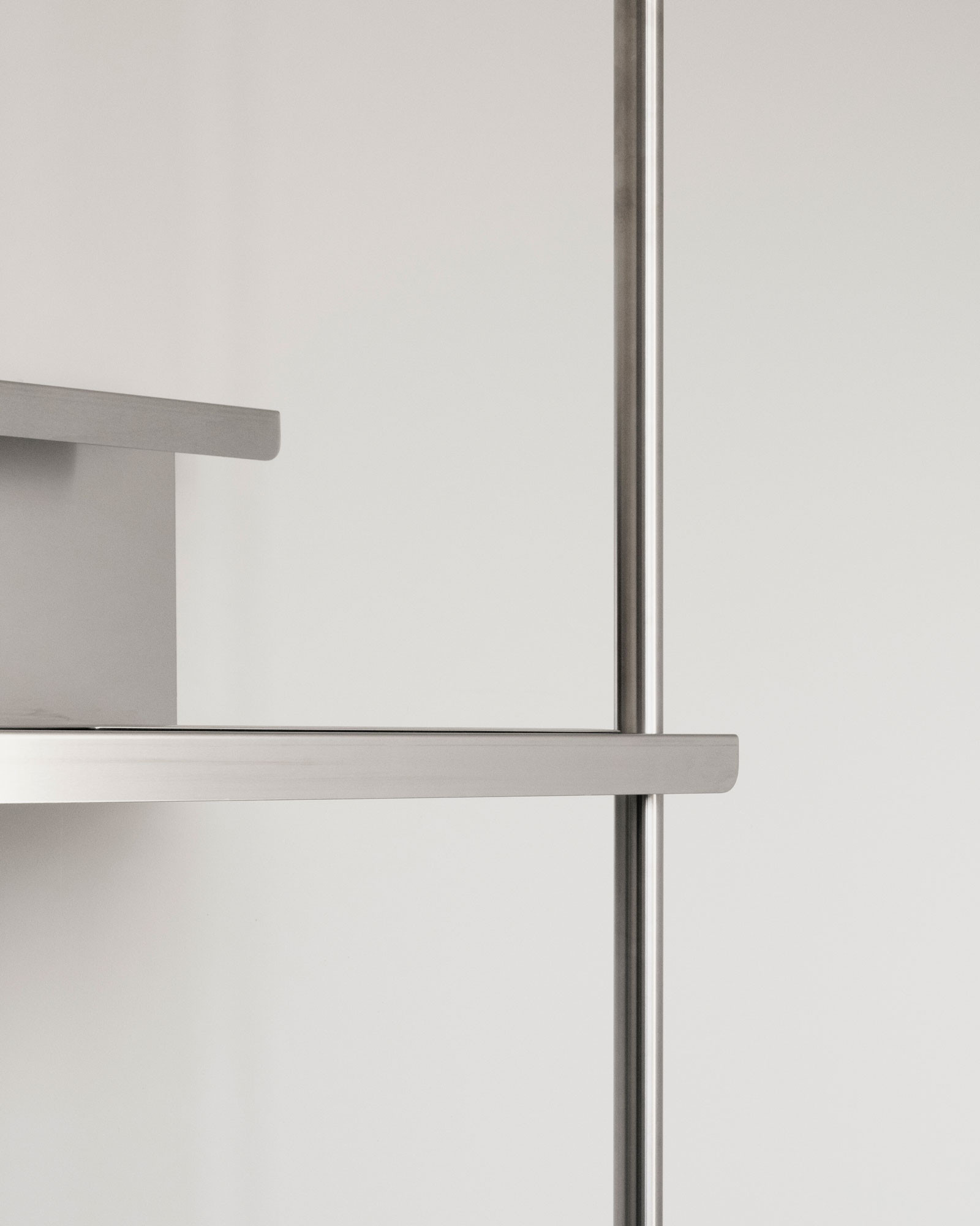
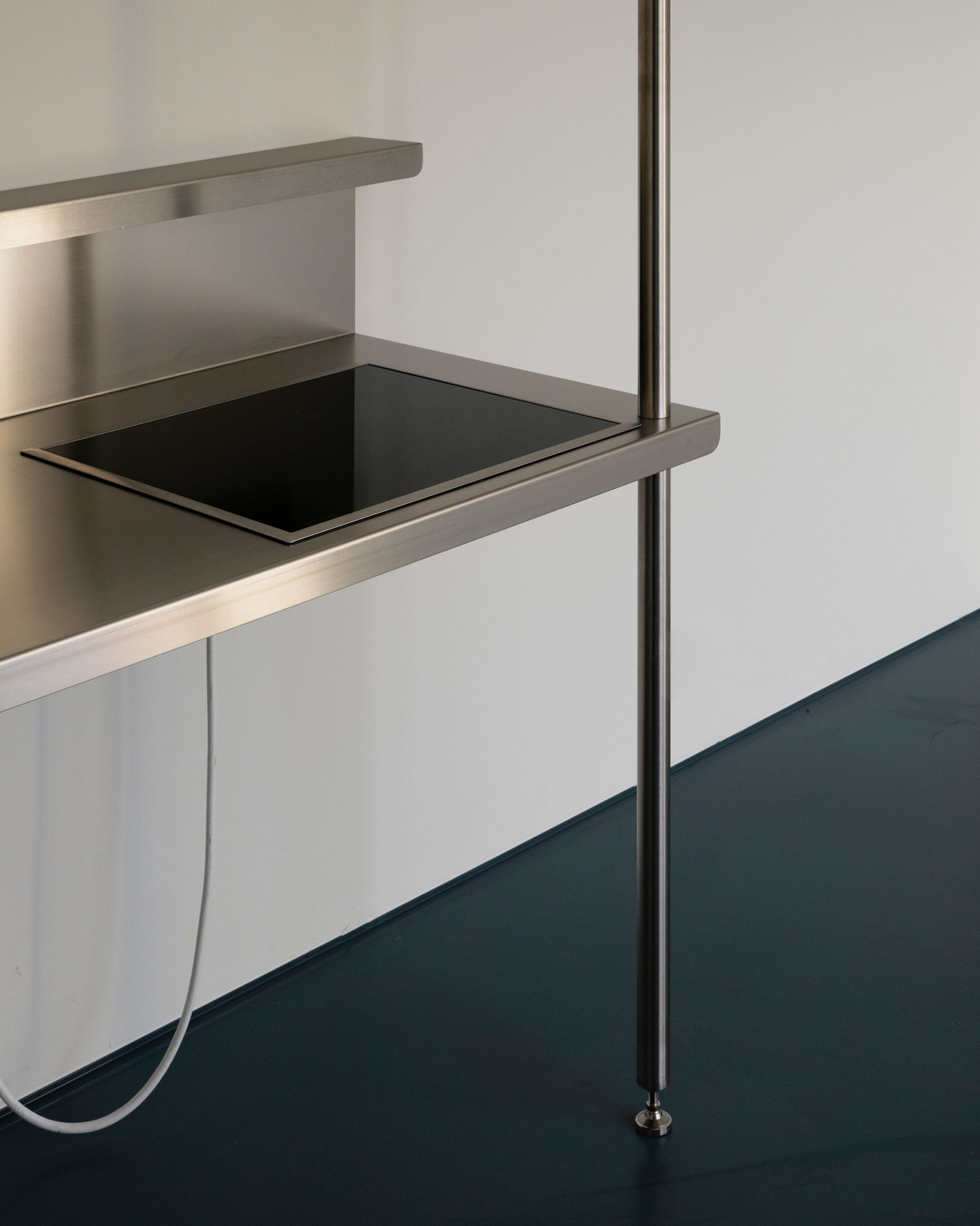
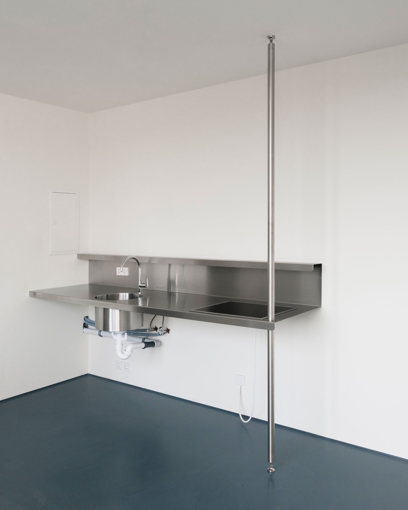
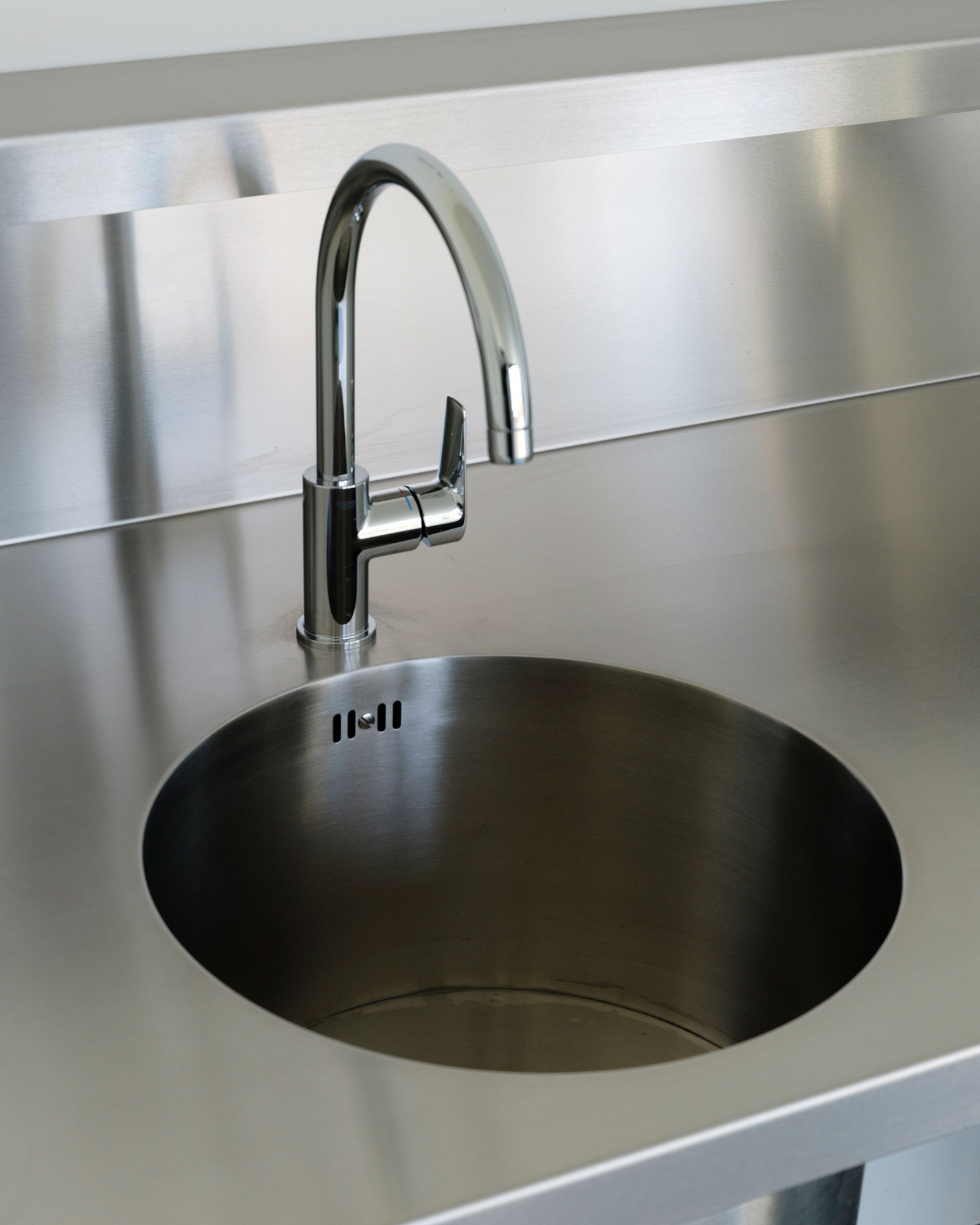
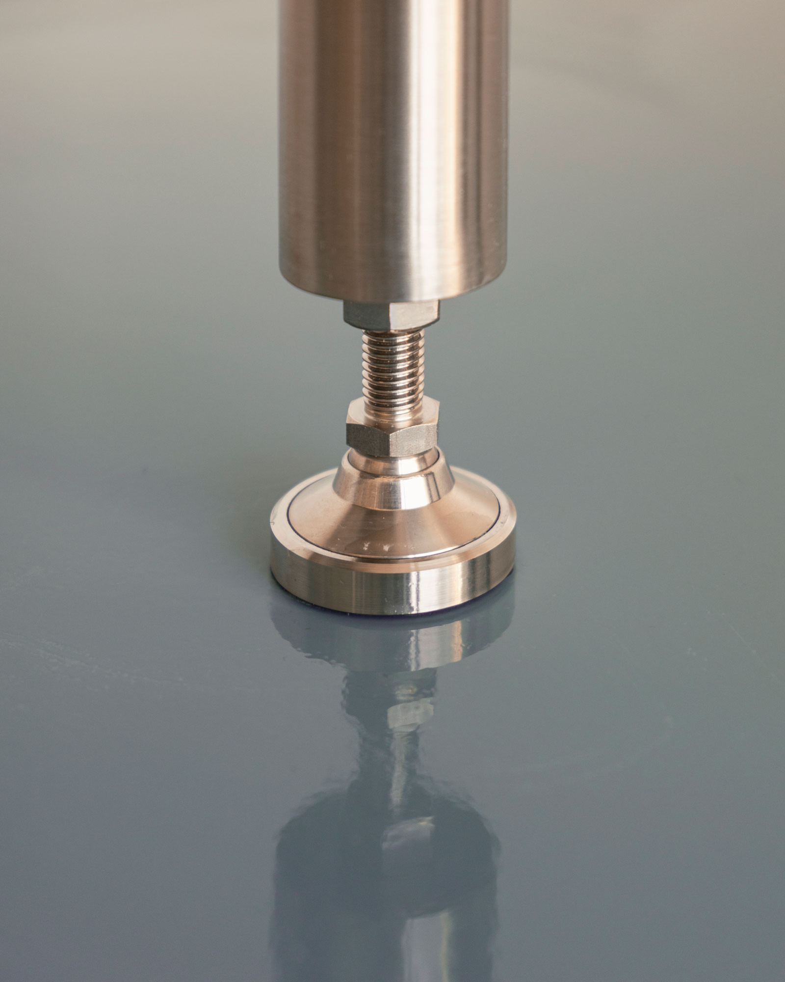
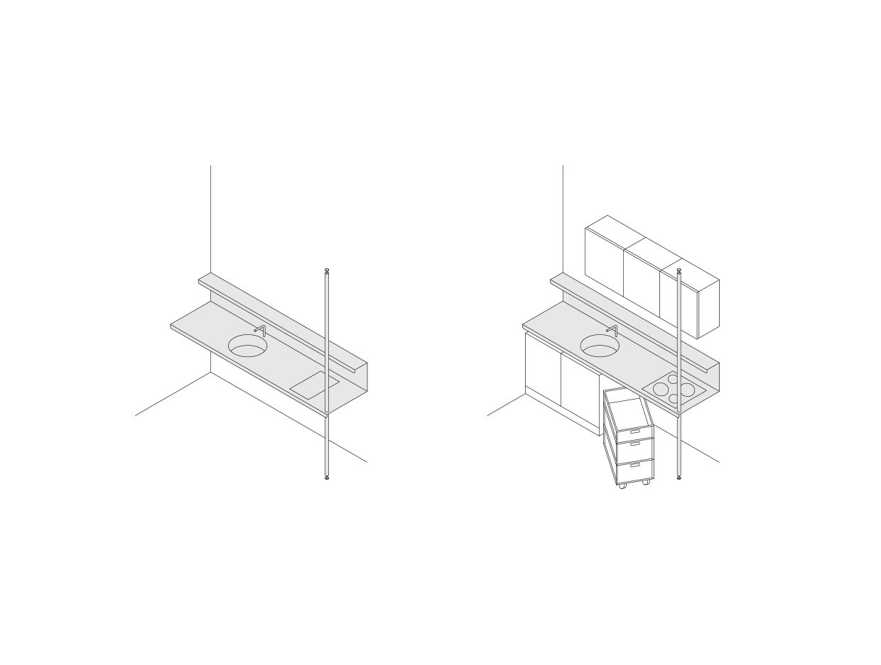
The Ausbauküche is a customizable open-plan kitchen unit that can be configured in many different ways. The kitchen is designed for the classic Berlin tenant-landlord relationship in which the landlord is legally obliged to provide the tenant with both a stove and a sink. In Berlin rental flats, this kitchen usually consists of a cheap cooker and sink from the DIY store. The tenant has to fit the rest of the kitchen themselves, usually removing the makeshift provision by the landlord.
The Ausbauküche is a counter-proposal. Designed as a robust stainless steel kitchen, it provides a sink, stove, worktop and basic storage in one and adapts to the standard modules of the major kitchen manufacturers. This means that the kitchen can be extended in a wide variety of ways and adapted to the needs of the respective occupants. Base units, fridges, dishwashers, mobile cabinets, etc. can be fitted precisely under the worktop. And wall units, shelves, extractor bonnets, etc. can be configured above the worktop as required, but the kitchens are also visible and fully usable without the need for extensions, giving the flats a cosy appearance even without a lot of furniture. The kitchens are therefore highly efficient to use, can be produced cost-effectively as basic equipment and are durable for decades thanks to their materiality.
Project in collaboration with Leonhard Clemens
Photos by Leonhard Clemens
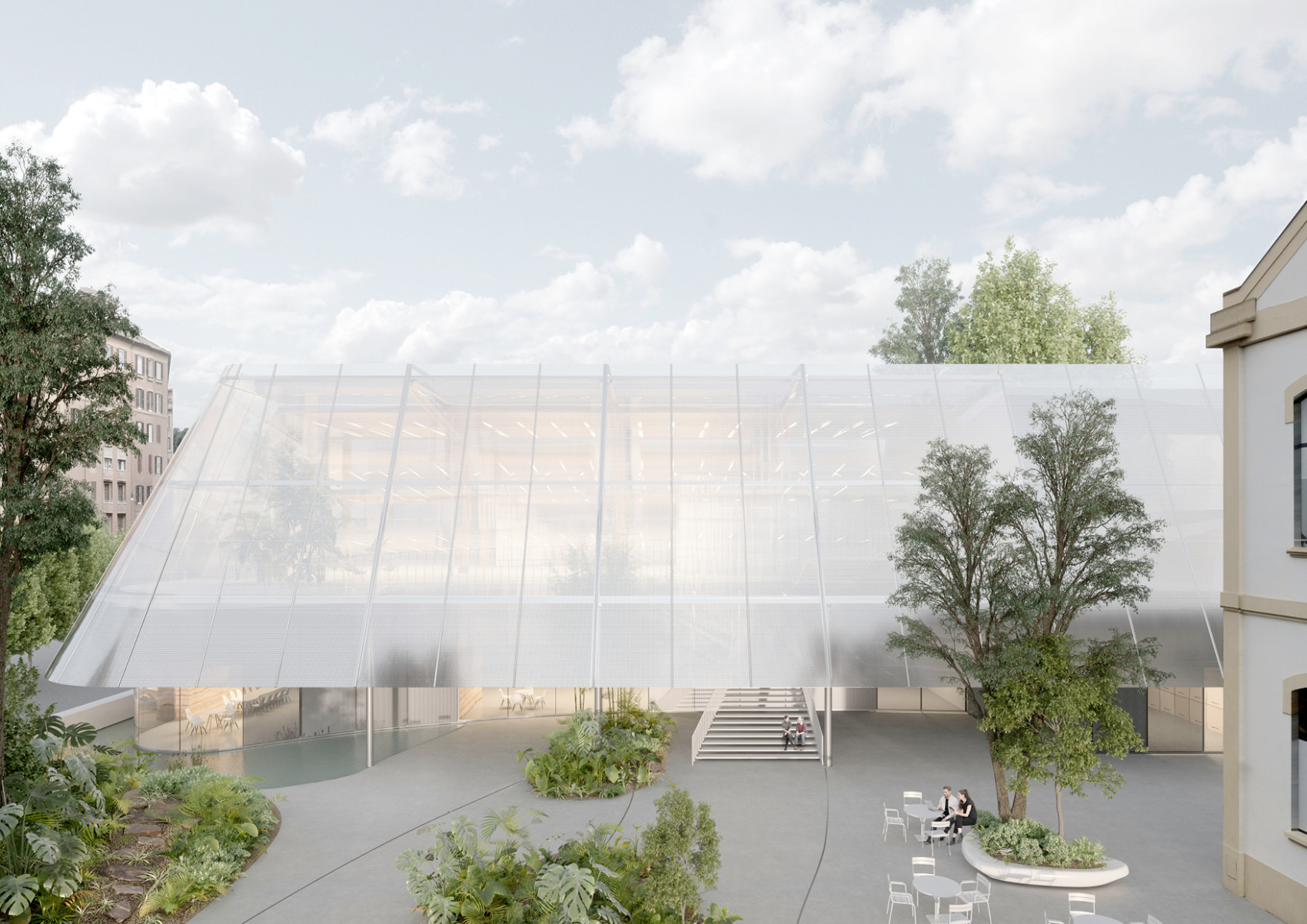
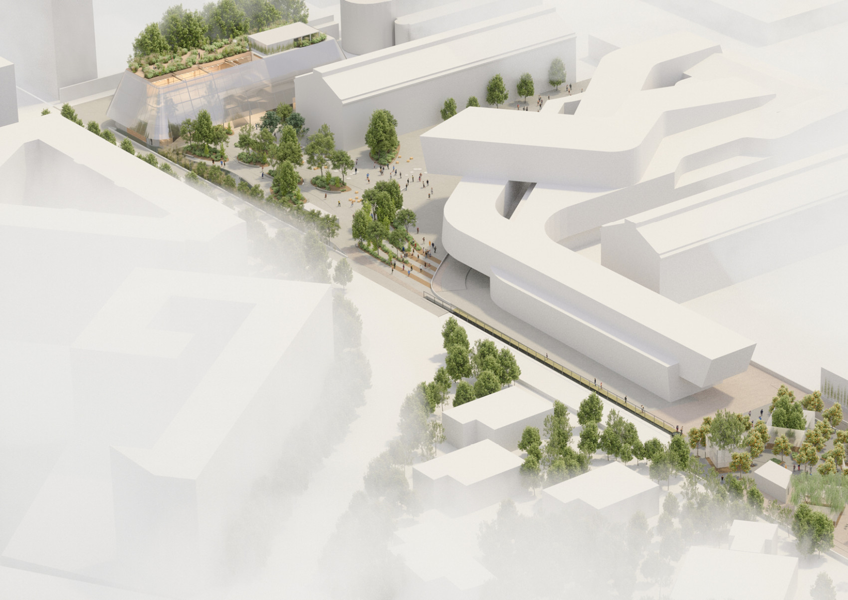
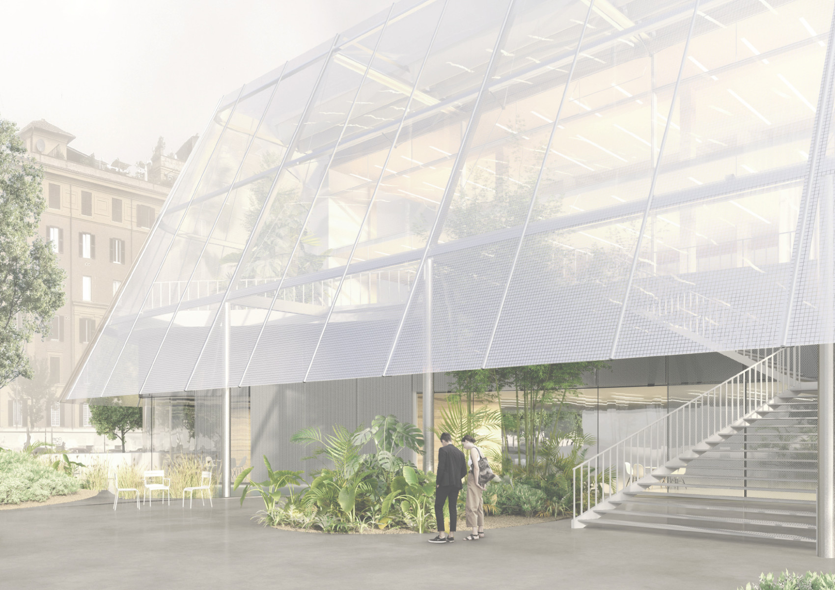
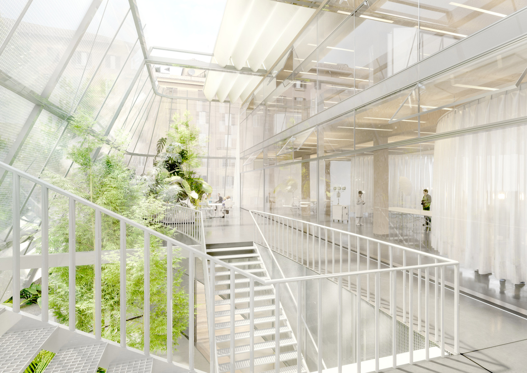
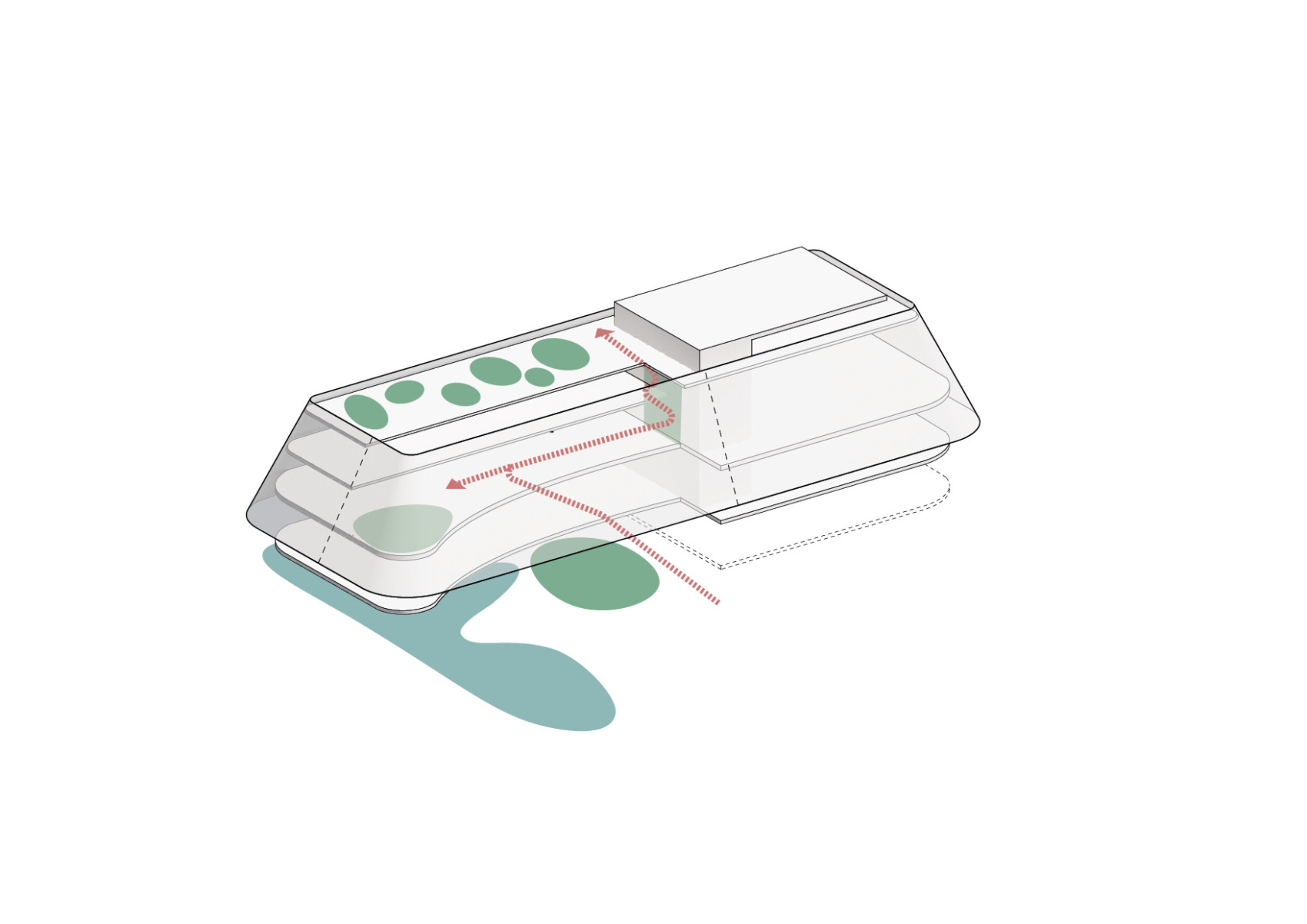
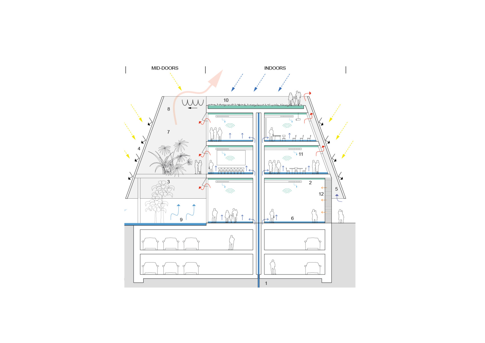
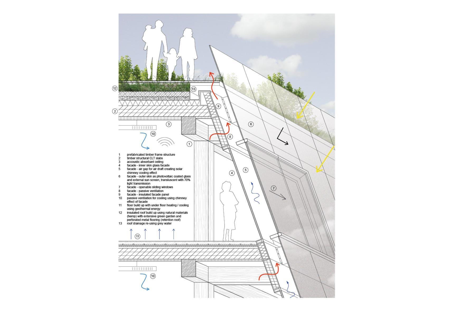
Our award winning proposal for the extension of the Maxxi Museum in Rome is essentially an industrial scale timber-frame structure on a rammed earth base covered by a large photovoltaic screen. The program ranges from an innovation hub to laboratories and art storages. The proposal challenges the traditional definition of inside and outside, by introducing a new type of space, “mid-doors” – a naturally air-conditioned communal space that is suitable for social events regardless of pandemics.
This innovative space is seen as a vertical extension of the new greenery on the north side of the campus, allowing the public to access the large roof with its lush hanging garden via a series of green platforms.
*this project was one of the finalists and received a special mention as part of the 2022 international design competition “Grande Maxxi
Project in collaboration with Gustav Düsing
Landscape by Studio Erde
Structure by Knippers Helbig Advanced Engineering, Berlin
Images by Grau Visuals
